Download
1 / 32
330 likes | 631 Views
INTRODUCTION TO GRAPHIC DESIGN MOVEMENT, BALANCE, UNITY, CONTRAST, EMPHASIS, LINE, AND COLOR. Graphic design elements are the building blocks of graphics. Line Color Shape Texture. Graphic design elements. Lines. Lines can be straight or curved.

E N D
INTRODUCTION TO GRAPHIC DESIGNMOVEMENT, BALANCE, UNITY, CONTRAST, EMPHASIS, LINE, AND COLOR
Graphic design elementsare the building blocks of graphics. Line Color Shape Texture Graphic design elements
Lines • Lines can be straight or curved. • How are lines used in the composition on this slide?
Hue is another word for color. Chroma is the intensity or purity of color. Tint is a color mixed with white. Tone is a color mixed with gray. Shade is a color mixed with black. Color definitions
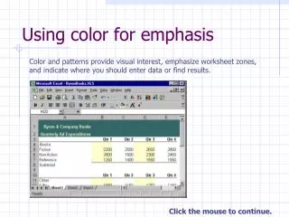
Color and contrast • Using color can enhance or detract from a composition.www.lighthouse.org/color_contrast.htm • Color wheels help determine which colors are in greatest contrast. Use Kuler from Adobe Labs to try out new color schemes: http://kuler.adobe.com/
Color wheels • Analogous colors are adjacent to each other on the color wheel. • Complementary colors are opposite each other on the color wheel.
Use color to label or show hierarchy. Use color to represent or imitate reality. Use color to unify, separate, or emphasize. Use color to decorate. Use color consistently. Color in design www.worqx.com/color www.colormatters.com/colortheory.html http://kuler.adobe.com
Shapes • Shapes are enclosed objects that can be created by line or created by color and value changes that define their edges.
Texture • Texture is the surface look of an object created by varying dark and light areas. • Roughness • Smoothness • Depth
Graphic design principlesare ways in which elements are used together. Movement Balance Emphasis Unity Graphic design principles
Movementis the use of lines, color, and repetition to create the illusion of motion. Curved forms or lines Repetition of geometric forms Fuzzy lines or outlines Movement
Lines • Lines can indicate motion or direction. • How are lines used in the composition on this slide?
Balanceis the act of comparing or estimating two things, one against the other, and the contrast between: Empty space (white space) and filled space Text and images Color and no colors and different colors Textures against flat colors Balance
There are three different types of balance when using color, shape, and position: Symmetry Asymmetry Radial symmetry Balance in composition
You can usually identify at least one of three lines of symmetry. Horizontal Vertical Diagonal Symmetrical or formal balance
Examples of symmetrical balance vertical vertical and horizontal
Examples of asymmetrical balance With asymmetrical balance you are evenly distributing the elements within the format which may mean balancing a large photo with several small graphics. Or, you can create tension by intentionally avoiding balance. Asymmetrical Balance — This page uses a 3 column format to create a neatly organized asymmetrical layout. The two columns of text are balanced by the blocks of color in the lower left topped by a large block of white space. In this case, because the white space is in a block shaped much like the text columns, it becomes an element of the design in its own right
Examples of asymmetrical balance Asymmetrical/All Over Balance — It can't be neatly sliced in half like a symmetrical design but most of the elements have only small differences in shape and mass. This page achieves an overall balance by use of an underlying grid that spreads the many pieces out over the entire page, more or less evenly.
Like a wild, unruly garden, the elements of this brochure cover are barely contained on the page. The plants spring up primarily along the left side but with a few stems escaping and arching across the page. The text, although randomly placed, follows the lines of the plants keeping them anchored to the overall design. The off-balance design creates a sense of freedom and movement. Asymmetrical Tension
How many examples of asymmetrical balance can you find? Examine the elements within the piece to see how the designer arranged them to achieve a balanced design without symmetry. Look for pieces that appear to be intentionally out of balance? How does the balance contribute to the mood of each piece? Is it dynamic? Does it appear to move in a certain direction or vibrate on the page? Record/CD Albums
Examples of radial balance On square and rectangular pages we generally place elements in orderly rows and columns. With radial designs the elements radiate from or swirl around in a circular or spiral path.
Examples of radial balance Radial — Here we have an example of radial balance in a rectangular space. The year represents the center of the design with the subtle color sections radiating from that center. The calendar month grids and their corresponding astrological symbols are arrayed around the year in a circular fashion. Radial — Colors and text radiate out from the apple in the middle of this CD cover design. The effect is almost one of spiraling down into the center of the apple. The apple itself looks nearly symmetrical but the curving text and the outlines edging off the page to the top and right throws it all slightly off-balance.
The rule of thirds says that most designs can be made more interesting by visually dividing the page into thirds vertically and/or horizontally and placing our most important elements within those thirds. Take this concept a step further, especially in photographic composition, by dividing the page into thirds both vertically and horizontally and placing your most important elements at one or more of the four intersections of those lines. Rule of Thirds and Balance
Visual Center and Balance • Placing important elements or the focal point of the design within the visual center of a piece is another design trick. The visual center is slightly to the right of and above the actual center of a page.
Grids and Balance • Roughly dividing a page into thirds or finding the visual center are relatively easy and you don't usually have to be exact to achieve your goals. However, constructing the underlying structure of a piece is a bit more complicated — but essential for most designs. Most balanced designs (and even unbalanced ones) rely on a grid. This invisible structure (visible while working in your page layout program) helps ensure that you place all the elements in the right location to achieve balance as well as to help with continuity and consistency of design. • Grids can be simple or complex depending on the needs of the design and the designer.
Unity • Unity: The correct balance of composition or color that produces a harmonious effect. • What is the focus of the message?
Emphasis • Emphasis: To express with particular stress or force. • What message is stressed here?
The basis of good graphic design is use of design elements and their thoughtful application in the form of design principles. Clearly identify what you are trying to accomplish — use design to convey your message. Brainstorm alternatives. Summary
TRANSFORMATIONS Fruit bars are not always made of fruit – and if they're not, what exactly are they made of?