Download
1 / 25
931 likes | 2.49k Views
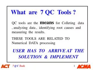
What are 7 QC Tools ?. QC tools are the means for Colleting data , analyzing data , identifying root causes and measuring the results. THESE TOOLS ARE RELATED TO Numerical DATA processing USER HAS TO ARRIVE AT THE SOLUTION & IMPLEMENT. Pareto Diagram.

E N D
What are 7 QC Tools ? QC tools are the means for Colleting data , analyzing data , identifying root causes and measuring the results. THESE TOOLS ARE RELATED TO Numerical DATA processing USER HAS TO ARRIVE AT THE SOLUTION & IMPLEMENT
Pareto Diagram 1. What is Pareto diagram ? A Pareto diagram is a combination of bar and line graphs of accumulated data, where data associated with a problem (e.g., a defect found, mechanical failure, or a complaint from a customer) are divided into smaller groups by cause or by phenomenon and sorted, for example, by the number of occurrences or the amount of money involved. (The name “Pareto” came from an Italian mathematician who created the diagram.)
Method Usage Result • Used to identify and prioritize a problem. • Used to review the effects of an action taken. • Allows clarification of important tasks. • Allows identification of a starting point (which task to start with). • Allows projection of the effects of a measure to be taken Used to prioritize actions.(Used during phases to monitor the situation, analyze causes, and review effectiveness of an action.) Pareto Diagram
Pareto Diagram Example Assessment using Pareto diagram (prioritization) Confirmation of Effect (Comparison) To identify a course of action to be emphasized using a variety of data. Frequently used to check the effect of an improvement. Details of “ A” Improved
Cause & Effect Diagram 1. What is Cause & effect Diagram ? A cause and effect diagram is “a fish-bone diagram that presents a systematic representation of the relationship between the effect (result) and affecting factors (causes).” Solving a problem in a scientific manner requires clarification of a cause and effect relationship, where the effect (e.g., the result of work) varies according to factors (e.g., facilities and machines used, method of work, workers, and materials and parts used). To obtain a good work result, we must identify the effects of various factors and develop measures to improve the result accordingly.
Cause & Effect Diagram Method Usage Result • Can obtain a clear overall picture of causal relation. (A change in the cause triggers a variation in the result.)○ Can clarify the cause and effect relationship. • Can list up all causes to identify important causes. • Can determine the direction of action (countermeasure). • Used when clarifying a cause and effect relationship.[Used during a phase to analyze causes.] • Used to develop countermeasures. [Used during a phase to plan countermeasures.]
Stratification 1. What is Stratification ? • Stratification means to “divide the whole into smaller portions according to certain criteria.” In case of quality control, stratification generally means to divide data into several groups according to common factors or tendencies (e.g., type of defect and cause of defect). • Dividing into groups “fosters understanding of a situation.” This represents the basic principle of quality control.
Number of Units X ★★★★★★★ Y △△△△ Z ○○○ Stratification Method Usage Result • Used to observe variations among strata. • Used to identify the relationship between cause and effect. • Used to identify a purpose and means to serve the purpose Grouping by day, time, place, worker, or process • Allows observation of variations among strata. • By performing a cause analysis using the stratified data, the following can be accomplished. [Used during phases to monitor the situation, analyze causes, review effectiveness of an action, perform standardization, and implement a selected control measure.] 1.Identification and control of a problem 2.“Division of data (obtained by using each QC tool) into several groups”
Check Sheet 1. What is Check sheet ? A check sheet is “a sheet designed in advance to allow easy collection and aggregation of data.” By just entering check marks on a check sheet, data can be collected to extract necessary information, or a thorough inspection can be performed in an efficient manner, eliminating a possibility of skipping any of the required inspection items. A check sheet is also effective in performing stratification (categorization).
Check Sheet Method Usage Result • Used to collect data. • Used when performing a thorough inspection. • Ensures collection of required data. • Allows a thorough inspection of all check items. • Can understand tendencies and variations. • Can record required data. Used during phases to monitor the situation, analyze causes, review effectiveness of an action, perform standardization, and implement a selected control measure
Check Sheet A check sheet used to identify defects
Control Chart (Control Chart / Graph 1) 1. What is Control Chart ? A control chart is used to examine a process to see if it is stable or to maintain the stability of a process. This method is often used to analyze a process. To do so, a chart is created from data collected for a certain period of time, and dots plotted on the chart are examined to see how they are distributed or if they are within the established control limit. After some actions are taken to control and standardize various factors, this method is also used to examine if a process is stabilized by these actions, and if so, to keep the process in a stable state.
Control Chart Method Usage Result Can identify a change caused by elapse of time. Can judge the process if it is in its normal state or there are some anomalies by examining the dots plotted on the chart. Used to observe a change caused by elapse of time. • [Used during phases to monitor the situation, analyze causes, review effectiveness of an action, perform standardization, and implement a selected control measure In the example “x bar ” -R control chart, “X bar” represents the central value, while “R” indicates the range. • Control Chart for Managerial Purposes: Extends the line indicating the control limit used for analytical purposes to plot data obtained daily to keep a process in a good state. Control Chart for Analytical Purposes: Examines a process if it is in a controlled state by collecting data for a certain period of time. If the process is not controlled, a survey is performed to identify its cause and develop countermeasures.
Control Chart Examples of Values Represented by Dots Values above the control limit control limit represented by seven seven Consecutive dots x x - - Control Chart Control Chart A decline A decline represented by represented by seven seven consecutive dots Group Number Group Number
Graph 1. What is Graph ? • A graph is “a graphical representation of data, which allows a person to understand the meaning of these data at a glance.” Unprocessed data simply represent a list of numbers, and finding certain tendencies or magnitude of situation from these numbers is difficult, sometimes resulting in an interpretational error. A graph is a effective means to monitor or judge the situation, allowing quick and precise understanding of the current or actual situation. • A graph is a visual and summarized representation of data that need to be quickly and precisely conveyed to others.
Graph Method Usage Result Can observe changes in a time-sequential order, ratios, and amounts. A graph is the most frequently used tool to examine the various matters such as those listed on the left. Changes in a time-sequential order – line graph Amounts – bar graph, etc. Ratios – pie graph, band chart, etc. (The items listed above are representative examples.)
Graph [ [ Bar Graph of Sales] Bar Graph of Sales] [Band Chart of Expenses] [Band Chart of Expenses] Survey Period: Dec. 1999 Survey Period: Dec. 1999 ・ ・ million) ( ¥ million) Prepared by: M/T Prepared by: M/T ・ ・ million) Before Before Oils Oils Oils Oils Chemicals Chemicals Chemicals Chemicals Electricity Electricity Electricity Electricity Sales Sales Taking Taking (200) (200) (200) (200) (430) (430) (430) (430) (170) (170) (170) (170) Actions Actions ( ( Total: Total: ¥ 8 million) 8 million) After After Chemicals Chemicals Chemicals Chemicals Oils Oils Oils Oils Taking Taking (240) (240) (240) (240) (150) (150) (150) (150) Actions Actions ( ( Total: Total: ¥ 4.95 million) 4.95 million) Sales Sales A Iwate Tokyo B Osaka C Shizuoka D Electricity Electricity Electricity Electricity Office Office (108) (108) (108) (108)
Histogram 1. What is Histogram ? • When creating a histogram, “a range of data is divided into smaller sections having a uniform span,and the number of data contained in each section (the number of occurrences) is counted to develop a frequency distribution table.” Then, “a graph is formed from this table by using vertical bars, each having the height proportional to the number of occurrences in each section.”
Histogram Method Usage Result • Used to assess the actual conditions. • Used to analyze a process to identify a problem point that needs to be improved by finding the location of the mean value or degree of variations in the graph. • Used to examine that the target quality is maintained throughout the process. • Others • Can identify the location of the mean (central) value or degree of variations. • Can find out the scope of a defect by inserting standard values. • Can identify the condition of distribution (e.g., whether there is an isolated, extreme value). [Used during phases to monitor the situation, analyze causes, and review effectiveness of an action.]
Scatter Diagram 1. What is Scatter Diagram ? • A scatter diagram is used to “examine the relationship between the two, paired, interrelated data types, ” such as “height and weight of a person.” A scatter diagram provides a means to find whether or not these two data types are interrelated. It is also utilized to determine how closely they are related to identify a problem point that should be controlled or improved.
Scatter Diagram Method Usage Result • Used to identify a relationship between two matters. • Used to identify a relationship between two matters and establish countermeasures based on their cause and effect relation. • Can identify cause and effect relation. • Can understand the relationship between two results. Example Usage 1.Relationship between thermal treatment temperature of a steel material and its tensile strengths 2.Relationship between visit made by a salesman and volume of sales 3.Relationship between the number of persons visiting a department store and volume of sales 4 Others [Used during phases to monitor the situation, analyze causes, and review effectiveness of an action.]
Scatter Diagram Axis Axis y y Abrasion (micron) Abrasion (micron) x x Axis Axis Number of Number of Rotations Rotations
Application of QC tools in Problem Solving Graphs Check sheet Stratification Pareto Diagram Cause & Effect Diagram Histogram Scatter Diagram Control Chart Identification of problem Defining the problem Record of facts Detecting causes of problem Develop Improvement method ( Solution ) Implementation Evaluation of result Process control ( Standardization ) Relation :- Strong Normal
To sum up 7 QC tools (Numerical data ) are used as follow: • Stratification Basic processing performed when collecting data • Pareto Diagram To identify the current status and issues • Cause and Effect Diagram • To identify the cause and effect relationship • Histogram To see the distribution of data • Scatter Diagram To identify the relationship between two things • Check Sheet To record data collection • Control Chart/Graph To find anomalies and identify the current status