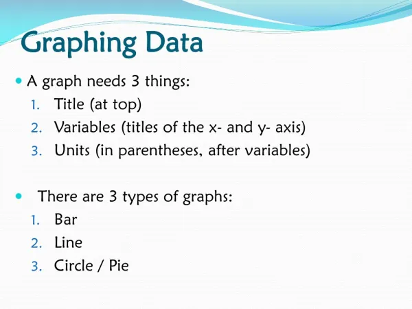
Graphing Data
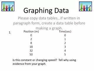
Graphing Data. Univariate Data. One variable – Distribution Graphs Pie Graphs – Show parts of a whole for each category. Percentages or counts Qualitative (categorical) and Discrete Bar Graphs – show frequencies (counts) or percentages of each category

Graphing Data
E N D
Presentation Transcript
Univariate Data • One variable – Distribution Graphs • Pie Graphs – Show parts of a whole for each category. Percentages or counts • Qualitative (categorical) and Discrete • Bar Graphs – show frequencies (counts) or percentages of each category • Qualitative or Quantitative and Discrete • Eye color (qualitative and discrete) • Ages or test scores (quantitative and discrete)
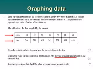
Univariate Data • Histograms – shows the frequencies (counts) of each interval • Quantitative and Continuous • Box and Whisker Plots - shows the frequencies (counts) of data • Used with discrete or continuous data • Breaks data into quarters (1/4 of data in each quarter)
Univariate Data • Dot Plots • Stem and Leaf Plots -Same as box & whisker plots but used with smaller sets of data
Bivariate Data Two variables – looks for a correlation between the two variables • Scatter Plots – explanatory variable goes on the x-axis and response variable goes on the y-axis • Do not connect the dots
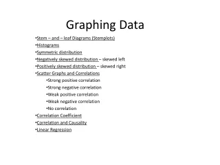
Bivariate Data • Linear Regression Line – creates a line of best fit on a scatter plot using least squares regression method.
Bivariate Data • Line Graphs – show change over time • Connect the dots