Download

1 / 16
160 likes | 434 Views
Bar graphs, Pie charts, Dot plots and stem plots. AP Statistics. What is an Individual?. Individual: Individuals are the objects described by a set of data. Individuals may be people, but they may also be animals or things. What are some examples of individuals?. BAR GRAPHS.

E N D
Bar graphs, Pie charts, Dot plots and stem plots AP Statistics
What is an Individual? • Individual: Individuals are the objects described by a set of data. Individuals may be people, but they may also be animals or things. • What are some examples of individuals?
BAR GRAPHS • Step 1: Label your axes of the graph. Draw a set of axes. Label you horizontal axis with your type that your categories fit in to. Title your graph. • Step 2: Scale your axes. Use the counts in each category to help you scale your vertical axis. Write the category names at equally spaced intervals beneath the horizontal axis. • Step 3: Draw a vertical bar above each category name to a height that corresponds to the count in each category.
PIE CHARTS • QUICK NOTE: When given Categorical Data in counts. Find the total of the counts and use each count divided by the total to find the percent. Then place the categories in a circle as pie slices according to their percent. Make a legend to color code the pie chart per category.
Company Cases Sold (millions) Market share Coca Cola Company 4377.5 44.1 Pepsi-Cola Company 3119.5 31.4 Dr. Pepper/7-up 1455.1 14.7 Cott Corp. 310.0 3.1 National Beverage 205.0 2.1 Royal Crown 115.4 1.2 Other 347.5 3.4 Example 1.2 p.8 : The following table displays the sales figures and market share (percent of total sales) achieved by several major soft drink companies in 1999. That year, a total of 9930 million cases of soft drink were sold.
Analyzing categorical Data • The best way to analyze Categorical Data is from a graph. Lets Analyze the graph from Example 1.3 p. 10
Quantitative Variables • A quantitative variable takes numerical values for which arithmetic operations such as adding and averaging make sense
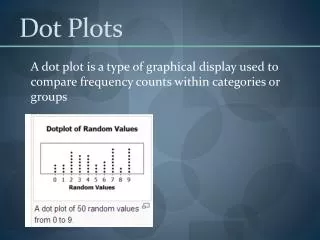
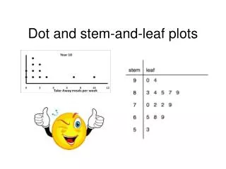
DOT PLOTS • Step 1: Label your axis and title your graph. Draw a horizontal line and label it with the variable. Title your graph • Step 2: Scale the axis based on the values of the variable • Step 3:Mark a dot above the number on the horizontal axis corresponding to each data value.
5 0 1 0 7 2 1 0 4 0 3 0 2 0 3 1 5 0 3 0 1 0 1 0 2 0 3 Example 14 page 11: The number of goals scored by each team in the first round of the California Southern Section Division V high school soccer playoffs is shown in the following table.
SHAPES • Skewed Right: Most of the data is concentrated to the left of the graph (tail point to the right) • Skewed Left Most of the data is concentrated to the right of the graph (tail points to the left) • Symmetric: The majority of the data is concentrated in the center of the graph (shaped like a bell)
What is the shape of the dot plot? • YES, It is skewed right.
Center and Spread • Center: the value that divides the observations so that about half have smaller values • Spread: the smallest and larges values expressed in an interval
What are the center and spread of the dot plot? • The center is 1 and the spread is 0 through 7
Stemplots • Step 1: Separate each observation into a stem consisting of all but the rightmost digit and a leaf, the final digit • Step 2: Write the stems vertically in increasing order from the top to bottom and draw a vertical line to the right of the stems. Go through the data, writing each leaf to the right of its stem and spacing the leaves equally. • Step 3: write the stems again, and rearrange the leaves in increasing order out from the stem. • Step 4:_ title your graph and add a key describing what the stems and leaves represent.
Example 1.5 Watch that CaffeineConstruct a Stem Plot with the data.