Download
1 / 3
0 likes | 23 Views
Discover 'How to Create Your First Dashboard Visualization in Less Than a Day,' a comprehensive guide for beginners in dashboard visualization. Learn what data visualization is, explore the intricacies of creating a data visualization dashboard, and dive into the world of business intelligence data visualization. Transform complex data into compelling, insightful visual stories quickly and effectively with our step-by-step approach.

E N D
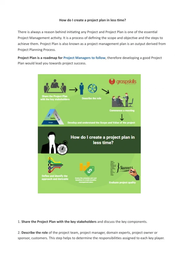
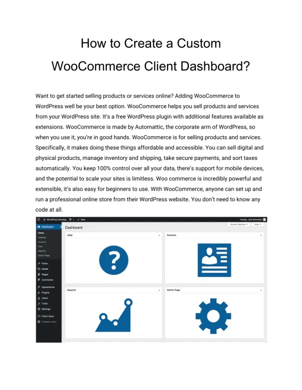
How to Create Your First Dashboard Visualization in Less Than a Day Suppose you’re a marketing manager, and you have a critical meeting in less than 24 hours. You need to present the latest campaign results, and spreadsheets just won’t cut it. This is where the magic of a data visualization dashboard comes into play, transforming rows of data into a compelling visual story. This blog will guide you through the process of creating your very first dashboard visualization, seamlessly and efficiently. In the realm of business intelligence, data visualization dashboards are more than just tools; they are essential narratives that drive decision-making. Whether it’s tracking sales, monitoring website traffic, or understanding customer behavior, a well-crafted dashboard can highlight key metrics and trends that might otherwise be lost in the noise of raw data. But how do you go from spreadsheets to a visually appealing, informative dashboard in less than a day? That's precisely what we'll explore. By the end of this blog, you'll not only grasp the basics of dashboard visualization but also be equipped to create your first data visualization dashboard. This guide is designed to streamline the process, ensuring that your journey into business intelligence data visualization is both rewarding and impactful. So, buckle up and prepare to embark on a journey that will elevate your data presentation skills and enrich your decision-making process. Let's dive into the world of dashboard visualization, where data tells a story, and every insight is a stepping stone to success. Let’s first see what Dashboard Visualization means What is data visualization, and why does it matter in BI? Simply put, dashboard visualization is the graphical representation of information and data. By using visual elements like charts, graphs, and maps, dashboard visualizations provide an accessible way to see and understand trends, outliers, and patterns in data. In the context of BI, this means turning large volumes of data into meaningful insights that can drive business decisions. Steps to Develop Your First Dashboard Visualization in Less Than A Day Step #1: Preparing Your Data The foundation of any effective data visualization dashboard lies in the quality of the data it represents. Start by identifying relevant data sources that align with your objectives. Ensure the data's accuracy and consistency, as this directly impacts the
reliability of your dashboard. Utilize tools for data cleaning, like Excel or specialized software, to remove any inconsistencies or irrelevant data. Then, transform your data, using SQL or Python scripts, into a format suitable for visualization. Step #2: Choosing the Right Visualization Tools Selecting the right tools is crucial for efficient dashboard visualization. Popular tools like Grow, Tableau, Power BI, and Qlik offer different features that cater to varying needs. For instance, Grow is renowned for its user-friendly interface and afforadability, while Power BI provides deep integration with other Microsoft services. Consider factors like ease of use, compatibility with existing systems, and the specific visualization needs of your business. Grow BI, for instance, offers an intuitive drag-and-drop interface, making it incredibly user-friendly for beginners. Its prebuilt templates serve as an excellent starting point, allowing you to create professional-looking dashboards without the need for extensive design experience. This ease of use is a significant advantage when you're learning the ropes of dashboard visualization. Step #3: Designing Your Dashboard A well-designed data visualization dashboard is both aesthetic and functional. Follow the principles of effective dashboard design: prioritize clarity, keep the design simple, and choose color schemes that enhance readability. The design should be user-centric, meaning it should be tailored to the needs and understanding of the end-user. Incorporate their feedback into the design to ensure it meets their needs. Step #4: Building Your Dashboard Building your first business intelligence data visualization dashboard can be a rewarding experience. Start by importing your data into your chosen tool. Then, select the types of charts or graphs that best represent your data. For instance, use line charts for trends over time or bar charts for comparisons. Remember, the goal is to make the data as easy to understand as possible, balancing visual appeal with practical functionality. Step #5: Testing and Iterating Testing is a critical step in dashboard development. Test the functionality of your dashboard and its effectiveness in conveying the intended message. Collect feedback from potential users and be open to making iterative changes. This process ensures that your data visualization dashboard remains relevant, accurate, and user-friendly. Best Practices for Maintenance and Updates Maintaining your dashboard visualization is key to its long-term usefulness. Regularly update the dashboard to reflect new data and trends. As you become more
comfortable with dashboard creation, experiment with advanced features like adding interactive elements or incorporating real-time data. Conclusion Achieving the milestone of creating a dashboard visualization in under a day is not just a dream but a practical reality with proper preparation and the right tools, such as those offered by Grow. Grow BI emerges as a highly accessible tool for beginners venturing into the world of dashboard visualization. Its user-friendly interface, coupled with features like drag-and-drop design, prebuilt templates, real-time data updates, and customizable widgets, makes dashboard creation not just simpler but also more efficient. Whether you're a small business owner or part of a larger organization, Grow BI equips you with the tools to transform complex data into actionable insights. These advantages make Grow software a compelling choice for anyone looking to start their journey in business intelligence data visualization. Curious about how Grow can transform your data visualization journey? Explore Grow Cost & Reviews on Capterra. This small step could be the start of your journey towards mastering the art of dashboard visualization, a key to unlocking the full potential of your business data.