Download
1 / 57
570 likes | 872 Views
Near-Real-Time IT-Control Charts . Igor Trubin, PhD , SunTrust Bank http://www.itrubin.blogspot.com/. Introduction. Agenda Where and why the Control Chart is used: review of some systems performance tools on a market that build and use control charts.

E N D
Near-Real-Time IT-Control Charts Igor Trubin, PhD, SunTrust Bank http://www.itrubin.blogspot.com/
Introduction • Agenda • Where and why the Control Chart is used: review of some systems performance tools on a market that build and use control charts. • What is the Control Chart? - A little bit of theory and history. • How SEDS (Statistical Exception Detection System) uses it - MASF charts vs. SPC ones. • IT-Chart concept. The best control chart type for IT data visualization. • Long gallery of already published charts in the CMG papers. • Plus some new ones with explanations how to read them. • How to build a Control Chart: using Excel for interactive analysis and R to automate the control chart generation with live demonstration of the technique.
BMC softwarewww.bmc.com: MASF technique in Performance Analysis for Servers and Performance Assurance tools; BMC ProactiveNet Analytics http://documents.bmc.com/products/documents/49/13/84913/84913.pdf Fujitsu www.fujitsu.com: ACTIVE BASELINING Technique www.fujitsu.com/downloads/AU/active_baselining_in_passive_data_environments.pdf McAfeewww.mcafee.com Anomaly-Based Intrusion Detectionwww.mcafee.com/us/local_content/white_papers/wp_ddt_anomaly.pdf BEZ systemswww.bez.com for Oracle and Teradata performance www.wmoug.org/bezPresentation.pdf Integrien Alive™http://www.integrien.com/ Netuitive http://netuitive.com/ Firescopehttp://www.firescope.com/default.htm Managed Objectshttp://managedobjects.com/ Six Sigma http://www.isixsigma.com/st/control_charts/ SEDS (Statistical Exception Detection System) http://www.itrubin.blogspot.com/ Where the Control Chart is used in IT
Why Control Chart is used for Capacity Management • Control Chart has the ability to uncover somehidden trends and patterns of systems performance data • Control Chart is a really proactive tool and could capture unusual resource usage before it breaks • Control Chart is the best base-lining tool and can show how actual data deviate from historical baseline • Control Chart provides dynamic threshold: no needs in manual settings • Control Chart is the tool to detect a workload pathology (run-away, memory leaks and other)
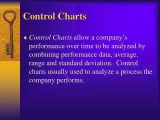
Control Chart Definitions • Definitions • The control chart, also known as the Shewhart chart or process-behavior chart, in statistical process control is a tool used to determine whether a manufacturing or business process is in a state of statistical control or not. • A graphical tool for monitoring changes that occur within a process, by distinguishing variation that is inherent in the process (common cause) from variation that yield a change to the process (special cause). This change may be a single point or a series of points in time - each is a signal that something is different from what was previously observed and measured.
What the Control Chart is • Chart details • Points representing measurements of a quality characteristic in samples taken from the process at different times [the data]. • A centre line, drawn at the process characteristic mean which is calculated from the data. • Upper (UCL) and lower (LCL) control limits (sometimes called "natural process limits") that indicate the threshold at which the process output is considered statistically 'unlikely' .
What the Control Chart is (continued) • Choice of limits • UCL= Mean+ 3; LCL= Mean- 3; Centerline = Mean (or Average) ( - Standard Deviation The reason that 3 control limits balance the risk of error is that, for normally distributed data, data points will fall inside the 3 limits 99.7% of the time when a process is in control.) • UCL=95th Percentile; LCL= 5th Percentile Centerline =50th Percentile (A percentileor centile is the value of a variable below which a certain percent of observations fall.) That choice is good if data is far from normal distribution.
What the Control Chart is (continued) • Special Types of Control Charts • There are X-bar, R, S, U, Np, P and C Control charts. • X-bar is most common and used in Capacity Management. In this chart the sample means are plotted in order to control the mean value of a variable. • C-control chart (Poisson or Counts) plots the number of defectives and is sensitive to changes in the number of defectives in the measurement process. For our area that could be used to control workload pathologies (e.g. run-always, memory leaks and so on). For C-chart the control limits are calculated as: LCL= c– 3 √c;UCL= c+ 3 √c where c is the mean number of defectives. Also, zero serves as a lower bound on the LCL. • Other types are more appropriate for mechanical engineering area. 8
MASF, SPC control and histogram charts comparison • MASF: Reference set vs. Actual data. • All three charts demonstrate different views of exceptions for CPU utilization that occurred at 8 am. • As opposed to classical X-bar univariate control chart, MASF chart can be most useful for showing a 24 (7x24) hour profile of a resource usage and actually is a multivariateControl Chart). NOTE: Limits might need to be cut at 100% or 0% natural thresholds
How close is the data to normal distribution • … for global CPU utilization on the same Unix server? Reference set grouped by hours Example of the 6 month hourly histograms for HP rp7400/550Mhz/ 6-way server global CPU utilization exception.
Types of Control Charts against performance data • Classical SPC type (daily or hourly aggregated (SEDS, BMC Visualizer) or raw granular data (Integrien – for near-real-time data alerting) • 24 hour profile for Global or application level data (MASF type) (SEDS, BMC) • Weekly profile of daily data (SEDS) • Weekly profile hourly data (IT-chart, main SEDS tool) – most efficient type of visualization tool to visualize IT systems performance • Monthly profile of daily data
Control Chart and other type of graphs • Control chart is one of the possible graphical tools. One of the most powerful, but other type of charts could be used: CONTROL CHART Top BarChart Trend Forecast Charts CASE: SEDS detected VM server is moved to other host by v-motion
IT-Chart Concept • Radar screen analogy. • Refresh border (line) is to separate current (week) period data from previous (week) period. • Refreshing speed: • Day– every morning the border shifts on 24 hour • Hour– hourly refreshed control chart, the border moves every hour. Good for near-real-time monitoring. • Minutes? Or seconds like the real radar refreshing? Could be a capacity problem… • Weekly IT-control chart is the best as it shows weekend, night and even lunch time seasonality. 13
How to read weekly IT-charts • This is the SEDS view to compare the last 7 days (actual) vs. the last 6 month baseline (historical) data. • Black curve is the actual hourly data. Left side from vertical line is THIS WEEK data up to yesterday. Right side is the last week data • Green curve is the hourly average (Mean) for particular weekday and hour for the history of 6 month. • Red is UCL; Blue is LCL;
How the weekly IT-chart is built • Take one week of recent data…
Take one week of recent data… How the weekly IT-chart is built 16
How the weekly IT-chart is built • Take one week of recent data and put that in weekly profile form;
How the weekly IT-chart is built • Take one week of recent data and put that in weekly profile form; • Take some representative historical reference data; set it as a baseline and then compare it with the most recent actual data. If the actual data exceeds some statistical thresholds, (e.g. Upper (UCL) andLower(LCL) Control Limits are mean plus/minus 3 standard deviations or some percentiles), NOTE it predicts what is suppose to be happened tomorrow
How the weekly IT-chart is built • Take one week of recent data and put that in weekly profile form; • Take some representative historical reference data; set it as a baseline and then compare it with the most recent actual data. If the actual data exceeds some statistical thresholds, (e.g. Upper (UCL) andLower(LCL) Control Limits are mean plus/minus 3 standard deviations or some percentiles), generate an exception (alert via e-mail) and build a control chart. NOTE it predicts what is suppose to be happened tomorrow
Why is it so powerful? Forecasting vs. exception detecting • In addition to unusual resource usage capture, the Weekly Control Chart has the following features: • “Summarization” It usessummarized data (6-8 month history of hourly data). • “Correlation” That allows you to see where system performance and/or business driver metrics correlate simply by analyzing synchronized control charts. • “Do Not Mix Shifts” Control Chart by nature visualizes the separation of work or peak time and off time. • “Statistical Model Choice” means playing with different statistical limits (e.g. 1 st. dev. vs. 3 or more st. dev. or percentiles) to tune the system and reduce the rate of false positives. • “Significant Events” To adjust itself statistically to some events because the historical period follows the actual data and every event will occasionally be older than the oldest day in the reference set. • “Outliers detection” All workload pathologies are definitely statistically unusual; they are captured and then suppose to be removed from historical data.
Why is it so powerful? EXAMPLES • The SEDS and Memory Metrics (Paging exceptions ) This metric has the following problem: there is no simple calculated threshold and, as such, it is hard to say if the 2 am spike is big enough to worry about.
Why is it so powerful? EXAMPLES • The SEDS and Memory Metrics (Paging exceptions ) This metric has the following problem: there is no simple calculated threshold and, as such, it is hard to say if the 2 am spike is big enough to worry about
Why is it so powerful? EXAMPLES • The SEDS and Memory Metrics (Paging exceptions ) The control chart shows unusual paging activity. That is confirmed by reviewing the historical paging trend:
Why is it so powerful? EXAMPLES • The SEDS and Memory Metrics (Weekly IT-chart )
Why is it so powerful? EXAMPLES • The SEDS and Memory Metrics (Weekly IT-chart )
Why is it so powerful? EXAMPLES • The SEDS and Memory Metrics (Weekly IT-chart ) This example shows the weekly scheduled server reboot (to avoid memory leak issues). This kind of graph is also useful since, even if there were no exceptions from yesterday, it may show exceptions from previous days.
Why is it so powerful? EXAMPLES • The SEDS and Memory Metrics (Weekly IT charts: Memory Leaks)
Why is it so powerful? EXAMPLES • The SEDS and CPU Metrics (24 hour and weekly control charts) Global exception correlates with some apps Some Citix apps defect on VMs
Why is it so powerful? EXAMPLES • The SEDS and Virtual Machine metrics Running-away VM HOST Running-away VM Control Chart detects Run-away of the VM even though the CPU utilization is <80%
Why is it so powerful? EXAMPLES • The SEDSandCPU Run Queue metric Run Queue is useful for capturing CPU bottlenecks. And it indirectly relates to the system response time. This is Sun Fire V880 4-way box
Why is it so powerful? EXAMPLES • The SEDSandCPU Run Queue metric If a CPU Queue exception is detected and CPU utilization had exception for the same hour plus CPU utilization was close to 100%, there is a high probability of a CPU capacity issue. But which Application caused the exceptions? This is Sun Fire V880 4-way box
Why is it so powerful? EXAMPLES • The SEDSandCPU Run Queue metric When a global exception occurs (CPU Queue), the workload level data can be scanned to identify what particular application on the server was responsible for the exception.
Why is it so powerful? EXAMPLES • The SEDSandCPU Run Queue metric The scan against the application level data showed Application5 had a similar exception. CONCLUSION: An unusual number of active processes is the cause of global CPU Queue exception and indicates a potential application performance problem!
Why is it so powerful? EXAMPLES • The SEDS and response time and some other application metrics SEDS could capture exceptions of Application Response Time (ART) and Calls Volume of particular functions (APIs Calls) within the Middleware tier.
Why is it so powerful? EXAMPLES • The SEDS and response time and some other application metrics Historical trend chart with E2E response time and transaction volume: IT-chart with E2E response time for “signon” application:
Why is it so powerful? EXAMPLES • The SEDS and disk space metrics
Why is it so powerful? EXAMPLES • The SEDS and disk I/O metrics • SEDS captured a Disk I/O rate exception at about 4:00 PM on ServerB, • and the application detector found that the workload “Appl2” had an exception as well.
Why is it so powerful? EXAMPLES • The SEDS and Unisys and Tandem metrics The Tandem server, in contrast, had two unusual spikes of CPUs utilization that crossed the upper limit. The Unisys server had unusual low utilization that might indicate Disk or Database performance problems
Why is it so powerful? EXAMPLES • Mainframe metrics Control Chart BMC Visualizer was used to find any exceptions based on different filtering policies. For that, the BMC collector needed to be installed on the server and BMC Visualizer used manually to capture any MASF exceptions. BMC Visualizer example: the System Hierarchy (spectrum) and Control Charts
Why is it so powerful? EXAMPLES • The SEDS and Mainframe metrics Exceptions Captured for one of the LPAR SEDS shows that Appl1 was responsible for the global maxima in the overall MIPS chart . Looking at a stacked workload data chart it’s difficult to find an application, which is responsible for spikes in overall CPU usage.
Why is it so powerful? EXAMPLES • The SEDS and Mainframe metrics Hourly SUM of the average response per transaction - RESP, (It shows the values consistently higher than average) Hourly SUM of ended transaction count - TRANS Hourly SUM of elapsed tasks duration - CPUsec
Why is it so powerful? EXAMPLES • The SEDS and Mainframe metrics To capture an unusual behavior of a relatively small application that was not big enough to create a global exception. HEALTH CHECK: To prove a stable behavior of any essential or critical application.
Near-Real Time Control Chart (Proactive Availability Management) • Real-Time Statistical Exception Detectionrequires to process data every interval (at least hourly) to do smart alerting based on dynamic (statistical) thresholds vs. static ones (currently more common). That can be used for Proactive Availability Management. Some tools do that: - Integrien (http://www.integrien.com/) - Netuitive (http://netuitive.com/) - ProactiveNet (www.BMC.com) SEDS was tested to do that too (see IT-chart on this slide) 43
How to build a Control Chart • Using existing statistical tools • SAS/Base and SAS/Graph • SAS/QC (Quality Control): • JMP from SAS • Minitab and other • qcc: An R package for quality control charting • Using built-in Control Chart builder (BMC, BEZ and so on) 44
How to build a Control Chart - EXCEL • What about just Excel! • EXAMPLE: CPS Control Chart with moving or static reference set LINK TO SPREADSHEET UpperLimit=F+M$2*G = H LowerLimit =F-M$2*G = J 7-day Moving Average =AVERAGE(B:B+10) = F 1 st. dev =STDEV(B:B+10) other limits can be used: =PERCENTILE(B3:B+10,0.05) =PERCENTILE(B3:B+10,0.95) (S+ =IF(B-H<0,0,B-H) = I S- =IF(B-J>0,0,B-J) = K EV= ExtraValue = I+K ) - see [1]
How to build a Control Chart - EXCEL • What about just Excel! • EXAMPLE2: Weekly Health Index (Concord metric) MASF Control Chart Builder LINK TO SPREADSHEET • For SUNday (Column “B”): • Mean = AVERAGE(B2:B25) • Upperlimit= AVERAGE(B2:B25)+ 3*STDEV(B2:B25) • Lowerlimit = IF(AVERAGE(B2:B25)- 3*STDEV(B2:B25)<0,0,AVERAGE(B2:B25)- 3*STDEV(B2:B25)) • StdDeviation = STDEV(B2:B25) • For other columns “B’ should be replaced with other column letter (e.g. MONday – “C” and so on) 46
How to use Control Chart (e.g. in the SEDS structure) Control Chart • To visualize SEDS findings (exceptions) SEDS DB PDB – raw data 47
How to use Control Chart (e.g. in the SEDS structure) Control Chart • To visualize SEDS findings (exceptions) script to chart DONE! See next slides (cchrt.r) Subsystem 1 Subsystem 2 … Subsystem 1 Subsystem n Subsystem 2 … Subsystem n script to built data for charting/detecting SEDS DB Exceptional subsystems (e.g. servers) script to detect exceptions PDB – raw data Knowledge Base (Filtering Rules): - statistical (e.g. Metric >UCL or <LCL) - empirical (e.g. Duration>2 hours) Severity of exception (e.g. number of hours) Exception DB
How to build a Control Chart – EXCEL vs. SAS vs. R The data is Unix File Space Utilization • What about SAS, Excel or R! • EXAMPLE3: Monthly Profile vs. Weekly Profile LINK TO SPREADSHEET EXCEL SAS 49
How to build a Control Chart – EXCEL vs. SAS vs. R • What about SAS, Excel or R! • EXAMPLE3: Monthly Profile R download: http://www.r-project.org/ The data is Unix File Space Utilization: INPUT is CSV R-script (published on my blog): Output is JPEG (FYI: qcc: An R package for quality control charting : http://cran.r-project.org/web/packages/qcc/index.html) 50