Innovating Magazine Design: Balancing Tradition and Modern Trends
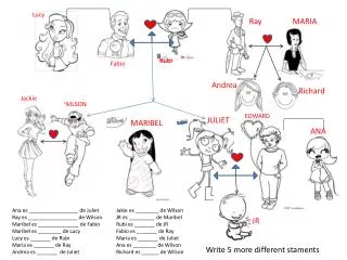
Georgia Wilson explores how her magazine product employs traditional media conventions while introducing creative elements to enhance reader engagement. From the strategic placement of the masthead to the professional look of the barcode, Wilson adheres to established design principles. However, she also challenges norms, like the layout of her contents page, keeping it neat and focused. By incorporating techniques such as drop caps and pull quotes, Wilson provides an engaging reading experience. This product reflects a deep understanding of media conventions and an innovative approach to attract diverse audiences.

Innovating Magazine Design: Balancing Tradition and Modern Trends
E N D
Presentation Transcript
In what ways does your media product use, develop and challenge forms and conventions of real media products? Georgia wilson
My product uses the traditional and developed conventions of a real media product through the title, image and other elements of my magazine. • Like other magazines my product has the masthead at the top of the page, I decided it looked neat and more professional to place the title there. Also the image over laps the title which is a common thing for a front cover, I thought it looked more real if I used the same conventions. • There is normally a barcode at the bottom of the front cover which I decided was needed to make the magazine look professional. Magazines such as Kerrangplace the barcode in the right hand corner to keep it out of the way, I have done the same. • Also, I placed the strapline at the bottom of the page so if there was a band they were not fond of they wouldn’t see that name first and be put off of buying the magazine. Unlike other magazines I have placed the cover lines only to the left of the page, I have done this as it looks neat, it is easier and quicker for the audience to read and it allows the reader to appreciate the photography, applying to Laura Mulvey’smale gaze theory ‘75, seeing the musician would hopefully attract a female audience as well as fans of that band. I have also tried to add a small amount of different colour. This is to entice a new audience as those colours represent other genres of music.
The title is the same font as the one on the cover and I have used banners throughout, this is to create a brand for my magazine. The title is again at the top of the page as it is the traditional place to have it. Unlike the typical elements of a contents page, I have kept the layout very neat and clear as I think the audience will appreciate not having to spend a lot of time looking for one band name. I have kept the image on one side and the writing on the other for the same reasons I did on the front cover. I placed the listings on the right because a reader would flick through a magazine and see the writing first, hopefully being enticed with a band name or interesting article. Also I only used one image on my contents page, keeping it neat and also keeping focus on the listings. I didn’t want readers to be distracted. I created my house style by keeping a constant colour scheme, stereotypical of the genre of music. I think I should have added an editors letter, which is normally a usual convention. I think it would have fit with the genre of the magazine and would interest the audience. If I had added an editors letter I would have cropped the image shorter and placed it at the bottom, a typical place for an editors letter.
I use traditional conventions such as a drop cap, pull quote, stand first, byline, end blob and gutters. • I used a drop cap to show the readers the start of my article, I think using a drop cap if far more interesting than not. • The pull quote is written in bold so it is obvious for the reader to see and interests the audience to read the whole article. The stand first tells the reader that the article is a Q & A and tells them about what has happened lately with the band, I have tried to word it in an interesting way. I used a byline to show that I have planned my magazine through properly, I thought it looked professional and also added colour to the page as I put it in red. I used a end blob to show the end of the paragraph and I use a square as it was a common shape throughout. As I use a different layout to most double page spread, gutters were important to separate the text merging together. I challenged the usual convention of the image on one side and the text on the other, I did this because my image was horizontal and I thought it made the magazine look different and neat. I decide to a use white background, which is different from my front cover and contents page, as it is easy on the eyes and doesn’t have the harshness of the white on black.