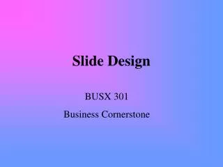
Slide Design
Slide Design. BUSX 301 Business Cornerstone. Format Guidelines. Headings need to be grammatically consistent Bullets need to be visually consistent Fonts need to be legible from 50 feet Background and text need to be opposite dark background and light text light background and dark text.

Slide Design
E N D
Presentation Transcript
Slide Design BUSX 301 Business Cornerstone
Format Guidelines • Headings need to be grammatically consistent • Bullets need to be visually consistent • Fonts need to be legible from 50 feet • Background and text need to be opposite • dark background and light text • light background and dark text
Content Guidelines • Use seven or fewer sentences per slide • Use short phrases • Use graphics and white space • Use charts when appropriate
Organization Guidelines • Divide your time into segments • Decide on what each segment will focus • Decide on a topic heading to introduce each segment • Decide on most relevant supporting material to bullet • Decide on relevant graphs, charts, pictures
Bar Charts: comparing short-term data
Line Charts: comparing long-term data
Pie Charts comparing parts to the whole
This is an example of a bad slide that would lose a lot of points • Sixth, the custom animation and sounds are totally annoying. Don’t anger your audience. • First, keep sizes, fonts, headings, and other details consistent. • Second, the title and these complete sentences are too long. • Third, there isn’t very much white space and waaaaaaayyyyyyyy too much information. Fourth, don’t use bizarre spellings to get your point across; just type the words out as they appear in the dictionary.
Ok, that one was Obvious • What’s Wrong with this Slide? • Using parallelism • Sometimes mistakes just happen. • Fix them! • Short • Quick • To the Point
A Good Slide • Uses short phrases • Stays parallel • Keeps upper and lower case letters consistent • Uses bullets wisely • If one bullet, then two bullets • If one bullet, then no bullets
Opening, Transitioning, Closing • Opening slide: • title of presentation • your name • Transitioning • headings • verbal cues • Closing • closing slide • verbal cues
The Things That Will Make Your Presentation Fabulous • Using bullets • Using short, pertinent phrases • Using a chart if appropriate • Using no sounds • Using appropriate and non-annoying effects