Section 1 (sizes):
Your title here: Maybe add some pictures and/or school logo on the left authors and affiliation (First names of authors increase interaction potential). Section 1 (sizes):

Section 1 (sizes):
E N D
Presentation Transcript
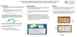
Your title here: Maybe add some pictures and/or school logo on the left authors and affiliation (First names of authors increase interaction potential) Section 1 (sizes): • Posters can be up to 44” tall and 90” wide. Since PowerPoint will not let one define paper that large, this is designed to be printed at 200% scaling. • Ideally want to keep very readable, this is not your paper, it’s a poster. 28pt here (56 final printing) is good for most text: • Sub-bullets24 here (48 final) • Don’t use smaller than 20pt in this template (which is 40pt in final printing at 200%) • Insert plenty of graphics and any math you need When inserting graphics or images of equations, keep the resolution high (remember this will be printed at 200%). If you can see blocking artifacts at 400% magnification in PowerPoint, consider finding better graphics. This is an example of BAD/LOW RES GRAPHICS Leave enough margin for pushpin and remember many big plotters cannot get within .5” of the actual paper edge. You are free to use colored backgrounds and such but they generally reduce readability. You are free to use what ever fonts you like. • San Serif fonts like Arial are more readable from a distance, • Serif fonts like times may look more consistent with your mathematics Section 2 (layout): • Remember the poster session will be crowded so design the poser to be read in columns so people can read what is in front of them and move left to right to get the whole story. • The poster should use photos, figures, and tables to tell the story of the study. For clarity, present the information in a sequence that is easy to follow. There is almost always too much text in a poster - there definitely is in this template! Posters primarily are visual presentations; the text should support the graphics. Look critically at the layout. Some poster 'experts' suggest that if there is about 20-25% text, 40-45% graphics and 30-40% empty space, you are doing well. Section 3: • Include more figures than are in the paper so you can talk to them. Include things that are not in the paper and then encourage them to read the paper. Don’t try to just put all the paper here. • Terry’s view is that if it looks like a cut/past of the paper, I skip that poster since I can read the papers after the conference. I find it better to spend my time talking with poster presenters that have more to offer than just redoing the paper content paper in big fonts. • . BAD Better Will you capture their attention?