Using Visuals
Learn how to effectively use visuals to tell compelling stories, match visual content to narrative, design ethical visuals, and incorporate them into your documents or presentations. Explore the importance of storytelling, design conventions, and considerations like color usage and clip art selection. Discover how visuals enhance communication, emphasize key points, and reduce repetition in your drafts. Uncover the power of good stories to support ideas, challenge assumptions, reveal trends, and drive action. Familiarize yourself with different types of visuals like tables, charts, and graphs, and understand the components that make visuals effective. Gain insights on color usage, clip art considerations, and how to avoid misleading practices like chartjunk. Start mastering the art of visual storytelling today!

Using Visuals
E N D
Presentation Transcript
To learn how to Use visuals to tell stories. Match the visual to the story. Design visuals. Make visuals ethical. Use visuals in your document or presentation. Using Visuals
Start by answering these questions: What are stories, and how do I find them? Does it matter what kind of visual I use? What design conventions should I follow? Can I use color and clip art? What else do I need to check for? Can I use the same visuals in my document and my presentation? Using Visuals
Use Visuals • In the rough draft to • See that ideas are presented completely. • Find relationships. • In the final draft to • Make points vivid. • Emphasize material. • Present material more compactly and with less repetition.
Good Stories • May • Support a hunch you have. • Surprise you or challenge so-called “common knowledge.” • Show trends or changes. • Have commercial or social significance. • Provide information needed for action. • Be personally relevant to you and the audience.
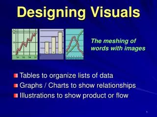
Types of Visuals • Tables • Pie Chart • Bar Chart • Line Graph
Components of Visuals • A title that tells the visual’s story. • A clear indication of what the data are. • Clearly labeled units. • Labels or legends. • The data’s source, if it’s reproduced. • The visual’s source, if it’s reproduced.
Visual Caveats • Color • Be aware of cultural meanings. • Use no more than five when colors have meanings. • Clip Art • Avoid bias; check clip art for balance (e.g., age, race, ethnicity, or gender). • Chartjunk • Avoid art that distorts data or sends incorrect messages.
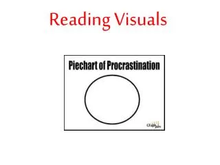
Chartjunk • Example • Avoid perspective graphs—such as this one—which distort data and are hard to read.