Bar Graphs & Histograms
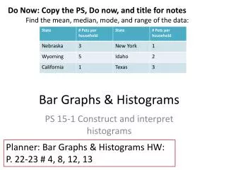
Do Now: Copy the PS, Do now, and title for notes Find the mean, median, mode, and range of the data:. Bar Graphs & Histograms. PS 15-1 Construct and interpret histograms. Planner: Bar Graphs & Histograms HW: P. 22-23 # 4, 8, 12, 13. Vocabulary.

Bar Graphs & Histograms
E N D
Presentation Transcript
Do Now: Copy the PS, Do now, and title for notes Find the mean, median, mode, and range of the data: Bar Graphs & Histograms PS 15-1 Construct and interpret histograms Planner: Bar Graphs & Histograms HW: P. 22-23 # 4, 8, 12, 13
Vocabulary • Bar Graph- a graph that uses vertical or horizontal bars to display data • Double Bar Graph- a bar graph that compares two related sets of data • Histogram – a bar graph that shows the frequency of data within equal intervals
Interpreting bar graphs • What color of M&M’s was the most popular? • What color was the least? • About how many more orange M&M’s were there than blue M&M’s?
Making a histogram • 1. Make a frequency table of the data • Make sure you use equal intervals • 2. Choose an appropriate scale and interval for the vertical axis. • The greatest value on the scale should be at least as great as the greatest frequency • 3. Draw a bar for each interval • The height of the bar is the frequency for that interval • Bars must touch, but not overlap • 4. Label the axes and give the graph a title
Let’s try together Make a histogram of the data: 26, 16, 13, 19, 21, 14, 12, 20, 15, 17, 27, 22 • Make a frequency table • Make the histogram Frequency Intervals
Homework • P. 22-23 # 4, 8, 12, 13