Presentations
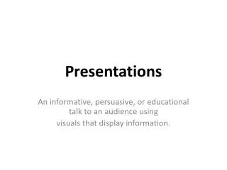
Learn key principles of good and bad presentation design, including slide structure, fonts, backgrounds, graphs, hyperlinks, and spelling/grammar. This guide outlines best practices such as simplicity, readability, and engagement. Enhance your presentation skills and captivate your audience.

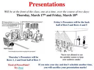
Presentations
E N D
Presentation Transcript
Presentations Good and Bad Design Principles Amresh Torul (Date)
Outline page Slide structure Fonts Backgrounds Graphs Hyperlinks Spelling and Grammar Conclusion page Questions Outline
Include an Outline Page • What to expect • Respect the order • Main points only
Slide Structure – Good • Point form (2 to 4 points) • Key words and phrases only
Slide Structure - Bad • This page contains too many words for a presentation slide. It is not written in point form, making it difficult both for your audience to read and for you to present each point. Although there are exactly the same number of points on this slide as the previous one, it looks much more complicated. In short, your audience will spend too much time trying to read this paragraph instead of listening to you.
Animations - Good • Show one point at a time: • Better concentration • Prevent audience from reading ahead • Presentation more focused.
Animations- Bad • Distracting animation • Going overboard with animation • Inconsistent (too many different styles).
Fonts - Good • At least 18-point, if not 20-point • Different size for main points (28pt) • and secondary points (24pt) • Standard fonts.
Fonts - Bad • Can you all read what’s written here? (14-point) • CAPITALIZE ONLY WHEN NECESSARY. IT IS DIFFICULT AND IRRITATING TO READ.
Font Colour - Good • Contrast with background • Different colours • Improve slide logic (e.g. title and body) • Emphasise on a word
Font Colour - Bad • Limited constrast: hard to read • Decoration can bedistracting and annoying • Using a different colour for each point is unnecessary • Using a different colour for secondary points is also unnecessary • Trying tobe creativecan alsobe bad.
Background - Good • Simple • Light backgrounds are better • Consistent.
Background – Bad • Avoid backgrounds that are distracting or difficult to read from
Background – Bad • Lack of background consistency
Graphs • Helpful with tabular data Profits from January to June (Million – US $)
Graphs - Good Profits from January to June Million (US $) Jan Feb Mar Apr May Jun
Using Graphs • Easier to understand data • Comparisons • Demonstrate predictions
Graphs - Bad Minor gridlines (unnecessary) Font is too small No title
Hyperlinks Avoid pasting web links and URLs http://uk.eurosport.yahoo.com/football/manchester-united/ Use Action Buttons instead Man Utd blog
Spelling and Grammar • Check your slides for: • speling mistakes • the use of of repeated words • grammatical errors you might have make
Conclusion • Conclusion slide: • Summarise main points • Additional information • Effective and strong
Questions • Simple question slide: • Invite your audience • Be polite