Download
1 / 1
10 likes | 13 Views
There are thousands of articles and tutorials on the web about web design. But many of them are either outdated, incomplete, or simply incorrect. In this Infographic, I will share with you the 12 most important points that every web designer should know and follow.

E N D
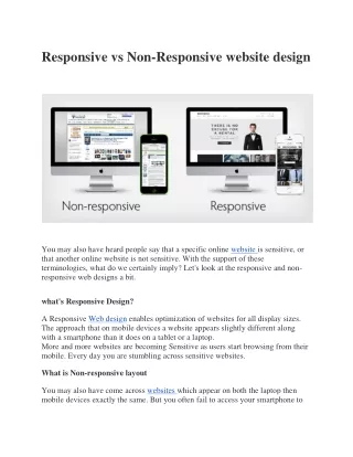
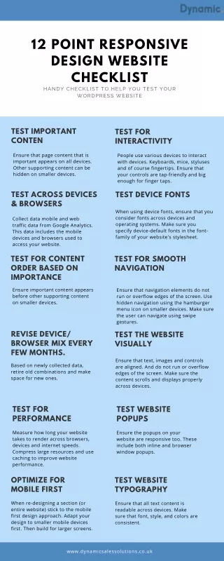
12 POINT RESPONSIVE DESIGN WEBSITE CHECKLIST HANDY CHECKLIST TO HELP YOU TEST YOUR WORDPRESS WEBSITE TEST IMPORTANT CONTEN TEST FOR INTERACTIVITY Ensure that page content that is important appears on all devices. Other supporting content can be hidden on smaller devices. People use various devices to interact with devices. Keyboards, mice, styluses and of course fingertips. Ensure that your controls are tap-friendly and big enough for finger taps. TEST ACROSS DEVICES & BROWSERS TEST DEVICE FONTS When using device fonts, ensure that you consider fonts across devices and operating systems. Make sure you specify device-default fonts in the font- family of your website's stylesheet. Collect data mobile and web traffic data from Google Analytics. This data includes the mobile devices and browsers used to access your website. TEST FOR CONTENT ORDER BASED ON IMPORTANCE TEST FOR SMOOTH NAVIGATION Ensure important content appears before other supporting content on smaller devices. Ensure that navigation elements do not run or overflow edges of the screen. Use hidden navigation using the hamburger menu icon on smaller devices. Make sure the user can navigate using swipe gestures. REVISE DEVICE/ BROWSER MIX EVERY FEW MONTHS. TEST THE WEBSITE VISUALLY Ensure that text, images and controls are aligned. And do not run or overflow edges of the screen. Make sure the content scrolls and displays properly across devices. Based on newly collected data, retire old combinations and make space for new ones. TEST FOR PERFORMANCE TEST WEBSITE POPUPS Measure how long your website takes to render across browsers, devices and internet speeds. Compress large resources and use caching to improve website performance. Ensure the popups on your website are responsive too. These include both inline and browser window popups. OPTIMIZE FOR MOBILE FIRST TEST WEBSITE TYPOGRAPHY When re-designing a section (or entire website) stick to the mobile first design approach. Adapt your design to smaller mobile devices first. Then build for larger screens. Ensure that all text content is readable across devices. Make sure that font, style, and colors are consistent. www.dynamicsalessolutions.co.uk