Download
1 / 8
80 likes | 122 Views
As more people are using various smart devices, itu2019s important for a business to have a responsive website. Learn how to check if your site is responsive.

E N D
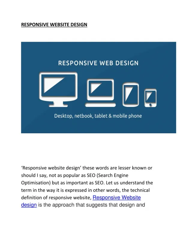
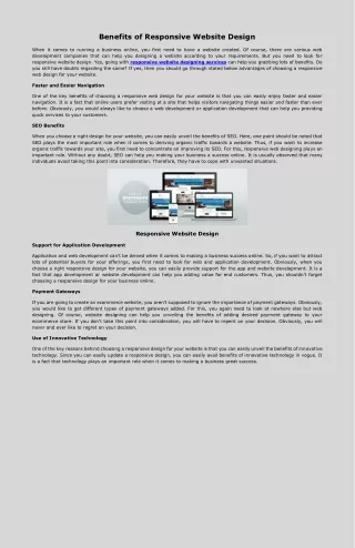
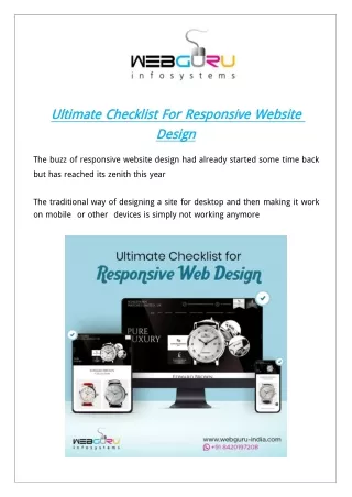
Ultimate Ultimate Checklist Checklist For For Responsive Responsive Website Design Design Website The buzz of responsive website design had already started some time back but has reached its zenith this year The traditional way of designing a site for desktop and then making it work on mobile or other devices is simply not working anymore
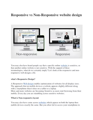
The bottom line is and we cannot stress this enough smart device first is the ONLY way to go Wondering why Because almost half of the web traffic is generated through a mobile platform source Search Engine Watch Leveraging such a wide audience can produce a great impact on your business But for that you need to have a clear insight into making a responsive web design Of course you can seek assistance from the experts at any website website design design company company nevertheless you should do your homework first So let’s start from the basics What What is is a a Responsive Responsive Web Web Design Design An An Overview Overview Once upon a time responsive web design used to suggest mobile friendly websites only But with the advancement of technology the term received a greater connotation Now it indicates the sites that can be accessed on any smart device A smart device can be as small as a watch or as big as a TV The responsive websites can easily adjust to the specifications of multiple smart devices and remain equally functional and appealing across any device platform So businesses need to ensure their sites look presentable and navigable across various smart devices browsers and operating systems
But the real problem is how would you understand whether your site is working across devices No worry We got you covered Here is the ultimate checklist for a responsive website 1. 1. Run Run a a Thorough Thorough Visual Visual Testing Testing The images and texts should be perfectly aligned Ensure that the content doesn’t exceed the edges of the screen If some part of the content is less important you may choose to keep it “out of sight” on small devices However make sure the important part of the content remains visible across all platforms 2. 2. Mind Mind the the Typography Typography The typography must be compatible with varied platforms The content is the heart of a website and should be readable and presentable across devices 3. 3. Test Test the the Site Site on on Multiple Multiple Devices Devices and and Browsers Browsers This is a crucial part Before your site goes live it’s important to check its availability across browsers and devices It will give you a clear insight into how the users can access your site Enhancing the User Experience UX is central to a business If you find any technical glitch while operating the site you need to fix the issue ASAP
4. 4. Assess Assess Traffic Traffic Data Data Avail mobile and web traffic data from Google Analytics Here you will learn which mobile devices and browsers are mostly used by the visitors to access your site Now check how your site looks on these devices and browsers 5. 5. Check Check the the Loading Loading Speed Speed Do you know that of people won’t wait for a page to load for more than seconds So optimize your site loading speed if you don’t want to increase the bounce rate Compress large resources to display them appropriately on smaller devices However ensure that the quality is not reduced You may also boost the site’s performance by using cache data Here are some simple yet effective tips to speed up your website 6. 6. Ensure Ensure Smooth Smooth Navigation Navigation for for the the Site Site The navigation element must not overlap the edges of the screen You may use the hamburger menu icon for hidden navigation Such an intuitive interface can enables visitors to easily navigate through the website Check out these extraordinary navigation menu design trends 7. 7. Examine Examine Interactivity Interactivity Various control instruments like keyboard stylus mouse and even fingertips are used while interacting with devices Keep an eye on the
accessibility and responsiveness of your site through these control means 8. 8. Review Review the the Site Site Pop Pop ups ups You should check whether the inline pop ups and browser window pop ups are responsive Now that you have learnt analyse your site’s responsiveness let’s dig deeper In the next passage we will explore the consistency in design assets Your brand must maintain consistency in design across various media platforms This is a crucial element in responsive web design Why Why Let’s explain it with an example The moment you hear “Nike” ”Apple” or “Coca Cola” immediately you can visualize the logos of these brands right This is the power of memorable strong and consistent designs The design assets must look consistent across various platforms even after resizing or scaling From icons to typography colours to font every aesthetic element of your site come under this category To avoid a negative brand impression carefully test the following Fonts Fonts Some fonts are likely to look uneven or clumsy when they are scaled up or
down or viewed on different browsers and devices For instance Mac OS can properly set font weight whereas Windows cannot Again the fonts may appear to be somewhat slimmer on Safari as compared to Chrome So make sure to test fonts and evaluate them on the basis of the above stated parameters Media Media Files Files and and Colour Colour Make sure that different versions of an image are compatible with multiple browsers viewport and device resolution You may use the Chrome Developer tools to check if the images can adversely affect the performance of the website Also identify if there are colour inconsistencies and fix them For a better understanding you may take a look at the importance of colour theory in website designs Code Code Here’s a basic checklist to support you in the code testing procedure ➢ Check if several browsers support a particular JS HTML or CSS property ➢ Look for any visual discrepancies after writing the codes Pay proper attention to the following
■ Spacing Spacing The elements or content must not run over each other ■ Alignment Alignment Ensure that the dynamic elements are aligned properly ■ Layout Layout Check if the entire layout is compatible with various sizes of the viewport ■ Horizontal Horizontal Scroll Scroll Look for the long links that make horizontal scrolling mandatory on the small sized screens These may affect the readability and user experience Also test text legibility on different browsers and viewport ■ Adjustable Adjustable Format Format Make sure to adjust the site elements on the basis of the viewport size Check if the elements can be easily made to hide appear or get re sized ■ Responsive Responsive Image Image The images should adequately fit within their allotted spaces Optimize the CSS and JS images compress or minimize them without affecting quality Note that several factors including the browser engine display resolution and GPU play a significant role in determining how the end users perceive the site So if you are not much tech savvy it’s better to consult a reputed website website development development company company Conclusion Conclusion Responsive web design needs to be updated regularly depending on the technological developments Continue to test your site for responsiveness on various devices browsers and operating systems
Remember an eye opening survey by Infront reveals that about of people won’t rely on a website if it has poor design and accessibility So put your best efforts to set the first impression And for any little help we are always there Source: https webdesignseotrend blogspot com ultimate checklist for responsive html ---------------------------------- WebGuru Infosystems Email ID: enquiry@webguru-india.com Phone No.: +91-33-40200844 Mobile No.: +91-8420197208 Visit Us: https://www.webguru-india.com Stay Connected Via: https://www.facebook.com/webguruinfosystems https://www.linkedin.com/company/webguru-infosystems-pvt--ltd- https://twitter.com/webgurutweet http://pinterest.com/webguruindia https://instagram.com/webguruinfosystems