Download
1 / 27
270 likes | 442 Views
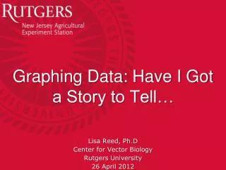
Graphing Data: Have I Got a Story to Tell…. Lisa Reed, Ph.D Center for Vector Biology Rutgers University 26 April 2012. For Today. Graph Importance Examples, both good and bad What are good graphs and good graph rules How do you make a good graph Excel graph designs Others

E N D
Graphing Data: Have I Got a Story to Tell… Lisa Reed, Ph.D Center for Vector Biology Rutgers University 26 April 2012
For Today • Graph Importance • Examples, both good and bad • What are good graphs and good graph rules • How do you make a good graph • Excel graph designs • Others • How to get them from Excel to Word
“The greatest value of a picture is when it forces us to notice what we never expected to see.”Tukey, 1977, Exploratory Data Analysis
Why Are Graphs Important? • Can give information quickly • Can highlight the point you want to make • Can direct towards statistical tools • But can give misinformation if not careful
Napoleon’s March to and From Moscow by Minard • Shows number of troops in geography and travel • Shows temperature and time • Gives an understanding for Napoleon’s failure
Snow’s Cholera Well • Identifies cholera deaths (in red) • Identifies wells (in blue) • Implicates cholera as a water-borne disease • Clearly indicates which well should be shut down.
Not so good. From junkcharts.typepad.com
What Makes A Good Graph? • Simple and efficient: Presents one basic conclusion. • Clear and Unambiguous: You understand what is being presented. • Not Misleading: You don’t come to a wrong conclusion. • Meaningful: You come to a correct and relevant conclusion.
Achieving Good Graphics • Use Titles – What are you trying to show? • Use Axis Labels – Tell what you are graphing. • Use Units of Measurements – Tell what you are graphing. • Use legends. • Use Series coloration/fills – but be careful for those who are colorblind. • Keep scaling appropriate. • Write out equations when appropriate. • Use error bars when available.
Fills & Colorblindness http://www.colblindor.com/2007/06/02/how-to-color-charts-respecting-color-blindness/ • Patterns (but must load patterns if using Excel 2007) • Labels • 1 Color and Brightness • Grayscale
You can run a colorblind checker… • http://www.vischeck.com/vischeck/vischeckImage.php • Browse to your image and run the checker.
Scale • Generally begin at zero. • But look at data. • If more than 1 graph on a page, try to use same scale. • If you cannot use one scale, make it obvious that the scales differ. • Different colors • Different gridlines
Equations and Error Bars • Both elements give added information. • But need specific information • Regression lines need the equation AND the R2 • Error bars need the type.
Making Graphs in Excel • Highlight Data • Choose Graph Style… • Voila!
Adding Titles, Labels and Legends Hold Down the Alt key and type from the keypad numbers: Alt 241 = ± Alt 248 = °
No Fills Available for versions 2007! • But, download add-in • http://officeblogs.net/excel/PatternUI.zip • Unzip file (and remember where it is) • Go to Window Flower, Excel Options, Add-in, Go and click Patternui. • Click on series in graph, go to Chart Tools, Format, Patterns and select which one you want.
Scale • Generally begin at zero. • But look at data. • If more than 1 graph on a page, try to use same scale. • If you cannot use one scale, make it obvious that the scales differ. • Different colors • Different gridlines
The Agony and the Ecstasy of Error Bars • You have a set of data. • You do a pivot table to summarize average and SD. • You copy and paste values, THEN create your graph: • You have a set of data. • You do a pivot table to summarize average and SD. • You plot average with the intention of doing SD as error bars: X
Achieving Good Graphics • Use Titles • Use Axis Labels • Use Units of Measurements • Use legends. • Use series coloration/fills. • Keep scaling appropriate. • Write out equations when appropriate. • Use error bars when available.
Why this Class? • Resistance Classes • Graphs • Simple Statistics • Probit Analysis
Suggested References • The Visual Display of Quantitative Information – Edward Tufte, 1983 • How to Lie with Statistics – Darrell Huff, 1994