Download
1 / 32
320 likes | 341 Views
Explore the contrasting facets of the Israeli economy over recent years, from declining growth and rising unemployment to positive aspects like export shifts and information technology advancements, impacting income distribution, social tensions, and government budgets.

E N D
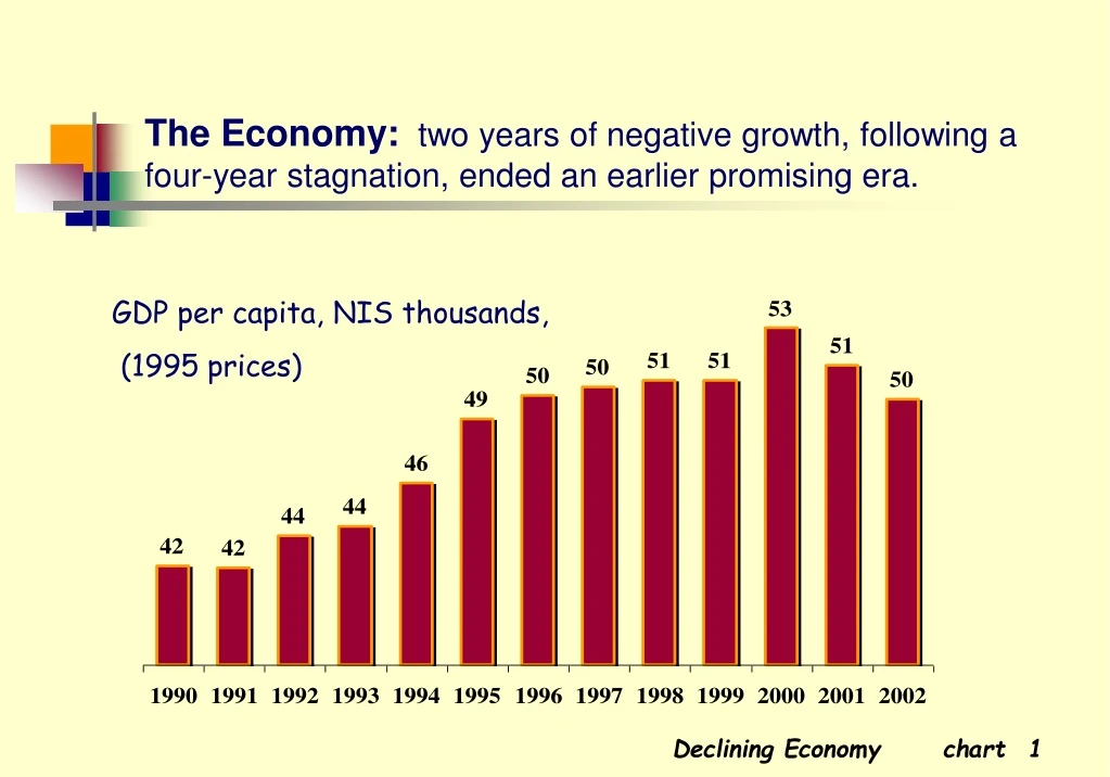
The Economy: two years of negative growth, following a four-year stagnation, ended an earlier promising era. GDP per capita, NIS thousands, (1995prices) Declining Economy chart
Unemployment:after declining, despite mass immigration, unemployment is once again rising. %unemployed Declining Economy chart
Unemployment by Region: periphery towns suffer more unemployment than the center. %unemployed Declining Economy chart
Standard of Living - Public Opinion:Has your standard of living changed in the last 2-3 years? The majority feel a decline in their standard of living. Declining Economy chart
Income Needs - Public Opinion:Does your income meet your basic needs?One third feel barely able to meet their needs. Declining Economy chart
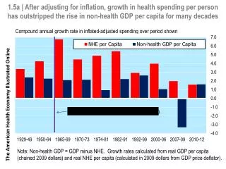
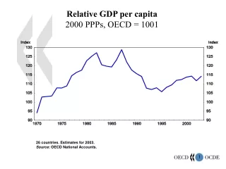
Gross Domestic Product: while lagging behind more developed countries as measured in per capita terms, Israeli ranking rises when examined per employee. Per capitaPer employed person US$, thousands The Positive Side chart
Exports: the past 20 years have seen a major shift from conventional industries to electronics. % of total exports The Positive Side chart
Information Technology: Israel has a high proportion of ICT in its business sector. Employment share is lower but still relatively high. % in Value-Added % in Employment The Positive Side chart
Occupational Structure: reflects reliance on academic and professional employment. The Positive Side chart
Income Distribution: those inthe lowest decile earn as little as 1/5 of those in the highest decile. Index, upper decile of income = 100 Deciles of income per standard person Income Distribution chart
Durable Goods Ownership: the lowest decile lags behind in access to computer technology and transportation. % of total in each decile Income Distribution chart
Families in Poverty: families living below the poverty line have leveled off at the high level of 16-17%. % of families below poverty line Income Distribution chart
Real Wages: a trend of rising real average wages has abruptly reversed. Index 1994=100 Income Distribution chart
Security - Public Opinion: Does the security situation influence your daily life?Over 50% feel a great impact. % of respondents Social Tensions chart
Violent Crime: the rate of violent crime doubled in the 90s; a major part, attributable to domestic violence. per 1000 population Social Tensions chart
Road Accidents: Israel has almost the highest number of road accident victims of all Western countries. per 100,000 population Social Tensions chart
Tolerance - Public Opinion: Is Israeli society tolerant of national, ethnic, or religious groups?The public perceives Israeli society as largely intolerant. Social Tensions chart
Foreign Workers: since the mid-90s, Palestinian laborers have been largely replaced by foreign workers. % of civilian labor force Social Tensions chart
Foreign Workers - Public Opinion: How should the government relate to foreign workers? Almost half think they should be prevented from entering and deported. Social Tensions chart
Government Outlays: social services are the largest component of the government budget. Total budget – US$ 60 billion Restrained Budget chart
Government Expenditure: stability following decline of government outlays from almost 60% of GDP to near 40%. Total budget, excl. debt servicing other defense social services Restrained Budget chart
In-Kind Social Services: after a short spurt in the early 90s, a moderate downward trend may be observed in education, health and welfare expenditures. % of GDP Restrained Budget chart
Unemployment Benefits: rising unemployment has led to a rapid increase in the number of people receiving unemployment and income support benefits. thousands Restrained Budget chart
Budget Cuts - Public Opinion: To what extent do budget cuts hurt social services? Most people say it has had a harmful effect. Restrained Budget chart
Social Gaps - Public Opinion: How does the budget affect socio-economic disparities? The public feels government policy has widened social gaps. Restrained Budget chart
University Enrollment: since reaching parity in 1985, more women now enroll in university than men. Enrolled as % of age group (20-29) Service development chart
Higher Education: over 40% of Israeli adults (age 25-64) have a post-secondary education. Service development chart
Education and Disparities - Public Opinion: Does the education system narrow social disparities? Only a minority see the education system as reducing disparities. Service development chart
National Health Expenditure: per capita expenditure is lower than in most Western countries. US$ Service development chart
Government Health Expenditure: expenditures failed to keep pace with population growth; per capita rates have declined to the level of the early 90s. Index: 1980=100 Service development chart
Health Care - Public Opinion: Do all enjoy the same level of health care? 80% feel that everyone does not receive equal treatment. Service development chart
Long-Term Care: The number receiving long-term care benefits increased dramatically. % of population aged 65+ Service development chart