Magazine Case Study
100 likes | 165 Views
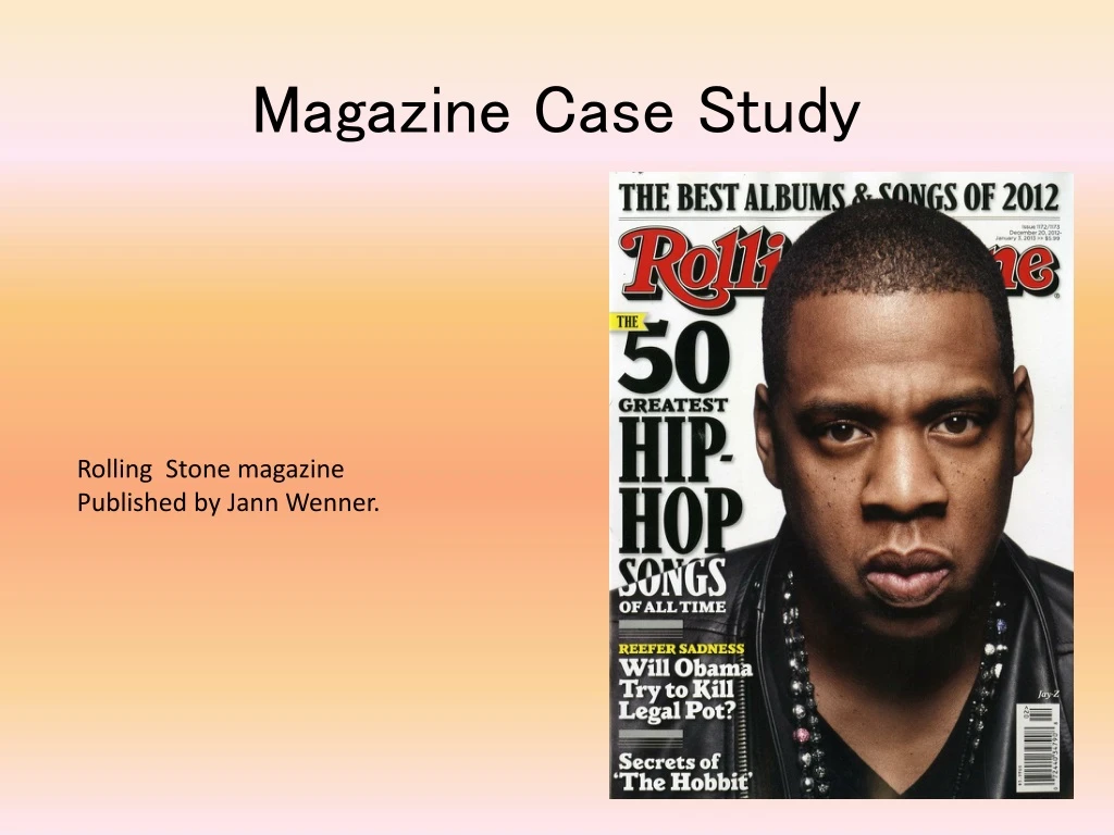
Magazine Case Study. Rolling Stone magazine Published by Jann Wenner. Background Information. Rolling Stone magazine was founded in San Francisco in 1967 by Jann Wenner. The first issue was published on the 9 th of November 1967, with John Lennon on the cover.

Magazine Case Study
E N D
Presentation Transcript
Magazine Case Study Rolling Stone magazine Published by Jann Wenner.
Background Information • Rolling Stone magazine was founded in San Francisco in 1967 by Jann Wenner. • The first issue was published on the 9th of November 1967, with John Lennon on the cover. • It is a bi-weekly magazine that focuses on popular culture e.g. musical coverage and political reporting (by Hunter S. Thompson). • In the 1990’s the magazine changed its structure to focus on appealing to a younger audience interested in TV shows, film actors and popular music. • It is published in the US but it is sold in many countries across the world, including the UK.
Design and Layout The front cover of the magazine always has ‘Rolling Stone’ written across the top of the page in the same font, this is usually covered by the artist/actor/actress’ head/s but as it is so recognisable, is still easy to identify. The double page spread usually has a large photo taking up one of the pages, and the other page has a big clear title with the story underneath, also with smaller pictures. The fonts used for this is usually continued to be used throughout the rest of the magazine and this makes it flow well. The contents page is separated into different sections with the page numbers quite big and bold, e.g. ‘features’, ‘rock&roll’ and ‘2012 year in review’, this is very useful as it is simple to find the part that the consumer wants to read.
Colour and Convention This issue of Rolling Stone magazine used quite minimal colouring and this was effective as it made the eyes draw straight to the main parts of the magazine that want to stand out. The main colours used were White, Black and Red which stand out very well for this magazine but still make it look professional. Even the main picture is wearing one of the colours (Black). This colour cohesion is used for many different magazines as I think that it can make a strong statement to the readers as they are bold colours.
Mode of address.. and interviews The interviews in Rolling Stone are mainly written in third person, usually it introduces the topic they will be talking about with the interviewee and the interviewer then asks questions and lets the interviewee talk about that topic. It is also sometimes written in a question and answer format but the it is mainly letting the interviewee talk and then the interviewer chips in to keep the conversation flowing. The interviewer usually speaks quite formally and the interviewee speaks comfortably towards them with usually quite casually depending on who the interviewee is. For example, if it were a politician, they would probably still speak quite formally.
Front Cover I like the front cover of this magazine as the layout isn’t very complex but is still effective and draws the readers attention to it. The picture that bleeds off the page relates well with the column inch “50 greatest hip-hop songs of all time” as the artist, Jay Z, is a hip-hop artist himself, I think its important that the picture relates well with the writing on the front cover as it wouldn’t look right with a random picture that doesn’t relate. I like the font used on this cover as it is easy to read and is laid out very clearly, ‘Rolling Stone’ is covered up by the image but as it is a very popular magazine, this isn’t an issue because it is so recognisable.
Contents Page The contents page is shown as a single page spread. It has the issue number of the magazine at the top of the page in bright red numbers with ‘All the NEWS THAT FITS’ written below, which suggests that the magazine contains everything you’d need. The contents page is separated into three sections, ‘features’, ‘rock&roll’ and ‘2012 year in review’, these headings vary in each issue as they always have different things in the magazine. This makes it easy to find what you want to read about and is also quick to do.
Photography The photography used in rolling stone is usually quite simple with close up shots however in this issue there is varied shots. They are usually staged to make the subject of the photo make a statement, for example, in these photo’s on the double page spread, they are all made to look quite strong and superior with simple backgrounds and them being the main focus.