Download
1 / 5
50 likes | 203 Views
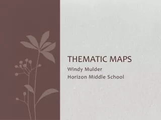
US and Canada Thematic Maps. Overview. You will be making thematic maps of the US to show high school graduation rates (the percentage of the population that graduates high school) Use the outline map at the end of this PowerPoint Open up your Geography textbooks to the data file on page 108.

E N D
Overview • You will be making thematic maps of the US to show high school graduation rates (the percentage of the population that graduates high school) • Use the outline map at the end of this PowerPoint • Open up your Geography textbooks to the data file on page 108
Work with your partner to make a legend • Subtract the lowest percentage of high school graduation in the country from the highest • This gives you the range that your map has to cover • Next, divide your range by 6 and subtract 0.1 • This gives you the interval, the size of each category • Next, you need to identify your 6 categories • The lowest number of your first range is the lowest percentage of high school graduation in the country • The highest number of your first range is the lowest number plus the interval • Each category follows this same pattern, and each is separated by 1/10th of a percent • Ex.: if one category goes from 80.0-81.5, the next will start at 81.6 • Finally, put a box labeled “legend” on your map, list your six categories, and assign a different color to each category
Work with your partner to color in your map • Use the data file on 108-113 and the political map on A20-A21 • Find out what the high school graduation percentage of each state is, what category it falls in, and fill it in with the correct color • Add a title to your map and put your names on the back