Hospital Bed Day Metrics Dashboard | Operational Data Analysis
Analyze and monitor hospital bed days, readmissions, occupancy rates, and more with this comprehensive dashboard. Utilize data to optimize patient care and operational efficiency.

Hospital Bed Day Metrics Dashboard | Operational Data Analysis
E N D
Presentation Transcript
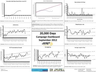
Comments: The graph shows the difference between the Predicted and actual cumulative bed days. Comments: There were 7 Dot Days in September – 3rd, 4th, 12th, 13th, 14th, 25th, 26th Comments: Cumulative bed day saving as at 30th September is 7433 Dashboard Summary: Cumulative bed day saving of 7433 is a reflection of the difference between actual bed day usage and the predicted growth. This is reflection of the system as whole. With the exception of occupancy which is showing a change in growth all other measures are stable and exhibiting normal variation. 20,000 Days Campaign DashboardSeptember 2012 Comments: Unplanned readmissions is stable and only normal variation exists Comments: Admissions are stable and only normal variation exists. Comments: Occupancy is showing special cause variation since September 2011, the data reflects a potential change from a previous pattern of growth to no growth. Comments: EC Presentations are growing but stable and only normal variation exists Comments: ALOS is stable and only normal variation exists. Campaign Manager : Diana Dowdle Clinical Leader: David Grayson Improvement Advisor: Ian Hutchby & Prem Kumar Version: 1.1 Dated: 04/10/2012 Contacts
Bed day Predicted Vs Actual Trigger /Dot Days Bed day Saving This graph shows the Actual bed day usage compared to the predicted usage. If the actual is less than predicated then we will have bed day gain. This Graph chart shows the days on which date the hospital was full and also the days between two Dot days. Hospital full days are also termed as Dot days. One of the aim is to minimise the Dot days and increase the time between Dot days. One of the contributing factor to achieve this is bed day saving This graph shows the cumulative bed saving on a monthly basis. Operational Definition Bed Days: Actual patient time on bed Predicted bed day: Cumulative bed required calculated based on bed modelling Cumulative: Previous 12 months of data from the current month Operational Definition Bed Days: Actual patient time on bed Savings: Cumulative savings is the difference between the forecasted bed required and the actual bed used since June 2011.Savings can be a positive or negative figure. Operational Definition Dot Days: A day is referred as “Dot Day” when Middlemore central send an email when the Hospital is full. Date of Dot Days: The actual date when the email was sent. Criteria Middlemore, Age >-15 years, Surgical/Medical specialty (incl Gynae), Acute and Elective Criteria Middlemore, Age >-15 years, Surgical/Medical specialty (incl Gynae), Acute and Elective Criteria All emails sent by Middlemore central with a subject “Hospital full” Unplanned Re admission Admission UCL: Upper control Limit is automatically calculated by the software it selves. CL: Centre Line can also be called as Average. LCL: Upper control Limit is automatically calculated by the software it selves. This graph shows the readmission rate over a period of time. This graph shows the admission of acute adult patient admitted to Middlemore over a period of time. Note: The graphs will help us to detect Shifts, Trends and variations. The lines within control limits indicate that the data is stable and in Statistical control. 20,000 DaysCampaign Dashboard Definitions Operational Definition Re-admission: An unplanned acute readmission to same speciality as discharged within 7 days Operational Definition Admission: Patient admitted to MMH wards for more than 3 hours from the 1st seen by time Criteria Middlemore, Age >-15 years, Surgical/Medical specialty (incl Gynae), Data extracted based on Inpatient discharged location Criteria Middlemore, Age >-15 years, Surgical/Medical specialty (incl Gynae) Average Length of Stay (ALOS) Occupancy EC Presentation This graph reflects the ALOS over a period of time. This graph reflects the total monthly occupancy of Surgical, Medical and Gyne specialty combined on a monthly basis This graph represents the Average daily presentation to MMH emergency care. Operational Definition Occupancy: Actual patient time on bed C.L in the graph represents Median Operational Definition Operational Definition LOS: Days between admission to discharge Criteria Middlemore, Age >-15 years, Surgical/Medical specialty (incl Gynae). Occupancy includes: MSSU and Observation Criteria Middlemore, Age >-15 years, Surgical/Medical specialty (incl Gynae) Criteria All presentation to MMH Emergency department This figures include adult and Paediatrics
Admissions The monthly control charts all mask a much greater daily variation in the data Excluding EDDS from the data has a greater impact on Medicine than surgery
Occupancy AMC Ward 2 Ward 6 Ward 7 Ward 8 Ward 9 Ward 10 Ward 11
Occupancy AMC Ward 32N Ward 33E Ward 33N Ward 34E Ward 34N Ward 35N