Download
1 / 31
310 likes | 361 Views
Learn about scatter plots, lines of best fit, correlations, and how misleading graphs can distort data representation.

E N D
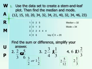
Use the data set to create a stem-and-leaf plot. Then find the median and mode. {12, 15, 10, 20, 34, 32, 34, 21, 40, 32, 34, 46, 23} Find the sum or difference, simplify your answer. 2. 3. 4. 1 0 2 5 Median = 32 2 0 1 3 Mode = 34 3 2 2 4 4 4 4 0 6 key 2 0 = 20 W A R M U P
Lesson 4.7 Scatter Plots and Lines of Best Fit
What is a scatter plot? Visual display which shows the relationship of two sets of data. (Both sets must be numerical) Data are grouped as ordered pairs and graphed as points on a grid. Scatter Plots
What is a line of best fit? A line that closely follows the pattern of the data, but does not necessarily touch all of the points. Can be used to make predictions. Line of Best Fit
What is positive correlation? Correlation • As one set of data increases, so does the other • The line of best fit slants upward. The more a letter weighs, the more it costs to mail it.
What is negative correlation? As one set of data increases, the other decreases. The line of best fit slants downward. The longer a bird’s wings, the fewer times it must beat its wings to fly. Correlation
When is there no correlation? There is no relationship between the data (the points are scattered randomly). A line of best fit cannot be drawn. The number of family members has no relationship with the number of pets. Correlation
What type of correlation does this show? Find the range of heights. Predict the height of a person with an arm span of 80 inches. Examples Positive 12 in. Approximately 78-80 in.
How do I make a scatter plot? Decide which set of data will be represented on the horizontal axis and which will be the vertical axis. (There is no right or wrong) Decide on an appropriate scale for each axis. Plot corresponding data as an ordered pair. Be sure to include a title and labels. Creating a Scatter Plot
Examples • The data represents the age and weight of 15 children who visit the doctor’s office during one week. Use the data to create a scatter plot, line of best fit, and then predict the weight of a teenager at the age of 15. 1 year old; 20 lb 9 year old; 87 lb 10 year old; 84 lb 3 year old; 35 lb 7 year old; 64 lb 10 year old; 120 lb 5 year old; 50 lb 5 year old; 60 lb 4 year old; 45 lb 12 year old;108 lb 2 year old; 30 lb 7 year old; 70 lb 2 year old; 38 lb 6 year old; 50 lb 11 year old; 90 lb
Dot Plots… A dot plot is kind of like a combination between a bar graph and a scatter plot. Once again, make sure you have a title, and label the bottom bar. The bottom is where you put your experimental options, such as how many times a week you eat out (1, 2, 3, 4, 5…) or how many times you work out, or how many responses you get on facebook when you leave a message. Above each of those options, you put a dot for each answer (this is the frequency)
4.8 Misleading Graphs Identify misrepresentations and distortions in displays of data and explain WHY they are misrepresentations or distortions.
Misleading Graphs • What are misleading graphs? • How can we tell if a graph is misleading? • Let’s see if we can tell.
TV Among Teens This graph was reported by a national consumer organization.
TV Among Teens The same data was used to make this graph as the one before. Notice the difference in each scale
TV Among Teens What types of conclusions do you think were made with the first graph? With the second graph? What aspect of the graph was used to mislead the analysis?
Distorting the display using the AXES • Uneven intervals • Spread intervals • Narrow intervals • Axes without an absolute value (like 0) • Unlabeled axes
A company was conducting a taste test survey among teens. They would show them this graph, and tell them that OJ was the most popular. Then they would have the teens taste the juice and state which they liked better. Notice the widths of the intervals are very wide. What distortion was used?
Candy bar Sales A Sales representative is trying to convince a local convenience store owner to carry a new candy bar. Which graph would best present his case? What is being used to distort the data display? The axes Why is that an effective tool? It is often overlooked It can spread data or shrink it depending on what you want people to think.
Math Scores Another example of axes distortion Is the data the same on both graphs? Who would benefit from using each graph?
Which graph is misleading? The second graph is misleading because you only get a small picture of the situation and it began at a very low point.
Distorting displays using the SCALE Some graphs distort the scale in an effort to make the conclusion match the desired outcome. • The scale may not be labeled or • The scale may use a symbol that distorts (as in a pictogram)
How is this misleading? • How can it be misread? • Is there a reason why they are not mentioning the change in population?
OUTLIER caused distortions • Outliers can cause distortion of a line of best fit.
The graph below is distorted by two outliers. The line of best fit is not showing the true TREND.
SAMPLE caused distortions • Sample size can distort results • A biased sample can distort results.
How is this misleading? • How many people of each ethnicity are there in the US? • Are they equal in number? • Is the sample biased?
Summary • How can you tell whether the data shows a negative correlation, positive correlation, or no correction? • Name three ways to distort data and HOW they can be effective. • Homework: worksheet 4.7 & 4.8