Download
1 / 13
130 likes | 158 Views
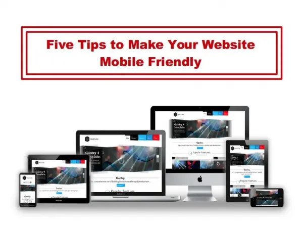
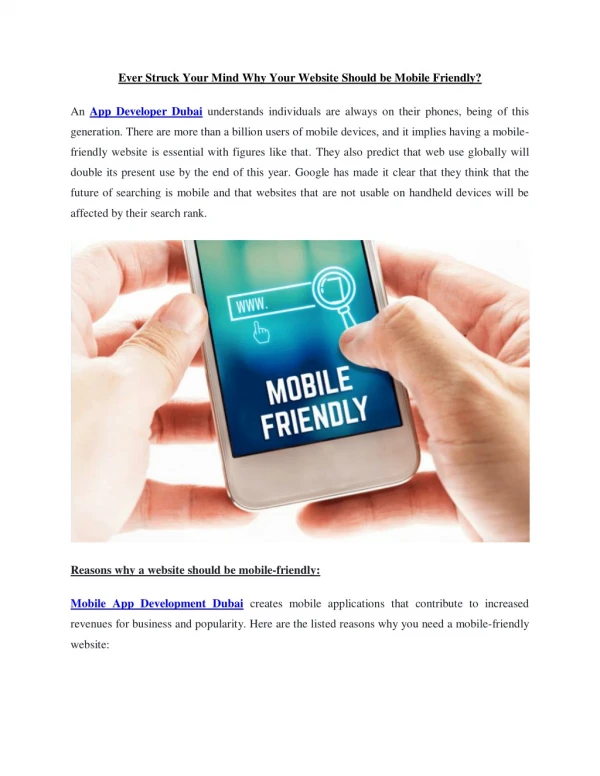
Mobile is changing the world. Today, everyone has smartphones with them, constantly communicating and looking for information. Having a mobile-friendly website has become a critical part of having an online presence. For More Information Visit: https://youtu.be/b6YwDww5jQc

E N D
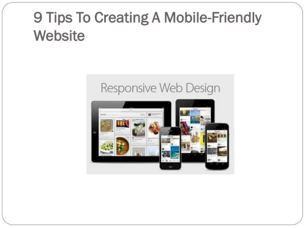
9 Tips On Making Your Website Easily Accessible On Mobile Devices Tip #1: Don’t Make A Separate Mobile Friendly Website • when we Designed Websites for the “MobileWeb,” we would cut out content to fit for mobile use and argue which parts are more suitable for mobile. • However, we can’t control what kind of content our users want, and we can’t say that mobile devices are so fundamentally different from our desktops that mobile has to have its own web space.
Last time I checked, There is only one Google, and if Google penalizes us for duplicated content already, then having two websites—one for mobile and one for desktops—with the same content defeats the purpose of trying to show up on Google’s search engines. • So you shouldn’t create a separate website for mobile.
Tip #2: Use Responsive Design • Responsive design allows website developers to create a site that will be easily viewable on different sizes of devices. This reduces the amount of work website developers have to do when it comes to creating a website. • Responsive design approach makes use of flexible layouts, flexible images, and cascading stylesheet media queries. • When responsive design is used on a website, the web page will be able to detect the visitor’s screen size and orientation and change the layout accordingly.
Tip #3: Always Include A Viewport Meta Tag • The Viewportis a virtual area used by the browser rendering engine to determine how content is scaled and sized. • There are Many Different Configurations that you can specify your viewport to control.
Tip #4: Font Sizes And Button Size Matters • Your font size and button sizes matter a lot for mobile devices. For font size, it should be at least 14px. • As for buttons, the bigger the button, the better—it reduces the chances that the user will miss it or hit the wrong button by mistake.
Tip #5: Use High-Resolution Images • Just like on Instagram, High-Resolution Images are extremely important on your responsive websites to ensure your user’s experience is of a high standard. • Having extremely High-Resolution Images will help you avoid having pixel related or even blurry images when viewed on a retina-quality screen.
Tip #6: Remove The Default Zoom • Auto-zoom can really mess up your layout elements, especially for images and navigation content. They may appear small or too large in your layout. • To remedy this, use the Viewport Meta Tag to set up custom variables within the content. Make sure you include this tag in your <head> HTML.
Tip #7: Use YouTube Videos On Your Site If you use a lot of videos on your site, the way your video is viewed on mobile will be very different and can sometimes be difficult. Using YouTube videos is a solution to combat any difficulties in viewing videos on mobile. The reason for this is that the embed code on YouTube is already responsive. This saves you multiple steps in making sure that your videos are mobile-friendly.
Tip #8: Don’t Constrain Your User’s Mobile Experience No matter how beautiful your mobile website is, Always include a “go to full website” or “view desktop version” option at the bottom of your site.
Tip #9: Never Stop Testing Once you’ve created your Responsive Website, test it, test it for the second time, and then test it again.