Download
1 / 20
220 likes | 649 Views
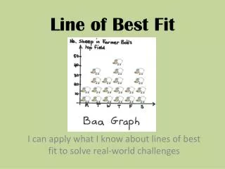
Lesson 5.6 Fit a Line to Data. Essential Question: How do you make scatter plots and write equations to model data?. Before we start…. What is a scatter plot ?. A graph used to determine whether there is a relationship between paired data.

E N D
Lesson 5.6Fit a Line to Data Essential Question: How do you make scatter plots and write equations to model data?
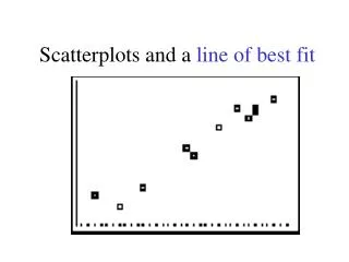
What is a scatter plot? A graph used to determine whether there is a relationship between paired data. Scatter plots can show trends in the data. These trends are described by correlation.
What is correlation? The relationship between the x and y values. Positive Negative None
Positive Correlation • y tends to increase as x increases.
Negative Correlation • y tends to decrease as x increases
No Correlation • The points show no obvious pattern.
Describe the correlation of the data graphed in the scatter plot. Predict a reasonable test score for 4.5 hours of studying.
Describe the correlation of the data graphed in the scatter plot. Predict a reasonable test score for 4.5 hours of television watched.
How do you make a scatter plot? • To make a scatter plot, you treat the data as ordered pairs. • Let x represent the independent data and y represent the dependent data. • Plot the ordered pairs as points in a coordinate plane.
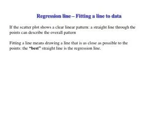
How do you fit a line to data? • Make a scatter plot of the data. • Decide whether the data can be modeled by a line. • Draw a line that appears to fit the data closely. • There should be approximately as many points above the line as below it. • Write an equation using two points on the line of best fit.
Bird Populations The table shows the number of active red-cockaded woodpeckers clusters in a part of the De Soto National Forest in Mississippi. Write an equation that models the number of active clusters as a function of the number of years since 1990.
Game Attendance The table shows the average attendance at a school’s varsity basketball games for various years. Write an equation that models the average attendance at varsity basketball games as a function of the number of years since 2000.
Grapefruit The table shows the price (in dollars) for one pound of grapefruit for the years 1997 through 2002. Write an equation that models the price of grapefruit since 1997.
How do you make scatter plots and write equations to model data?
Ticket Out the Door Describe the correlation.