Download
1 / 14
140 likes | 150 Views
Learn about the features of Microsoft PowerPoint, including its vector-based graphics, resizable images, and editable text. Explore the strengths and weaknesses of PowerPoint, and discover design principles for creating visually appealing slides.

E N D
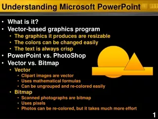
Understanding Microsoft PowerPoint • What is it? • Vector-based graphics program • The graphics it produces are resizable • The colors can be changed easily • The text is always crisp • PowerPoint vs. PhotoShop • Vector vs. Bitmap • Vector • Clipart images are vector • Uses mathematical formulas • Can be ungrouped and re-colored easily • Bitmap • Scanned photographs are bitmap • Uses pixels • Photos can be re-colored, but it takes much more effort
PowerPoint Strengths • Easy to learn • Installed on many computers • Easy to edit • Make changes before, or even during a presentation • Multiple medias • Text, images, clipart • Graphs, charts • Sound, video • Versatile • Computer slides • Handouts • 35mm slides • Transparencies • Posters • Website
PowerPoint Weaknesses • Is fairly common • Many people use it for presentations, and your audience can get bored easily • It will let you create bad slides
PowerPointWeakness This program will let you create bad slides! Slides that produce ‘visual noise’ can be distracting for your audience. 4
Slide layout • Make backgrounds dark • It is easier on the eye in a dark room • It is easier to read text if you have bad lighting • Why? • The screen’s natural color – in any room – with any lighting –….is black! • Text color matters • Light to dark • The greater the contrast = the greater the importance • Text size matters • The bigger the text = the greater the importance • Don’t make the smallest text, the most important text, most of your audience won’t be able to read it!
Text Issues • Keep all fonts above 20 pt. • What’s the easiest font to read? • Suggestions from the pros • Arial • Century Gothic • Tahoma • Verdana • What’s the difference? • Sans-Serif • Serif ABC Sans-Serif ABC Serif
Graphic Design Principles • Proximity • Group related items together • Helps the eye “move” through your slide • Alignment • Visually connect elements • Create strong verticals • Repetition • Repeat colors, shapes, visual elements • Consistent: background, picture placement, etc. • Contrast • Good color and shading techniques • Using text that is readable
Graphic Design Principles A DISCUSSION ABOUT VISUAL SPACE Chris Bornhoft Guest Lecturer Center for Teaching Innovation Education 208
Graphic Design Principles A DISCUSSION ABOUT VISUAL SPACE Chris Bornhoft Guest Lecturer Center for Teaching Innovation Education 208
Visual Guidelines • Avoid multiple sentences if possible • Avoid lines of text that leave one word hanging • Keep spacing and text style consistent • Other things to avoid….
Things to Avoid… • Distracting backgrounds • Distracting text • Bad clipart • Multiplefonts • Unnecessarycolor 11
Slide layout 1 2 3 4 • Top 3/4 guideline
Slide layout 1 2 3 4 • Top 3/4 guideline
Slide layout 1 2 3 4 • Top 3/4 guideline 14