Download
1 / 23

E N D
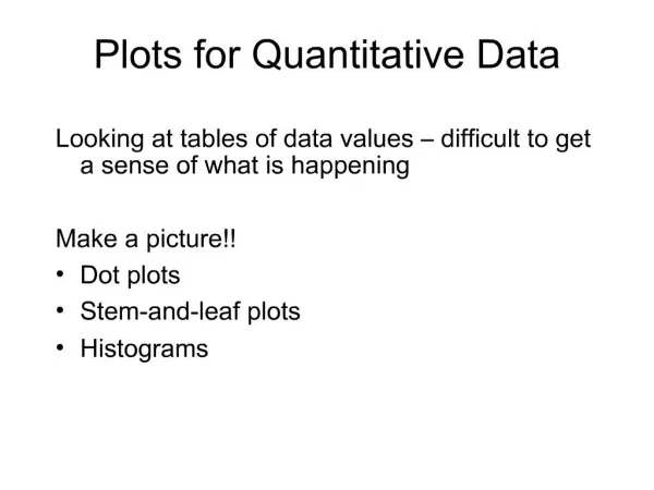
1. Plots for Quantitative Data Looking at tables of data values � difficult to get a sense of what is happening
Make a picture!!
Dot plots
Stem-and-leaf plots
Histograms
2. Dotplots A dotplot is a simple display. It just places a dot for each case in the data.
The dotplot to the right shows Kentucky Derby winning times, plotting each race as its own dot.
3. Stem-and-Leaf Displays Stem-and-leaf displays show the distribution of a quantitative variable, like dotplots do, while preserving the individual values.
Stem-and-leaf displays contain all the information found in a histogram and, when carefully drawn, satisfy the area principle and show the distribution.
4. Stem-and-Leaf Example In the figure, 2|124 stands for the numbers $2.1, $2.2, and $2.4. Note that the stem tells us we are in the $2 range, and each leaf gives us the Enron stock price change to the nearest dime.
5. Constructing a Stem-and-Leaf Display First, cut each data value into leading digits (�stems�) and trailing digits (�leaves�).
Use the stems to label the bins.
Use only one digit for each leaf�either round or truncate the data values to one decimal place after the stem.
6. Distributions and Histograms First, slice up the entire span of values covered by the quantitative variable into equal-width piles called bins.
The bins and the counts in each bin give the distribution of the quantitative variable.
The frequency histogram plots the bin counts as the heights of bars (like a bar chart).
7. Histogram
8. Construction Determine range of data � minimum, maximum
Split into convenient intervals � use round numbers for boundaries (or midpoints)
Use 5 to 15 intervals (normally)
Count number of observations in each interval - frequency
9. Equal-width intervals: Draw boxes of height equal to frequency for each interval
10. Distributions and Histograms (cont.) A relative frequency histogram displays the percentage of cases in each bin instead of the count. In this way, relative frequency histograms are faithful to the area principle.
11. Unequal width intervals: Calculate
12. Shape, Center, and Spread When describing a distribution, make sure to always tell about three things: shape, center, and spread�
13. The Shape of the Distribution When talking about the shape of the distribution, make sure to address the following three questions:
Does the histogram have a single, central hump or several separated bumps?
Is the histogram symmetric?
Do any unusual features stick out?
14. Humps and Bumps Does the histogram have a single, central hump or several separated bumps?
Humps in a histogram are called modes.
A histogram with one main peak is dubbed unimodal; histograms with two peaks are bimodal; histograms with three or more peaks are called multimodal.
15. Humps and Bumps (cont.) A bimodal histogram has two apparent peaks:
16. Humps and Bumps (cont.) A histogram that doesn�t appear to have any mode and in which all the bars are approximately the same height is called uniform:
17. Symmetry Is the histogram symmetric?
If you can fold the histogram along a vertical line through the middle and have the edges match pretty closely, the histogram is symmetric.
18. Symmetry (cont.) The (usually) thinner ends of a distribution are called the tails. If one tail stretches out farther than the other, the histogram is said to be skewed to the side of the longer tail.
In the figure below, the histogram on the left is said to be skewed left, while the histogram on the right is said to be skewed right.
19. Anything Odd? Do any unusual features stick out?
Believe it or not, sometimes it�s the unusual features that tell us something interesting or exciting about the data.
You should always mention any stragglers, or outliers, that stand off away from the body of the distribution.
Are there any gaps in the distribution? If so, we might have data from more than one group.
20. Comparing Distributions Often we would like to compare two or more distributions instead of looking at one distribution by itself.
When looking at two or more distributions, it is very important that the histograms have been put on the same scale. Otherwise, we cannot really compare the two distributions.
21. *Re-expressing Skewed Data
22. *Re-expressing Skewed Data One way to make a skewed distribution more symmetric is to re-express or transform the data by applying a simple function (e.g., logarithmic function).
Note the change in skewness from the raw data (Figure 4.12) to the transformed data (Figure 4.13):
23. What Can Go Wrong? Don�t make a histogram of a categorical variable�bar charts or pie charts should be used for categorical data.
Choose a scale appropriate to the data.
Avoid inconsistent scales, either within the display or when comparing two displays.
Label clearly so a reader knows what the plot displays.