Download
1 / 23
230 likes | 234 Views
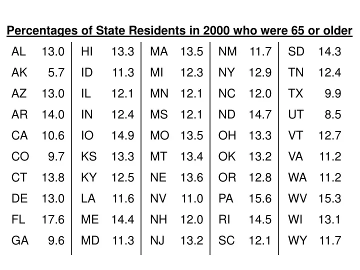
Percentages of State Residents in 2000 who were 65 or older. AL. 13.0. HI. 13.3. MA. 13.5. NM. 11.7. SD. 14.3. AK. 5.7. ID. 11.3. MI. 12.3. NY. 12.9. TN. 12.4. AZ. 13.0. IL. 12.1. MN. 12.1. NC. 12.0. TX. 9.9. AR. 14.0. IN. 12.4. MS. 12.1. ND. 14.7. UT. 8.5.

E N D
Percentages of State Residents in 2000 who were 65 or older AL 13.0 HI 13.3 MA 13.5 NM 11.7 SD 14.3 AK 5.7 ID 11.3 MI 12.3 NY 12.9 TN 12.4 AZ 13.0 IL 12.1 MN 12.1 NC 12.0 TX 9.9 AR 14.0 IN 12.4 MS 12.1 ND 14.7 UT 8.5 CA 10.6 IO 14.9 MO 13.5 OH 13.3 VT 12.7 CO 9.7 KS 13.3 MT 13.4 OK 13.2 VA 11.2 CT 13.8 KY 12.5 NE 13.6 OR 12.8 WA 11.2 DE 13.0 LA 11.6 NV 11.0 PA 15.6 WV 15.3 FL 17.6 ME 14.4 NH 12.0 RI 14.5 WI 13.1 GA 9.6 MD 11.3 NJ 13.2 SC 12.1 WY 11.7
Statistics and Data (Graphical) Section 9.6
Statistics measures characteristics of individuals (people, animals, things, etc.), called variables; two varieties: Categorical Variable – identifies individuals as belonging to a distinct class (e.g., gender, school grade, etc.) Statistics Quantitative Variable – takes on numerical values for the characteristic being measured (e.g., height, weight, etc.)
Leading Causes of Death in the U.S. in 1999 Cause of Death Number of Deaths Percentage Heart Disease 725,192 30.3 Cancer 549,838 23.0 Stroke 167,366 7.0 Other 949,003 39.7 What type of variables are these? Categorical!!! We can display categorical data using: bar chart, circle graph, or even a pie chart.
Leading Causes of Death in the U.S. in 1999 Bar Chart 1000 800 600 Number of Deaths (thousands) 400 200 Heart Disease Cancer Stroke Other Causes of Death
Leading Causes of Death in the U.S. in 1999 Circle Graph Heart Disease 30.3% Other 39.7% Cancer 23.0% Stroke 7.0%
Stemplots Stemplot (also called a stem-and-leaf plot) – a quick way to organize and analyze a small set of quantitative data. Each number in the data set is split into a stem, consisting of its initial digit or digits, and a leaf, which is its final digit. Now, let’s create a stemplot from the “Do Now” data…
To create the stem-and-leaf plot: • Use the whole number part of each number as the • stem, and the tenths digit as the leaf. 2. Write the stems in order down the first column and, for each number, write the leaf in the appropriate stem row. 3. Finally, arrange the leaves in each stem row in ascending order.
Stem Leaf 5 6 7 8 9 10 11 12 13 14 15 16 17 7 5 6 7 9 6 0 2 2 3 3 6 7 7 0 0 1 1 1 1 3 4 4 5 7 8 9 0 0 0 1 2 2 3 3 3 4 5 5 6 8 0 3 4 5 7 9 3 6 6 Notes: • The “leafless stems” • Spacing among the leaves
By looking at both the stemplot and the table, answer the follow- ing questions about the distribution of senior citizens among the 50 states. 1. Judging from the stemplot, what was the approximate average national percentage of residents who were 65 or older? 12-13% 2. In how many states were more than 15% of the residents 65 or older? 3 states 3. Which states were in the bottom tenth of all states in this statistic? Bottom 5 states in the stemplot: AK, CO, GA, TX, UT 4. The numbers 5.7 and 17.6 are so far above or below the other numbers in this stemplot that statisticians would call them outliers. Quite often there is some special circumstance that explains the presence of outliers. What could explain the two outliers in this stemplot?
The average annual salaries for the top 15 U.S. metro areas are shown below. Make a stemplot that provides a good visualization of the data. What is the average of the 15 numbers? Why is the stemplot a better summary of the data than the average? San Jose, CA 76,076 San Francisco, CA 59,314 New York, NY 56,377 New Haven, CT 50,585 Middlesex, NJ 48,977 Newark, NJ 48,733 Jersey City, NJ 47,514 Boulder, CO 45,565 Washington, D.C. 45,333 Boston, MA 45,191 Seattle, WA 45,171 Trenton, NJ 44,576 Oakland, CA 44,170 Bergen, NJ 43,789 Hartford, CT 42,349 Round the data to $1000 units, then create a split-stemplot : Stem Leaf 4 4 5 5 6 6 7 7 2 4 4 5 5 5 5 6 8 9 9 1 6 9 6
The average annual salaries for the top 15 U.S. metro areas are shown below. Make a stemplot that provides a good visualization of the data. What is the average of the 15 numbers? Why is the stemplot a better summary of the data than the average? San Jose, CA 76,076 San Francisco, CA 59,314 New York, NY 56,377 New Haven, CT 50,585 Middlesex, NJ 48,977 Newark, NJ 48,733 Jersey City, NJ 47,514 Boulder, CO 45,565 Washington, D.C. 45,333 Boston, MA 45,191 Seattle, WA 45,171 Trenton, NJ 44,576 Oakland, CA 44,170 Bergen, NJ 43,789 Hartford, CT 42,349 The average of the 15 numbers is $49,582, but this is misleading; The salaries are actually fairly tightly clustered around $45,000; The few highest salaries skew the average upward…
Mark McGwire and Barry Bonds entered the major leagues in • From 1986 to 2001, they averaged 36.44 and 35.44 home • runs per year, respectively. Compare their annual home run • totals with a back-to-back stemplot. Can you tell which player • has been more consistent as a home run hitter? Year 86 87 88 89 90 91 92 93 94 95 96 97 98 99 00 01 McGwire 3 49 32 33 39 22 42 9 9 39 52 58 70 65 32 29 Bonds 16 25 24 19 33 25 34 46 37 33 42 40 37 34 49 73 Mark McGwire Barry Bonds 9 9 3 9 2 9 9 3 2 2 9 2 8 2 5 0 0 1 2 3 4 5 6 7 6 9 4 5 5 3 3 4 4 7 7 0 2 6 9 3 Which player do you think was more consistent as a home run hitter?
Frequency Tables Frequency Table for Mark McGwire’s Yearly HR Totals Home Runs Frequency 0 – 9 10 – 19 20 – 29 30 – 39 40 – 49 50 – 59 60 – 69 70 – 79 Total
Frequency Tables First, think back to the stemplots we just completed – where does the visual impact of a stemplot come from? • The rows of leaves let us see how many leaves branch off each stem!!! Ex. from last class: Mark McGwire HRs The number of leaves for a particular stem is the frequency of observations within each stem interval. 0 1 2 3 4 5 6 7 3 9 9 2 9 2 2 3 9 9 2 9 2 8 5 0 We can also record this information in a frequency table, which gives a frequency distribution of the data.
Frequency Tables Frequency Table for Mark McGwire’s Yearly HR Totals Home Runs Frequency 0 – 9 3 Notes: 10 – 19 0 • Higher frequencies in this • table correspond to longer • leaf rows in a stemplot. 20 – 29 2 30 – 39 5 40 – 49 2 • Unlike a stemplot, a • frequency table does not • display what the numbers • in each interval actually are. 50 – 59 2 60 – 69 1 70 – 79 1 Total 16
Histograms Histogram – gives a visual display of information from a frequency table. A histogram is to quantitative data what a bar chart is to categorical data. Histogram for HR frequency of Mark McGwire 5 4 What are the differences between a histogram and a bar chart? 3 Frequency 2 1 0-9 10-19 20-29 30-39 40-49 50-59 60-69 70-79 HR Intervals
Histograms To create this histogram with your calculator: • Put the lowest value of each subinterval into L (start with 0, • 10, 20,…) 1 • Put the corresponding frequencies into L 2 • Settings for STAT PLOT1 – Type: Histogram (it’s a picture!), • Xlist: L , Freq: L 1 2 • Settings for WINDOW: Xmin = –10, Xmax = 80, Xscl = 10, • Ymin = –1, Ymax = 6, Yscl = 1 NOW GRAPH!!!
Histograms Now, create a frequency table and histogram for the HR data for Barry Bonds from last class. Frequency Table: Home Runs Frequency The stemplot: 0 – 9 0 Barry Bonds 10 – 19 2 0 1 2 3 4 5 6 7 6 9 4 5 5 3 3 4 4 7 7 0 2 6 9 3 20 – 29 3 30 – 39 6 40 – 49 4 50 – 59 0 60 – 69 0 70 – 79 1 Total 16
Histograms Histogram for HR frequency of Barry Bonds 6 5 4 3 Frequency 2 1 0-9 10-19 20-29 30-39 40-49 50-59 60-69 70-79 HR Intervals
Make a histogram of Hank Aaron’s annual home run totals given below, using interval width 5. Year 1954 1955 1956 1957 1958 1959 1960 1961 1962 1963 1964 1965 HR 13 27 26 44 30 39 40 34 45 44 24 32 Year 1966 1967 1968 1969 1970 1971 1972 1973 1974 1975 1976 HR 44 39 29 44 38 47 34 40 20 12 10 First, create a frequency table: HR 10 – 14 15 – 19 20 – 24 25 – 29 30 – 34 35 – 39 40 – 44 45 – 49 Total Frequency 3 0 2 3 4 3 6 2 23 Next, create the histogram (by hand and using a calculator)
Histograms Histogram for HR frequency of Hank Aaron 6 5 4 3 Frequency 2 1 10-14 15-19 20-24 25-29 30-34 35-39 40-44 45-49 HR Intervals