Download
1 / 30
300 likes | 323 Views
This note guide covers the topics of metric conversions, data presentation, and graphing. Students will learn how to record and analyze experimental data. The guide also provides examples and instructions for creating data tables, line graphs, and bar graphs.

E N D
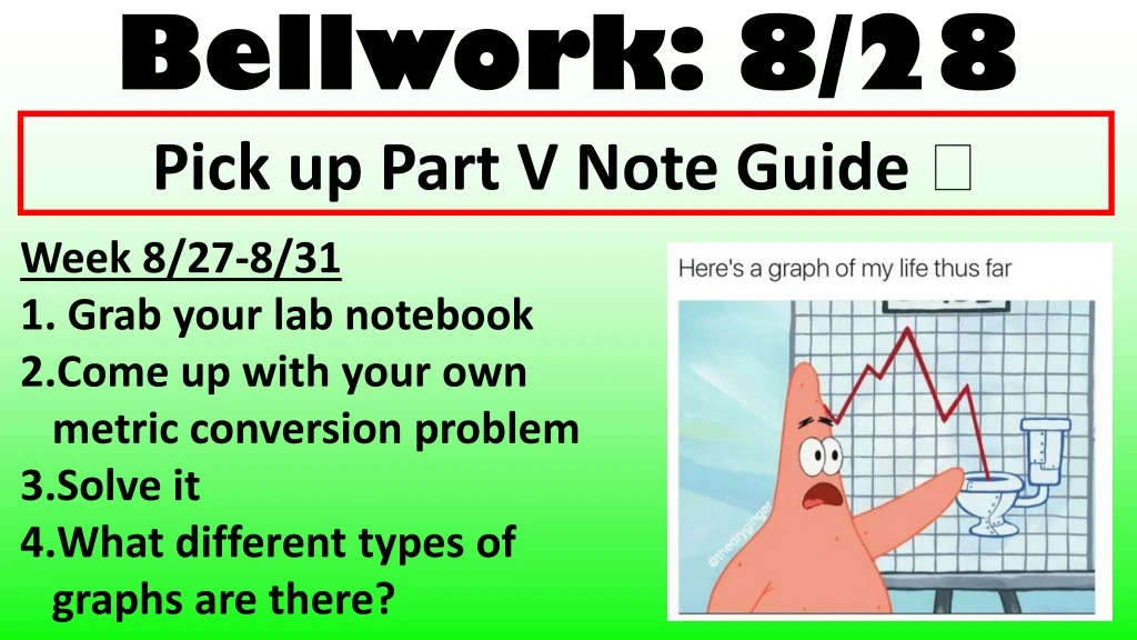
Bellwork: 8/28 Pick up Part V Note Guide Week 8/27-8/31 Grab your lab notebook Come up with your own metric conversion problem Solve it What different types of graphs are there?
Objective • Learn how to appropriately record and analyze experimental data
Today: • Finish metric lab • Part V Notes • Graphing Practice
Materials • Lab Notebook • Unit Book
Homework • Graphing Practice due Thursday!
LAB RULES • 10 Minutes per station • STAY AT YOUR STATION UNTIL I SAY SWITCH! • Switch at your lab bench, do NOT go to a different bench • COMPLETE SENTENCES & SHOW WORK FOR CONVERSIONS • Measurements FIRST, conversions LAST!!! • Be careful around the glassware – let me know if anything breaks • If you do not follow directions….you will be taken out of the lab
Presentation of Experimental Work • Tables • Graphs
Overall Purpose of Data Table • Organize information in one place • Identify patterns in the data • Help analyze & interpret results • Help present data to reader
Data Tables • Key Characteristics: • Title- • Must be specific and describe data table • Columns/rows labeled with units included • Easy to view • All data displayed
Example of Data Table • Table: The number of brine shrimp found in sections of tubing after the shrimp were exposed to changes in light, pH, or temperature
THINK • List the strengths and the weakness of this data table
Overall Purpose of Graphs • Visually display data • More eye-catching than data tables • Easier to see patterns across data points
Relationship Between Data Tables & Graphs • Graphs cannot stand alone • Must be preceded by a data table • Data tables provide the experimental details • Graphs provide the trends
General Rules for Making Graphs • Must use graph paper, if drawing by hand • Must have a good title – Y axis vs. X axis • Dependent vs. Independent • Is the title on the right a good title?
General Rules for Making Graphs • Independent variable is placed on the x-axis • Dependent variable is placed on the y-axis
General Rules for Making Graphs • Scales of X and Y axis: • Range of x and y axis must be appropriate for the data presented • Each scale MUST be equal intervals • Scales are not necessarily the same on each axis • Commonly each axis starts at zero
General Rules for Making Graphs • Each axis must have a label with appropriate units
General Rules for Making Graphs • Multiple lines or bars must include a key • Keysindicate what each bar or line represents
Line Graphs • Compares relationship between x and y variable • Shows the rise & fall of values • Represents continuous data • Choose any point on the x axis and predict, from the graph, the value of y • Usually made when all data is quantitative
Construction of a Line Graph • Plot the data as separate points with symbols as a scatter plot • Look for relationships between the two variables
Best Fit Line • Do not connect the points in the scatter plot • Rather, draw a best fit line or curve • Definition of Best Fit Line or Curve: • Straight line or smooth curve that best represents the points • Draw a line or curve that comes as close to as many points as possible • The line drawn should have equal number of points above and below the line or curve
Equation of Best Fit Line • Take two points that lie on best fit line • Calculate the slope m= DY/DX • Extend the line until it intersects the y-axis at x=0; equals the y-intercept (b) • Plug the y-intercept and slope into the equation of line y=mx+b
Sample Problem • Table1: % seed germination versus nickel concentration in seeds • Create scatter plot • Draw best fit line • Calculate equation of line
Characteristics of Bar Graphs • Common type of graph used when • Independent variable is discontinuous data • When the data is quantitative and qualitative • Qualitative Data – water, milk, etc… • Discrete Units – Year 1, 2 and 3