Download
1 / 5
50 likes | 173 Views
This document analyzes the relative frequencies of train survey results, focusing on the preferences for Sweet, Sour, and Bland categories. By converting survey data of 540 trains into fractions and percentages, we derive insights on punctuality rates, calculating that 20% of trains were on time. Using these frequencies, we also illustrate the sour category through a pie chart angle of 202.5 degrees. Key calculations reveal that 210 trains were on time, enhancing understanding of operational performance in the railway sector.

E N D
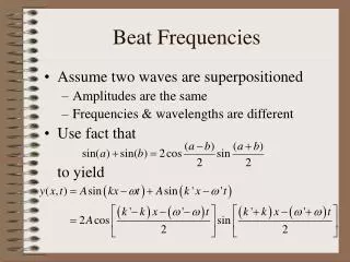
Relative Frequencies and Pie Charts
Relative frequency of 1. Sweet (fraction) 2. Sour (decimal) 3. Bland (%) 4. Pie Chart angle for Sour
540 trains were surveyed 5. How many were right on time? Early Late 1200 1000 Right on time
80 Relative frequency of 20/80 1. Sweet (fraction) 0.5625 2. Sour (decimal) 18.75% 3. Bland (%) 0.5625 X 360 = 202.50 4. Pie Chart angle for Sour
540 trains were surveyed 5. How many were right on time? 140/360 X 540 = 210 Early Late 1200 1000 1400 Right on time