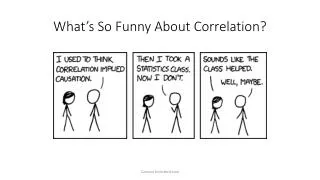
Graphing & Correlation
Graphing & Correlation. Data Trends Unit. In 10 years, will gas cost more or less than it does today?. Quartiles. The median divides data into two sets. The lower quartile is the value of the middle of the first set, where 25% of the values are smaller than Q1 and 75% are larger.

Graphing & Correlation
E N D
Presentation Transcript
Graphing & Correlation Data Trends Unit
Quartiles • The median divides data into two sets. • The lower quartile is the value of the middle of the first set, where 25% of the values are smaller than Q1 and 75% are larger. • The upper quartile is the value of the middle of the second set, where 75% of the values are smaller than Q3 and 25% are larger.
Example: Quartiles A year ago, Angela began keeping track of the number of kilowatt hours of electricity used at her apartment each month. The following data set is the number of kilowatt hours Angela used each month for the past 12 months. 340, 470, 10, 150, 570, 240, 200, 110, 190, 500, 280, 370 Use Angela's sales records to find: a) the median b) the range c) the upper and lower quartiles
Box & Whisker Plots • A box & whisker plot is one way to graphically represent the Q1, Median & Q3
Example: Box & Whisker Plots • Use the data from the first example to create a box & whisker plot
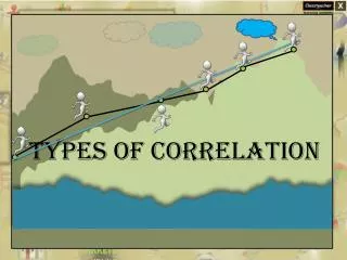
Plotting Two Sets of Data • 2D scatterplots can reveal trends in data • These trends are referred to as correlation
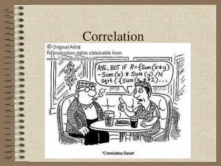
Correlation Strong Positive Weak Positive Strong Negative Weak Negative
Example: Correlation • The data below is a record of the average yearly temperature (AYT) for Duluth, MN between 1993 and 2001 • Create a box & whisker plot of the AYT data. • Create a scatterplot of AYT vs. YEAR. 1993, 6.45 1994, 7.53 1995, 7.49 1996, 5.79 1997, 7.0 1998, 9.74 1999, 8.44 2000, 8.07 2001, 8.52
Questions • Is the data correlated? In what way? • Homework: • Box & Whisker Plot (AYT) • 2D Scatterplot (AYT vs. YEAR)
References Statistics Canada, Data Information and Statistics http://www.statcan.ca/english/edu/power/ch1/first1.htm