Download
1 / 26
310 likes | 729 Views
Writing Software Documentation A Task-Oriented Approach Thomas T. Barker . Chapter 13: Using Graphics Effectively Summary by Cornelius Farrell and Emily Werschay . Guidelines for Using Graphics Effectively. 1 . Identify needs for graphics by your users. 2 . Set graphics styles.

E N D
Writing Software DocumentationA Task-Oriented Approach Thomas T. Barker Chapter 13: Using Graphics Effectively Summary by Cornelius Farrell and Emily Werschay
Guidelines for Using Graphics Effectively • 1. Identify needs for graphics by your users. • 2. Set graphics styles. • 3. Revise and edit. • 4. Revise for typography.
1. Identify Needs for Graphics by Your Users • Graphics should support user questions • Help the user locate and operate the features of the program • Encourage education, guidance, and support • For novice to experienced users, use more cartoons and animations. • For experienced to expert users, use technically-oriented charts and diagrams.
Where Is It? • Use graphics to help the user locate buttons, rulers, sliders, check boxes, menu commands, and other interface elements on the screen. • Making things visible means: • Show the User Where to Look to Perform Tasks • Show Concrete Versions of Abstract Things • Make Visuals Clear
What Is It? • Define unfamiliar concepts using examples and metaphors. • Examples show documents, reports, and printouts. • Metaphors allow users to know something without having to learn it from scratch.
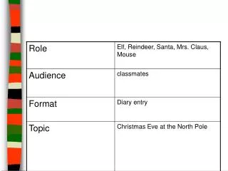
How Do I Do It? • Demonstrate and support sequential actions with step-by-step images to help the user build a mental model of the process before performing it.
Where Am I? • Access Indicators tell users where information fits into the organized whole. • Progress Indicators keep track of pacing and lessons.
What’s the Big Picture? • Users need to know the structure of a program. • Beginners need it because they don't have a store of knowledge. • Experienced users may need reminders of how programs work. • Expert users may never have worked with this particular program, but they expect the structure to exist.
Overall Program Diagrams illustrate program system components to show the flow of information. • Menu Maps consist of program menus arranged in the same structure as they appear in the program interface. • Conceptual Overviews reinforce the ideas of how to use a program. • Use generic figures and easy-to-identify images. • Embody the mental mold of use to predict successful user actions. • Simplify use concepts, but make the images visually interesting.
How to Use the Manual • Use graphics to reinforce the big picture of your manual or online help system and route users to the right section of your manual.
2. Set Graphics Styles • Use the same types and fonts and the same arrow, box, and frame styles throughout your document. • Establish these standards early in the project. • Communicate the standards. • Keep your standards updated.
3. Revise and Edit • Revise your draft based on the standards you have established. • Focus on correctness and consistency. • Focus on detail including small spaces, alignment, etc. • Give your graphics clear purpose so the visual element does not confuse the user.
Ask yourself these questions? • Should you use graphics as much as possible? • Should you associate each task with an image? • Barker believes the answer is “NO” • Users have a craving for the name of the thing (a word) rather than the thing itself (a picture) • Words complete the user’s sense of control • Strive for balance
Titles • Not all images or screens require titles. • Follow these guidelines for creating titles for your graphics: • Number the titles sequentially. • List numbers and titles in the front of the manual • Don’t use the same graphic over and over • Use boldface titles, sometimes enlarged, in body-text style
Labels • Often called callouts, labels direct the user to the correct and informative parts. • Follow these guidelines for labeling your graphics: • Explain most or all figures • Place callouts outside the image or screen • Use consistent capitalization • Label the components of screens used for presenting overviews and screen objects • Keep captions brief • Make terminology consistent with the text
Placement • Placement relates to where you put images on the page or screen. • Follow these guidelines for placing graphics: • Position table and figure titles consistently • Obey the text margins • Set aside a region for graphics • Always place graphics as close to or following the text they relate to
Rules and Lines • Rules and lines help define the communications space and give your page structure. • Follow these guidelines: • Keep lines straight and of the same value • Use large enough arrows • Make rules and lines straight and neat • Make rules conform to the style of headers • Use rules to hierarchies of information in your text • Use grayscale rules when you don’t want to waste ink and you need to save disk space. • Use rules sparingly in help screens
Size • Images that the user can’t read clearly are unhelpful in a manual. • Follow these guidelines: • Use screens and icons liberally • Try to keep your illustrations on one page • Flip oversized illustrations 90 degrees • Keep it within the margins • If a screen takes up two columns, try to position it so that it falls with the margins of the two columns • Crop pictures for maximum impact • Design a hierarchy of sizes • Make it large enough to show up with a minimum of about 3 to 5 inches in width • Give images enough white space/soft boundaries • 1/2 inch white space around figures • 1/8 to 1/4 inch around screens
Colors • Though colors can add to the appeal and impact of your manuals, they should relate clearly to the scheme of information you have designed. • Follow these guidelines in using color: • Relate color schemes to patterns of information • Keep elements the same tones of gray or the same families of intensity • Use a single color for bars along paper edges • Avoid “reserved” colors
4. Revise for Typography • Follow these guidelines for the proper use of typography in creating a manual or online help system: • Make important things larger • Make important things darker • Make important things central • Make important things sharper • Align related things • Put first things left, later things right
Showing How Tools Apply to the Workplace • The interface of a computer contains many tools called interface elements. Support the operation of these tools in two ways : • 1. Using images of the actions taking place • 2. Using tables showing the commands, the objects and their definitions
Show Results of Software Operations • Teaching • Accompanies the illustration of the tool in use • Guidance • Accompanies the most important step of a procedure • Reference • Shows specific screens or other results the reader should see when the function is used
Present Overviews to Integrate Software with Workplace Activities • Overviews help the user to fit the procedures into his or her existing mental framework • Task oriented documentation often uses cartoons or drawings of various elements with process arrows to show how things fit together • Works well in installation sections • Help systems have overviews built in because of the interactive nature of the screen • Icons show different elements of the help system the user can choose from • Graphics help explain how users should read pages • Greatly increase the usability of manuals
Suggest Functions and Uses • Design to capture a typical-use scenario or workplace activity • Outline the most common use of the program • These are the actions and activities the program is designed to support
Make the Abstract Concrete Through Metaphors • Graphics that convey abstract concepts help the user see the invisible • They help the user to see complex actions that would be difficult to communicate in the written word • Often get put in special reference sections • Often images conveying abstract concepts portray a central metaphor of a program