Download
1 / 20
200 likes | 339 Views
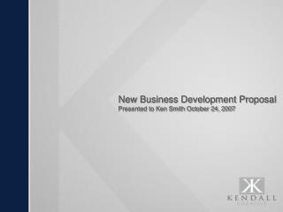
New Business Development Proposal Presented to Ken Smith October 24, 2007. Agenda. Overview Current CRU Logo Variations The Process Recommendations Logos Open Discussion and Next Steps. Overview.

E N D
New Business Development ProposalPresented to Ken Smith October 24, 2007
Agenda • Overview • Current CRU Logo Variations • The Process • Recommendations • Logos • Open Discussion and Next Steps
Overview • The objective of the given project was to review the current Construction Resources United logo and make a recommendation on developing a consistent brand image to move forward with. • Things to consider were: • There are currently many variations of the CRU logo. • 2006 marks the 10th anniversary for CRU. • Incorporating The RAACE Foundation into CRU’s marketing agenda.
Current CRU Logo Variations • Web address below • Tagline written above • No background • Sphere on multi-colored background • No tagline • No web address • Font and key stretched vertically • No tagline • Logo on black background
Current CRU Logo Variations • Key a darker shade of gold • Key touches bottom of sphere • Drop shadow behind font • No sphere • No drop shadow • Company info within logo • Grey sphere • Gold key • Completely different
Additional Variations Name • CRU • Construction Resources United • The Construction Resources United Corp. Tagline • “Putting The Right Team Together To Meet Your Framing Needs” • “Turn Key Framing” Is it turnkey, turn-key, or turn key?
The Process Research • We reviewed over 150 different construction, framing, and management companies to see what was out there. • Some of these companies had 5-10 employees and some had several hundred. • The locations of the companies varied. We broke it down into local (Baltimore Metro), regional (Maryland, Pennsylvania, Virginia, and DC), and national (United States).
The Process Concepts • After our research was completed, we determined that the majority of the major players in the construction game used personal names of the founder, owner, or president within the logo. • We also determined that for companies who did this there was little to no opportunity to create a brand.
The Process Over 450 sketches were created.
Recommendations Color Pallets • CRU uses organic product made in nature to produce its final product. Based off that fact, we chose "earth tones" as the base of colors. • We wanted something a little different than the traditional red or blue corporate colors that were accented with black. • Straying from those traditional corporate color will help CRU stand out in the construction markets cluttered competitive landscape. • CRU’s style of business is unique in the construction industry so should be the corporate image which is controlled by a branded color.
Recommendations 10th Anniversary • 10th anniversary verbiage should be incorporated as a sidebar in materials, not in the logo. • This will allow for an easy transition next year. Name • We recommend using the CRU acronym as opposed to Construction Resources United. Tagline • Using the CRU acronym, we feel it is imperative to include a descriptive tagline at all times with the logo. • Each logo recommendations has a tagline attached. However we are not married to any of them and we should come to an agreement on the proper way to describe CRU. • This will allow us to easily communicate what we do to our new customers and vendors. The RAACE Foundation • The RAACE Foundation will be incorporated also as a footnote in each of the marketing materials. 11
Logo 1 • Modernized version of the CRU “key” corporate mark. • This contemporary type treatment has an angled slant style that is reflective of a pitched roof. • Type treatment is heavy in weight to represent strength and stability • Type treatment is displayed in a blond or tan color to greater reflect the bulk of CRU's final product...wood framing. • The key has been put into action instead of a passive display as it resides in the current CRU mark. • Burgundy color was selected to signify a confident but approachable style of leadership. 13
Logo 1 Stationary design is for illustration purposes only.
Logo 2 • An almost futuristic type treatment was selected because CRU is constantly looking forward to insure lumber prices for the client. • The futuristic type treatment was also selected to symbolize the progressive thinking and a new style of doing business. • The "U" has been "framed" by a roof line like structure to represent CRU's work. • The "U" and the structure combine to make a strong, semi silent up arrow recognizing that not only does your product grow but that CRU is growing stronger everyday. • White was chosen to fill the letters to represent a clean and easy transaction when doing business with CRU.
Logo 2 Stationary design is for illustration purposes only.
Logo 3 • This contemporary type treatment has an angled slant style that is reflective of a pitched roof. • Type treatment is heavy in weight to represent strength and stability. • The inner icon is a highlighted complex roof line of a multi-family housing complex. This represents the final product of CRU. • The inner icon is "framed" by a pitched abstraction to symbolize creativity. • The color treatment of golden & tan on dark green represents the product and the life behind it.
Logo 3 Stationary design is for illustration purposes only.