Assessing Normality
Assessing Normality. Assessing Normality

Assessing Normality
E N D
Presentation Transcript
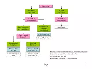
Assessing Normality The Normal distributions provide good models for some distributions of real data. Many statistical inference procedures are based on the assumption that the population is approximately Normally distributed. Consequently, we need a strategy for assessing Normality. • Plot the data. • Make a dotplot, stemplot, or histogram and see if the graph is approximately symmetric and bell-shaped. • Check whether the data follow the 68-95-99.7 rule. • Count how many observations fall within one, two, and three standard deviations of the mean and check to see if these percents are close to the 68%, 95%, and 99.7% targets for a Normal distribution.
Normal Probability Plots: • A normal probability plot is a scatter plot of the (normal score*, observation) pairs. • Most software packages (including your TI-8X) can construct Normal probability plots. These plots are constructed by plotting each observation in a data set against its corresponding percentile’s z-score.
Interpreting Normal Probability Plots If the points on a Normal probability plot lie close to a straight line, the plot indicates that the data are Normal. Systematic deviations from a straight line (such as curvature in the plot) indicate a non-Normal distribution. Outliers appear as points that are far away from the overall pattern of the plot.
Normal Probability Plot Example Ten randomly selected couch potatoes were each asked to list how many hours of television they watched per week. The results are: 82 66 90 84 75 88 80 94 110 91 • Use your graphing calculator to verify normality: • Enter the data into a list • Open the Stat Plot menu, turn a plot on, and select the last option under Type. • Hit Zoom 9 • (Minitab obtained the normal probability plot on the following slide.)
Normal Probability Plot Example Notice that the points all fall nearly on a line so it is reasonable to assume that the population of hours of TV watched by couch potatoes is normally distributed.
EXAMPLE A sample of times of 15 telephone solicitation calls (in seconds) was obtained and is given below. 5 10 7 12 35 65 145 14 3 220 11 6 85 6 16 Construct your own plot to verify normality.
Normal Probability Plot Example Clearly the points do not fall on a line. Specifically the pattern has a distinct nonlinear (perhaps logarithmic) appearance. It is NOT reasonable to assume that the population of telephone solicitation calls is normally distributed. One would most assuredly say that the distribution of lengths of calls is not normal.