Download
1 / 14
140 likes | 251 Views
Ensure your data visualizations empower users to take action by utilizing key performance indicators, alert systems, and drill-down capabilities. Design effective displays by carefully arranging visuals, using minimal text, and selecting appropriate colors for clarity. Test your display with real users to confirm it conveys critical information and supports easy navigation. Prioritize legibility with large, high-contrast text, and interactive elements that facilitate user engagement. Use animations and visuals wisely to draw attention without overwhelming viewers. Continuous feedback is crucial for improvement.

E N D
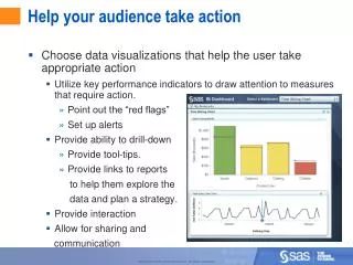
Help your audience take action • Choose data visualizations that help the user take appropriate action • Utilize key performance indicators to draw attention to measures that require action. • Point out the “red flags” • Set up alerts • Provide ability to drill-down • Provide tool-tips. • Provide links to reports to help them explore the data and plan a strategy. • Provide interaction • Allow for sharing and communication
Ensure that you have an effective display • Arrange visualizations on one screen. There should be no scrolling. • Pick 4 to 6 related graphics to show on a screen. • Graphics that are meant to be compared should be on the same screen. Graphics related to different categories should be on different pages. • This helps to support the capabilities of short-term memory, which can only hold a limited amount of information (7 ±2 items.) • Unless rehearsed, items in short-term memory are forgotten within 20 seconds. • To save space, don’t show the same information in two different ways. When in doubt, pick a graphic representation because users prefer them over tables of numbers.
Ensure that you have an effective display • Use text wisely. • A visualization should be easy to interpret without an explanation, so there shouldn’t be much text on the screen. • Provide titles and labels that make sense. • Text should be large enough to be legible. You must consider: • Possible visual impairments in your audience • Screen size • Distance of the user from the screen • Text should be dark on a light background. • If not black on white, then there should be a high contrast. • Avoid gradient backgrounds. As the gradient gets darker, it can be harder to read text over the background. • Use sans-serif fonts, like Arial, which reduce visual clutter and are easier to read on a computer screen. • Avoid italics • Use bold sparingly, only to place emphasis.
Ensure that you have an effective display • Use color wisely • Color draws attention, so avoid highly saturated or bright colors. • If using color specifically to draw attention, only use that color when it for that purpose. • For example, if using red in gauges to mean Below Target, then don’t use red elsewhere on the screen. • If using color to compare measures, then don’t use colors within a gradient that are too similar. • Consider those who may be color-blind by not using only color to give information and setting noticeable differences in saturation.
Ensure that you have an effective display • Use animation and interaction wisely • Motion draws the user’s attention, so it should be used carefully. • Avoid continuous animations (animations that loop, or tickers) • Good uses of animation and interaction • Interactive highlighting • Selecting a row in a table highlighting a corresponding bar on a chart, or vice versa. • Drawing an area around a part of a chart, and rows of a table become highlighted to point out details of those data points • Filtering • Choosing a category from a drop-down list changes the charts on the display to show data for that category • Hovering the mouse over a data point to get a tool tip.
Ensure that you have an effective display • Consider how you arrange indicators on the screen • If there is an object in the center, it will be noticed first • If not, then the top-left corner will be noticed • The bottom-right corner is noticed last • So the most important visualizations should be placed at the top from left to right, and the least important should be at the bottom-right corner. • Let the viewer’s eyes flow by lining up indicators in rows or columns. • Information can be grouped into rows, columns, or blocks that can be made with white space, borders, or background color
Ensure that you have an effective display • Test your display with your audience • Make sure that it displays the information that they want • Make sure it organizes the information in a way that allows for comparisons and easy navigation • Make sure that the visual aspects are appropriate and attractive • Print your display in black and white to ensure that • There is enough contrast between the text and background • There is enough saturation between colors • Visualizations can be interpreted. They shouldn’t have to be explained. • Important information can be gathered quickly. • Details can be obtained when needed. • Continue asking for feedback and sharing ideas.
Test Yourself • What are some improvements that can be made to this dashboard display?
Test Yourself - Solutions • Bullet bars are better for making comparisons than speedometers or dials, • but vertical bullet bars should be lined up horizontally and horizontal bullet bars should be lined up vertically so their values are easy to compare. • Avoid bright colors. • Avoid using 3D in charts. • Labels should be close to their graphs. • Group related graphs with white space. • Avoid using too many visualizations.
Questions? • Lisa Whitman • Usability Analyst for Business Intelligence Software • Contact • Lisa.Whitman@sas.com • http://support.sas.com/usability