The Sixth Miner: Exploring Teaching and School Life Through Creative Imagery
60 likes | 238 Views
In my upcoming magazine, "The Sixth Miner," I aim to highlight the significance of teaching and school culture. I envision a formal depiction of a teacher in a suit lecturing in a classroom to emphasize the importance of education. Additionally, an intriguing photograph of a duck hiding among classroom desks will spark curiosity about our school's history. To ground my magazine visually, I'll include an image of the miner and the arch outside the Phoenix Café. I plan to complete my layout and evaluations by the end of the month.

The Sixth Miner: Exploring Teaching and School Life Through Creative Imagery
E N D
Presentation Transcript
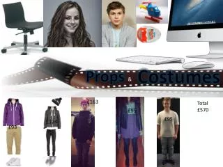
Actors, Location, Props, Costumes • I will need a teacher in a leaching pose, in a classroom looking official in a suit. I feel this will be good for the magazine as it will allow me to “create” an article about teaching which is a highly important thing in a sixth form. • I will need a photograph of a duck hiding in a classroom. This fits in with my ideas as it is something that has been happening throughout the years at this school and is something which many people actually wonder about, this would bring interest to my magazine. • I also require a photo of the miner and arch outside of the phoenix café. This would act as my background as I intend to call my magazine “the sixth miner”.
Time Management • By the 19th- I plan to have my evaluation of a contents page and front cover done. • By the 23rd- I plan to have my flat plan completed and uploaded to the blog. • By the 26th- I should have completed my research and planning and have it uploaded to the blog. • By the 28th- I WILL have my front cover and contents page completed and uploaded to the media blog. • By the 30th- I WILL have my evaluation uploaded and have finished my prelim task.
Title, single text and colour, lacks in interest Logo Snapshot images to attract a wider audience Person in centre of page to draw in interest and focus reader to the middle of the page Plain white background Bold, standout-ish colour to attract attention
Front cover • I found this front cover lacking in design and somewhat thrown together. The mono-colour background leaves the eyes wandering and feeling blank. • I felt that the images were well placed but could have been in better resolution to decrease pixilation and a multi colour background would have improved this piece by a large degree • The fonts used were good and easy to read, and they have a fun edge to them.
Contents list to tell people what is on what page. Text and background colour swapped from front page. Adds contrast. Same font followed from front cover. Photos with cut out backgrounds so the fit with the background, helps people to preview those pages, the same way that the others do but fits in more with their surroundings. Images with backgrounds in opposite corners giving the page a fuller look and helps people to preview what is happening on those pages. Plain white background, looks unprofessional.
Contents page • I found the contents page very similar to the front cover, in the way that basic colours were used and that it seemed to only follow a basic form and had little artistic concept. • However I felt that the use of swapping colours from the first page around was good as it added contrast and this is a technique I may use at a later point.
