Download
1 / 1
10 likes | 90 Views
Learn why choosing the right color scheme in your presentation is crucial. Avoid eye strain and enhance audience engagement by selecting contrasting colors that improve readability and visual appeal.

E N D
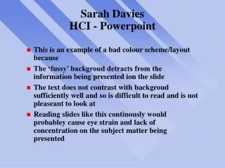
Sarah DaviesHCI - Powerpoint • This is an example of a bad colour scheme/layout because • The ‘fussy’ backgroud detracts from the information being presented ion the slide • The text does not contrast with backgroud sufficiently well and so is difficult to read and is not pleaseant to look at • Reading slides like this continously would probabley cause eye strain and lack of concentration on the subject matter being presented