Download
1 / 40
400 likes | 534 Views
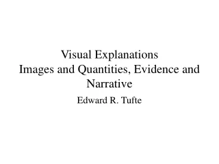
Visual Explanations Images and Quantities, Evidence and Narrative. Edward R. Tufte. Goals. Heart of thinking/explaining: assessment of change, dynamics, cause and effect

E N D
Visual ExplanationsImages and Quantities, Evidence and Narrative Edward R. Tufte
Goals Heart of thinking/explaining: assessment of change, dynamics, cause and effect Goal: Proper arrangement in space and time of images, words and numbers – to present information about motion, process, mechanism, cause and effect. Strategies are independent of content area and technology of display.
First Statistical Graph Ever 1644 Michael Florent van Langren, Flemish astronomer
Supercomputer Scientific Animations • 65% of 134 color images in one compilation had no scales or labeled dimensions at all. • Only 13% had complete labels and scales. • Animation of Venus, based on radar data collected during 1992 Magellan space probe used scale exaggerated by 22.5 times. Good TV, bad science. Turned rolling hills into mountains.
Image from “Study of a Numerically Modeled Severe Storm How big is the cloud? What direction is it moving? What are the dimensions of the grid?
How to assess integrity of visual evidence? Ethical standards: • Show unprocessed image along with manipulated image. • Identify manipulators and methods. • Make clear what the pool of images the displayed image was selected from. Is it representative?
Scale Appropriate re-expressions or transformations of scales are among the most powerful strategies for exploring data. In this example, chose aspect ratio that centers absolute values of line segments on 45 degrees. Revised graph shows cycle rises rapidly, declines slowly. More pronounced when peak is sharp.
Cholera Epidemic in London, 1854 • Example of using displays of evidence for making decisions. • When we reason about qualitative evidence, certain methods for displaying and analyzing data are better than others. • Dr John Snow was able to determine the cause of the epidemic and bring it to an end.
Cholera Epidemic • Original data was victim’s names, ordered by date of death. • Snow had theory about cause of cholera, collected data to support his theory.
Details • No deaths at brewery. They drink beer, also have their own well in basement. • Few deaths at workhouse. They have their own well, never go to Broad Street. • Deaths outside the area. • children attending school in area • family who preferred water from Broad Street • Need to show all evidence, not just the evidence which supports theory.
Pros Deceptive affects of aggregation are avoided. Aid in identifying individual cases to be analyzed. Cons Death rates not shown Doesn’t show number people in area… could be dense population near Broad Street. Map may become cluttered. Pros and Cons of graph
Daily aggregation shows trend • Disease was already in decline when pump handle removed.
Aggregation by week makes effect appear more dramatic. • Snow: “There is no doubt the mortality rate was much diminished, as I said before, by the flight of the population, which commenced soon after the outbreak; but the attacks had so far diminished, by the time the use of the water was stopped, that it is impossible to decide whether the well still contained the cholera poison in an active state or whether, from some cause, the water had become free of it.”
More aggregation effects • Aggregated data does not show quarterly dips at all • Time-series are exquisitely sensitive to choice of intervals and endpoints. • Some aggregations are sensible, reduce tedious redundancy and uninteresting complexity (e.g., daily not hourly for cholera charts).
Challenger • January 8, 1986, space shuttle Challenger exploded and seven astronauts died because two o-rings leaked. • O-rings had lost resiliency because shuttle was launched on very cold day. • Day before the flight, engineers who designed the rocket opposed the launch. • Created 13 charts to support their case. • NASA official was “appalled” by the recommendation not launch, asked them to reconsider (even though only no-launch recommendation in 12 years). • NASA officials pointed out serious weaknesses in the charts. • The Thiokol managers changed their minds, decided the evidence was inconclusive. • Serves as example of groupthink, technical decision-making in the face of political pressure, and bureaucratic failures to communicate. • But it could have been avoided, with more convincing arguments…
Title chart (not shown) does not provide names of preparers. Would indicate responsibility, use authors’ reputation & credibility. • This chart is too detailed, need summary. Shows effect, no data about cause. Same rocket has 3 names (NASA#, Thiokol #, launch date). Some evidence not included, such as important flight two weeks earlier that sustained damage.
Two of these already reported on previous report. • Nozzle blow-by not relevant in cold weather. • SRM-15 had worst damage, not really clear.
Shows SRM-15 which was coldest launch. • Also includes SRM-22 on a warm day. • “We had blow-by on hottest motor and coldest motor” – est is extreme characterization for sample of two! • Focus on blow-by doesn’t emphasize erosion, which was much worse on SRM-15
Basis for decision • Blow-by, not erosion, and temperature for 2 launches. • Included data from development motors which are fixed rockets on horizontal test stands. Not same stress as real launch. • Omitted 22 previous shuttles, temperature variations, O-ring performance. • Selection of data – whether partisan, hurried, haphazard, uninformed or thoughtful and wise – can make all the difference.
Based on charts that don’t present evidence well, engineers presented their recommendations.
Alternative chart by Tufte • complete history • ordered by possible cause • damage is summarized in severity - weighted index. • “numbers become evidence by being in relation to” • engineers were thinking causally, not displaying causally.
Scatterplot of same data • Shows large extrapolation to predicted launch temperature
Chart prepared after accident • cross-hatching varies from dark to medium to medium dark. No numeric scale. • Data are from development motors, not launches.
Related chart • damage chart not repeated, depicted by little marks rather than score. • “chartjunk” – rockets, indicates statistical stupidity • sideways temperature obscures causal variable. • data is shown as time-series, not ordered by causality. • “If the substantive matter is a cause-effect relationship, graphs should be organized to illuminate such a link.
Feynman’s testimony • showed crowd that o-ring loses resiliency when clamped in cold water for brief time. • “O-rings were not designed to erode. Erosion was a clue something was wrong.” • Credible experiment would require 2 glasses, to rule out whether effect is due to wet or cold. Also rules out clamp. • “The one-glass method is not an experiment, it is an experience” – and an effective one! • Variations in cause must be explicably and measurably linked to variations in effect.
Summary of principles Design of statistical graphs must include • documenting the sources and characteristics of data • insistently enforcing appropriate comparisons • demonstrating mechanisms of cause and effect • expressing mechanisms quantitatively • recognizing the inherently multivariate nature of analytic problems • inspecting and evaluating alternative explanations.
Smallest Effective Difference • Make all visual distinctions as subtle as possible, but still clear and effective • Mute secondary elements (arrows, pointer lines, tic marks, grids, meshes, legends, highlights, accents, bevels, shadows and fills). • “When everything is emphasize, nothing is emphasized.”
Two scales for depth • Minimal distinctions reduce visual clutter. • Small contrasts increase the number of distinctions that can be made within a single image.