Download
1 / 11
120 likes | 140 Views
Explore various graphical methods such as bar graphs, pie charts, histograms, frequency polygons, cumulative frequency graphs, ogives, pictographs, and box plots with detailed explanations. Learn how to effectively visualize and interpret data.

E N D
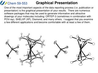
Graphical Presentation of data Delivered by:-Mrs. Babita Assistant Professor
BAR GRAPH • A bar graph is a graphical display of data using bars of different heights. • The bars can be plotted horizontally or vertically. • A vertical chart is sometimes called a column bar chart. Cont…..
PIE CHART • Pie diagrams are popularly used to denote percentage breakdown. • It is a circular statistical graphic which is divided into slices to illustrate numerical proportion. • In a pie chart, The arc length of each slice( consequently its central angle & area) is proportional to the quantity it represent.
HISTOGRAM • A histogram is a set of rectangles whose areas in proportion to class frequencies. • It is a graph in which the frequencies are represented by bars . • The bars are adjacent to each other not separated. • It was first introduced by Karl Pearson.
FREQUENCY POLYGON • A polygon is a many angled or many sided closed figure. • The frequency polygon is a graphical representation of frequency distribution in which midpoints of the class interval against the frequencies. • To close the figure, we will take two extra intervals, one above and one below the given intervals are taken. • In comparing two or more distributions by plotting two or more graphs on the same axis.
CUMULATIVE FREQUENCY GRAPH • In order to draw cumulative frequency graph, we have to obtained cumulative frequency directly from frequency. • Cumulative frequencies are obtained by adding successively, starting from the bottom, the individual frequencies. • These frequencies tell us the total number of cases lying below a given score or class interval. • The last value for the cumulative frequency will always be equal to the total number of frequencies or size of sample.
OGIVE • In order to draw cumulative percentage frequency graph or Ogive, we have to obtain cumulative percentage frequencies by multiplying cumulative frequency with 100/N, where N is total number of frequencies. • These frequencies tell us the percentage of cases lying below given score or class interval.
PICTOGRAPH • A pictograph is a way of showing data using images. • Each image stands for a certain numbers of things e.g., in the given illustration, one picture of pencil corresponds to 3 pencils.
BOX PLOT • Box plots are graphical tools to visualize key statistical measures, such as median, mean and quartiles. • A single box plot can be used to represent all the data. It is also possible to visualize separate statistics for subsets by selecting a column for the X-axis. • The individual box plot is a visual aid to examining key statistical properties of a variable. The diagram below shows how the shape of a box plot encodes these properties. The range of the vertical scale is from the minimum to the maximum value of the selected column, or, to the highest or lowest of the displayed reference points.