Download
1 / 92
920 likes | 960 Views
Explore the art of graphical presentation, types of variables, and guidelines for creating good graphics charts. Learn the common mistakes to avoid and special-purpose chart types to effectively communicate data. Enhance your skills in charting based on variable types and principles of graphical excellence. The text covers the dos and don'ts of creating informative and visually appealing graphics to maximize data communication.

E N D
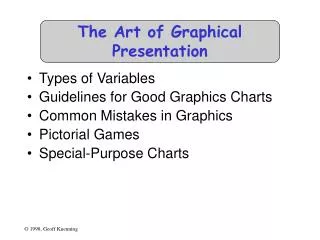
The Art of Graphical Presentation • Types of Variables • Guidelines for Good Graphics Charts • Common Mistakes in Graphics • Pictorial Games • Special-Purpose Charts
Types of Variables • Qualitative • Ordered (e.g., modem, Ethernet, satellite) • Unordered (e.g., CS, math, literature) • Quantitative • Discrete (e.g., number of terminals) • Continuous (e.g., time)
Charting Based on Variable Types • Qualitative variables usually work best with bar charts or Kiviat graphs • If ordered, use bar charts to show order • Quantitative variables work well in X-Y graphs • Use points if discrete, lines if continuous • Bar charts sometimes work well for discrete
Guidelines for Good Graphics Charts • Principles of graphical excellence • Principles of good graphics • Specific hints for specific situations • Aesthetics • Friendliness
Principlesof Graphical Excellence • Graphical excellence is the well-designed presentation of interesting data: • Substance • Statistics • Design
Graphical Excellence (2) • Complex ideas get communicated with: • Clarity • Precision • Efficiency
Graphical Excellence (3) • Viewer gets: • Greatest number of ideas • In the shortest time • With the least ink • In the smallest space
Graphical Excellence (4) • Is nearly always multivariate • Requires telling truth about data
Principles of Good Graphics • Above all else show the data • Maximize the data-ink ratio • Erase non-data ink • Erase redundant data ink • Revise and edit
Erase Non-Data Ink North West East
Erase Redundant Data Ink North West East
Erase Redundant Data Ink North West East
Specific Things to Do • Give information the reader needs • Limit complexity and confusion • Have a point • Show statistics graphically • Don’t always use graphics • Discuss it in the text
Give Informationthe Reader Needs • Show informative axes • Use axes to indicate range • Label things fully and intelligently • Highlight important points on the graph
Limit Complexityand Confusion • Not too many curves • Single scale for all curves • No “extra” curves • No pointless decoration (“ducks”)
Have a Point • Graphs should add information not otherwise available to reader • Don’t plot data just because you collected it • Know what you’re trying to show, and make sure the graph shows it
Having a Point • Sales were up 15% this quarter:
Show Statistics Graphically • Put bars in a reasonable order • Geographical • Best to worst • Even alphabetic • Make bar widths reflect interval widths • Hard to do with most graphing software • Show confidence intervals on the graph • Examples will be shown later
Don’t AlwaysUse Graphics • Tables are best for small sets of numbers • e.g., 20 or fewer • Also best for certain arrangements of data • e.g., 10 graphs of 3 points each • Sometimes a simple sentence will do • Always ask whether the chart is the best way to present the information • And whether it brings out your message
Discuss It in the Text • Figures should be self-explanatory • Many people scan papers, just look at graphs • Good graphs build interest, “hook” readers • But text should highlight and aid figures • Tell readers when to look at figures • Point out what figure is telling them • Expand on what figure has to say
Aesthetics • Not everyone is an artist • But figures should be visually pleasing • Elegance is found in • Simplicity of design • Complexity of data
Principles of Aesthetics • Use appropriate format and design • Use words, numbers, drawings together • Reflect balance, proportion, relevant scale • Keep detail and complexity accessible • Have a story about the data (narrative quality) • Do a professional job of drawing • Avoid decoration and chartjunk
Use Words, Numbers, Drawings Together • Put graphics near or in text that discusses them • Even if you have to murder your word processor • Integrate text into graphics • Tufte: “Data graphics are paragraphs about data and should be treated as such”
Reflect Balance, Proportion, Relevant Scale • Much of this boils down to “artistic sense” • Make sure things are big enough to read • Tiny type is OK only for young people! • Keep lines thin • But use heavier lines to indicate important information • Keep horizontal larger than vertical • About 50% larger works well
Poor Balanceand Proportion • Sales in the North and West districts were steady through all quarters • East sales varied widely, significantly outperforming the other districts in the third quarter
Better Proportion • Sales in the North and West districts were steady through all quarters • East sales varied widely, significantly outperforming the other districts in the third quarter
Keep Detail and Complexity Accessible Make your graphics friendly: • Avoid abbreviations and encodings • Run words left-to-right • Explain data with little messages • Label graphic, don’t use elaborate shadings and a complex legend • Avoid red/green distinctions • Use clean, serif fonts in mixed case
Have a Story About the Data (Narrative Quality) • May be difficult in technical papers • But think about why you are drawing graph • Example: • Performance is controlled by network speed • But it tops out at the high end • And that’s because we hit a CPU bottleneck