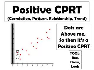
1. A positive correlation. As one quantity increases so does the other.
280 likes | 681 Views
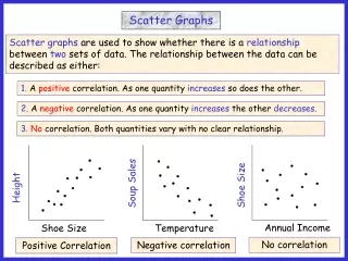
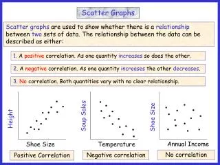
Scatter Graphs. Scatter graphs are used to show whether there is a relationship between two sets of data. The relationship between the data can be described as either:. Height. Soup Sales. Shoe Size. Annual Income. Shoe Size. Temperature.

1. A positive correlation. As one quantity increases so does the other.
E N D
Presentation Transcript
Scatter Graphs Scatter graphs are used to show whether there is a relationship between two sets of data. The relationship between the data can be described as either: Height Soup Sales Shoe Size Annual Income Shoe Size Temperature 1. A positive correlation. As one quantity increases so does the other. 2. A negative correlation. As one quantity increases the other decreases. 3.No correlation. Both quantities vary with no clear relationship. No correlation Negative correlation Positive Correlation
Scatter graphs are used to show whether there is a relationship between two sets of data. The relationship between the data can be described as either: 1. A positive correlation. As one quantity increases so does the other. 2. A negative correlation. As one quantity increases the other decreases. 3.No correlation. Both quantities vary with no clear relationship. Height Soup Sales Shoe Size Annual Income Shoe Size Temperature Scatter Graphs A negative correlation is characterised by a straight line with a negative gradient. A positive correlation is characterised by a straight line with a positive gradient.
State the type of correlation for the scatter graphs below and write a sentence describing the relationship in each case. 3 1 2 Petrol consumption (mpg) Physics test scores Height KS 3 Results Car engine size (cc) Maths test scores Sales of Ice Cream 4 6 5 Sales of Sun cream Heating bill (£) Daily rainfall totals (mm) Daily hours of sunshine Outside air temperature Positive None Negative People with higher maths scores tend to get higher physics scores. There is no relationship between KS 3 results and the height of students. As the engine size of cars increase, they use more petrol. (Less mpg) People tend to buy less ice cream in rainier weather. People tend to buy more sun cream when the weather is sunnier. As the outside air temperature increases, heating bills will be lower. Negative Positive Negative
A positive or negative correlation is characterised by a straight line with a positive /negative gradient. The strength of the correlation depends on the spread of points around the imagined line. Strong Positive Moderate Positive Weak Positive Strong negative Moderate Negative Weak negative
Lobf Drawing a Line of Best Fit A line of best fit can be drawn to data that shows a correlation. The stronger the correlation between the data, the easier it is to draw the line. The line can be drawn by eye and should have roughly the same number of data points on either side. The sum of the vertical distances above the line should be roughly the same as those below.
Question 1 (1). The table below shows the shoe size and mass of 10 men. (a) Plot a scatter graph for this data and draw a line of best fit. Plotting the data points/Drawing a line of best fit/Answering questions. Size 5 12 7 10 10 9 8 11 6 8 Mass 65 97 68 92 78 78 76 88 74 80 100 95 90 85 80 Mass (kg) 75 70 65 60 9 8 10 13 6 12 4 5 7 11 Shoe Size
(1). The table below shows the shoe size and mass of 10 men. (a) Plot a scatter graph for this data and draw a line of best fit. Size 5 12 7 10 10 9 8 11 6 8 Mass 65 97 68 92 78 78 76 88 74 80 100 95 90 85 80 Mass (kg) 75 70 65 60 9 8 10 13 6 12 4 5 7 11 Shoe Size
(1). The table below shows the shoe size and mass of 10 men. (a) Plot a scatter graph for this data and draw a line of best fit. Size 5 12 7 10 10 9 8 11 6 8 Mass 65 97 68 92 78 78 76 88 74 80 100 95 90 85 80 Mass (kg) 75 70 65 60 9 8 10 13 6 12 4 5 7 11 Shoe Size
(1). The table below shows the shoe size and mass of 10 men. (a) Plot a scatter graph for this data and draw a line of best fit. Size 5 12 7 10 10 9 8 11 6 8 Mass 65 97 68 92 78 78 76 88 74 80 100 95 90 85 80 Mass (kg) 75 70 65 60 9 8 10 13 6 12 4 5 7 11 Shoe Size
(1). The table below shows the shoe size and mass of 10 men. (a) Plot a scatter graph for this data and draw a line of best fit. Size 5 12 7 10 10 9 8 11 6 8 Mass 65 97 68 92 78 78 76 88 74 80 100 95 90 85 80 Mass (kg) 75 70 65 60 9 8 10 13 6 12 4 5 7 11 Shoe Size
(1). The table below shows the shoe size and mass of 10 men. (a) Plot a scatter graph for this data and draw a line of best fit. Size 5 12 7 10 10 9 8 11 6 8 Mass 65 97 68 92 78 78 76 88 74 80 100 95 90 85 80 Mass (kg) 75 70 65 60 9 8 10 13 6 12 4 5 7 11 Shoe Size
(1). The table below shows the shoe size and mass of 10 men. (a) Plot a scatter graph for this data and draw a line of best fit. Size 5 12 7 10 10 9 8 11 6 8 Mass 65 97 68 92 78 78 76 88 74 80 100 (b) Draw a line of best fit and comment on the correlation. 95 87 kg 90 85 80 Mass (kg) 75 70 65 Size 6 60 9 8 10 13 6 12 4 5 7 11 Shoe Size Positive • (c) Use your line of best fit to estimate: • The mass of a man with shoe size 10½. • (ii) The shoe size of a man with a mass of 69 kg.
Question2 (2).The table below shows the number of people who visited a museum over a 10 day period last summer together with the daily sunshine totals. (a) Plot a scatter graph for this data and draw a line of best fit. Hours Sunshine 6 0.5 8 3 8 10 7 5 3 2 Visitors 300 475 100 390 200 50 175 220 350 320 500 450 400 350 300 Number of Visitors 250 200 150 100 0 6 5 7 10 8 3 9 1 2 4 Hours of Sunshine
(2).The table below shows the number of people who visited a museum over a 10 day period last summer together with the daily sunshine totals. (a) Plot a scatter graph for this data and draw a line of best fit. Hours Sunshine 6 0.5 8 3 8 10 7 5 3 2 Visitors 300 475 100 390 200 50 175 220 350 320 500 450 400 350 300 Number of Visitors 250 200 150 100 0 6 5 7 10 8 3 9 1 2 4 Hours of Sunshine
(2).The table below shows the number of people who visited a museum over a 10 day period last summer together with the daily sunshine totals. (a) Plot a scatter graph for this data and draw a line of best fit. Hours Sunshine 6 0.5 8 3 8 10 7 5 3 2 Visitors 300 475 100 390 200 50 175 220 350 320 500 450 400 350 300 Number of Visitors 250 200 150 100 0 6 5 7 10 8 3 9 1 2 4 Hours of Sunshine
(2).The table below shows the number of people who visited a museum over a 10 day period last summer together with the daily sunshine totals. (a) Plot a scatter graph for this data and draw a line of best fit. Hours Sunshine 6 0.5 8 3 8 10 7 5 3 2 Visitors 300 475 100 390 200 50 175 220 350 320 500 450 400 350 300 Number of Visitors 250 200 150 100 0 6 5 7 10 8 3 9 1 2 4 Hours of Sunshine
(2).The table below shows the number of people who visited a museum over a 10 day period last summer together with the daily sunshine totals. (a) Plot a scatter graph for this data and draw a line of best fit. Hours Sunshine 6 0.5 8 3 8 10 7 5 3 2 Visitors 300 475 100 390 200 50 175 220 350 320 500 (b) Draw a line of best fit and comment on the correlation. 450 400 350 300 Number of Visitors 310 250 200 150 5 ½ 100 0 6 5 7 10 8 3 9 1 2 4 Hours of Sunshine Negative • (c) Use your line of best fit to estimate: • The number of visitors for 4 hours of sunshine. • (ii) The hours of sunshine when 250 people visit.
Means 1 (1). The table below shows the shoe size and mass of 10 men. (a) Plot a scatter graph for this data and draw a line of best fit. Size 5 12 7 10 10 9 8 11 6 8 Mass 65 97 68 92 78 78 76 88 74 80 100 95 90 85 80 Mass (kg) 75 70 65 60 9 8 10 13 6 12 4 5 7 11 Shoe Size (b) Draw a line of best fit and comment on the correlation. If you have a calculator you can find the mean of each set of data and plot this point to help you draw the line of best fit. Ideally all lines of best fit should pass through: (mean data 1, mean data 2) In this case: (8.6, 79.6)
Means 2 (2).The table below shows the number of people who visited a museum over a 10 day period last summer together with the daily sunshine totals. (a) Plot a scatter graph for this data and draw a line of best fit. Hours Sunshine 6 0.5 8 3 8 10 7 5 3 2 Visitors 300 475 100 390 200 50 175 220 350 320 500 450 400 350 300 Number of Visitors 250 200 150 100 0 6 5 7 10 8 3 9 1 2 4 Hours of Sunshine (b) Draw a line of best fit and comment on the correlation. If you have a calculator you can find the mean of each set of data and plot this point to help you draw the line of best fit. Ideally all lines of best fit should pass through co-ordinates: (mean data 1, mean data 2) In this case: (5.2, 258)) Mean 2
Worksheet 1 (1.) The table below shows the shoe size and mass of 10 men. (a) Plot a scatter graph for this data and draw a line of best fit. Size 5 12 7 10 10 9 8 11 6 8 Mass 65 97 68 92 78 78 76 88 74 80 100 95 90 85 80 Mass (kg) 75 70 65 60 9 8 10 13 6 12 4 5 7 11 Shoe Size
Worksheet 2 (2).The table below shows the number of people who visited a museum over a 10 day period last summer together with the daily sunshine totals. (a) Plot a scatter graph for this data and draw a line of best fit. Hours Sunshine 6 0.5 8 3 8 10 7 5 3 2 Visitors 300 475 100 390 200 50 175 220 350 320 500 450 400 350 300 Number of Visitors 250 200 150 100 0 6 5 7 10 8 3 9 1 2 4 Hours of Sunshine