Download
1 / 37
370 likes | 574 Views
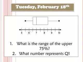
What is the range of the upper 75%? What number represents Q1. Tuesday, February 18 th. EOCT Week 5- # 2. What class has the highest pulse rates? Class 1 Class 2 Class 3 Class 4 . Reminder . Friday : Test #2-Statistics Part 1 All absent/missing work is due THURSDAY!!! . CW

E N D
What is the range of the upper 75%? What number represents Q1 Tuesday, February 18th
EOCT Week 5-#2 What class has the highest pulse rates? Class 1 Class 2 Class 3 Class 4
Reminder Friday: Test #2-Statistics Part 1 All absent/missing work is due THURSDAY!!!
CW Grades
HW Hand in!
Whiteboard Review
#1 Which is NOT a measure of central tendency? • Mean • Mode • MAD • Median
#2 Which is NOT a measure of spread? • IQR • Outlier • MAD • Range
#3 When do you use the median for the BEST measure of central tendency? • When you want the average of the data • When you want the data value that occurred the most • When there is an outlier in the data set • None of the above
#4 If you use the mean as the best measure of central tendency, what measure of spread would you use? • IQR • Median • MAD • Outlier
#5 If you use the median as the best measure of central tendency, what measure of spread would you use? • IQR • Range • MAD • Outlier
#6 • Group A has greater mean: Group A greater variation • Group B has greater mean: Group B greater variation • Group A has greater mean: Group B greater variation • Group B has greater mean: Group A greater variation
#7 What are the measures of central tendency? Mean Mode Median
#8 How do you find the mode? The number(s) that occur the most
#9 Explain the MAD The average distance between each data value and the mean.
#10 How do you find the MAD? • Find the mean • Subtract the mean from each data value • Find the mean of the new data values
#11 How do you find the IQR? • Put the data in numerical order. • Find the median. • Find the median of the lower quartile (Q1). • Find the median of the lower quartile (Q3). • Q3 - Q1
#12 How many different values must you find for a box and whisker?
#13 What is another name for the “box” in a box plot?
Today’s Goal Dot Plots & Histograms
DOT PLOT Center it represents: Mode
Definition • A data display in which each data item is shown as a dot above a number line • In a dot plot a cluster shows where a group of data points fall. • A gap is an interval where there are no data items.
Steps to Create a Dot Plot • Order numbers from least to greatest. • Draw a number line. • Label the number line with the minimum and the maximum then all the numbers that fall between them. • Put a dot above each number on the number line for each data entry in your set. • Don’t forget a title and labels!
You try it! • In an airline training program, the students are given a test in which they are given a set of tasks and the time it takes them to complete the tasks is measured. The following is a list of the time (in seconds) for a group of new trainees. 61, 61, 64, 67, 70, 71, 71, 71, 72, 73, 74, 74, 75, 77, 79, 80, 81, 81, 83 Display the data in a dot plot.
Answer! Airline Training Program Test New Trainees = 1 person Time in Seconds 61 62 63 64 65 66 67 68 69 70 71 72 73 74 75 76 77 78 79 80 81 82 83
What is the Mode? Airline Training Program Test New Trainees = 1 person Time in Seconds 71 seconds 61 62 63 64 65 66 67 68 69 70 71 72 73 74 75 76 77 78 79 80 81 82 83
What is the Range? Airline Training Program Test New Trainees = 1 person Time in Seconds 22 seconds 61 62 63 64 65 66 67 68 69 70 71 72 73 74 75 76 77 78 79 80 81 82 83
Finding Measures of Central Tendency • Use the dot plot to find the three measures of central tendency for this sample. There are seven data values, so the fourth data value is the median. Counting in four values from either end, the median is 65 in. The mean is The mode is 65 in., the height that occurs most frequently.
HISTOGRAM Center it represents: Mode for a range of numbers
Histogram • Histogram is a bar graph that shows the frequency of data within equal intervals. • There is no space in between the bars.
Frequency Chart • A Frequency Chart is a table that breaks data down into equal intervals and then counts the amount data in each interval. • A Frequency Chart is often used to sort a list of data to make a Histogram. • Make a Frequency Chart to display the data below: 90, 85, 78, 55, 64, 94, 68, 83, 84, 71, 74, 75, 99, 52, 98, 84, 73, 96, 81, 58, 97, 75, 80, 78 6 7 2 3 6
Creating a Histogram Don’t forget little things…like labels and equal intervals! 10 Math Test Scores 8 6 Frequency 4 2 90-99 80-89 50-59 70-79 60-69 100-109 Test Scores
The table below shows the number of hours students watch TV in one week Make a histogram of all the data.
Step 1 • Make a frequency table of the data. Be sure to use equal intervals
Step 2 • Choose an appropriate scale and interval for the vertical axis. The greatest value on the scale should be at least as great as the greatest frequency.
Step 3 • Draw a bar for each interval. The height of the bar is the frequency for that interval. Bars must touch but not overlap. • Label the axes and give the graph title