Chapter 1: Exploring Data
Learn how to analyze categorical data by constructing and interpreting bar graphs, pie charts, and two-way tables. Discover how to describe relationships between categorical variables and organize statistical problems.

Chapter 1: Exploring Data
E N D
Presentation Transcript
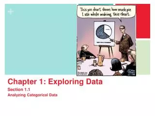
Chapter 1: Exploring Data Section 1.1 Analyzing Categorical Data The Practice of Statistics, 4th edition - For AP* STARNES, YATES, MOORE
Chapter 1Exploring Data • Introduction:Data Analysis: Making Sense of Data • 1.1Analyzing Categorical Data • 1.2Displaying Quantitative Data with Graphs • 1.3Describing Quantitative Data with Numbers
Section 1.1Analyzing Categorical Data Learning Objectives After this section, you should be able to… • CONSTRUCT and INTERPRET bar graphs and pie charts • RECOGNIZE “good” and “bad” graphs • CONSTRUCT and INTERPRET two-way tables • DESCRIBE relationships between two categorical variables • ORGANIZE statistical problems
WARM UP (Example) Find the five number summary for the data set below. {91 89 82 93 94 91 85 90}
Individuals vs Variables Individuals Variables • Individuals: the objects described by a set of data • Individuals can be people, animals or things • Variables: any characteristic of an individual • Variables can take different values for different individuals A high school’s student data base, for example, includes data about every currently enrolled student. The students are the individuals described by the data set. For each individual, the data contain the values of variables such as age, gender, GPA, homeroom and grade level. Ask yourself: WHO vs WHAT
Categorical vs Quantitative Categorical Quantitative • A categorical variable places an individual into one of several groups or categories • A quantitative variable takes numerical values for which it makes sense to find an average • NOTE: Not every variable that takes number values is quantitative! • Example: Zip Code • You can make a quantitative variable categorical by dividing the numbers into categories. • Example: Dividing ages into 0 – 10, 11 – 20, 21 – 30…
Distributions The distribution of a variable tells us what values the variable takes and how often it takes these values. Here is information about 10 randomly selected US residents from the 2000 census. 1. Who are the individuals in the data set? 2. What variables are measured? Identify each as categorical or quantitative. In what units were the quantitative variables measured? 3. Describe the individual in the first row.
Answers 1. Individuals: the 10 randomly selected U.S. residents from the 2000 census. 2. Categorical: state, gender, marital status Quantitative: number of family members, age in years, total income in dollars, travel time to work in mins. 3. This person is a 61 year old married female from Kentucky who drives 20 minutes to work and has a total income of $21,000. She has 2 family members in her household.
WARM UP (grab a sheet from the black trays) • 1. Data from a medical study contain values of many variables for each of the people who were the subjects of the study. Identify each of the variables recorded as categorical or quantitative: a. gender b. age c. race d. level of calcium in the blood • 2. Popular magazines rank colleges and universities on their “academic quality” in serving undergraduate students. Describe two categorical variables and two quantitative variables that you might record for each student. • 3. Who are the individuals in the data set in question 2?
Analyzing Categorical Data • Categorical Variables place individuals into one of several groups or categories • The values of a categorical variable are labels for the different categories • The distribution of a categorical variable lists the count or percent of individuals who fall into each category. Example, page 8 Variable Values Count Percent
Analyzing Categorical Data • Let’s make a class data set… What is your favorite color of the rainbow?
Analyzing Categorical Data • Displaying categorical data Frequency tables can be difficult to read. Sometimes it is easier to analyze a distribution by displaying it with a bar graph or pie chart.
Analyzing Categorical Data • Example: • Portable MP3 music players, such as the iPod, are popular, but not equally popular with people of all ages. Here are the percents of people in various age groups who own a portable MP3 player, according to an Arbitron survey of 1112 randomly selected people. • a. Make a well-labeled bar graph to display the data. Describe what you see. • b. Would it be appropriate to make a pie chart for these data? Why or why not?
Graphs: Good and Bad Analyzing Categorical Data Bar graphs compare several quantities by comparing the heights of bars that represent those quantities. Our eyes react to the area of the bars as well as height. Be sure to make your bars equally wide. Avoid the temptation to replace the bars with pictures for greater appeal…this can be misleading! Alternate Example This ad for DIRECTV has multiple problems. How many can you point out?
Classwork: Frequency Tables • 1. Choose or generate a question that will result in a range of categorical data. • Examples: What is your favorite ice cream flavor?, If you could be a superhero, what would your super power be?, etc. • 2. Survey at least 25 people to gather data to answer your question. Record your responses. • 3. Organize your data into a frequency table. • 4. Create a relativefrequency table of the results. • 5. Create a bar graph of your data. (Don’t forget labels!) • 6. Write a brief explanation as to why or why not a pie chart would be appropriate for your data.
Analyzing Categorical Data WARM UP: How can we help wood surfaces resist weathering, especially when restoring historic wooden buildings? In a study of this question, researchers prepared wooden panels and then exposed them to the weather. Below are some of the variables recorded. Identify each as categorical or quantitative. • Type of wood • Type of water repellant • Paint thickness • Paint color • Weathering time
Analyzing Categorical Data • Two-Way Tables and Marginal Distributions When a dataset involves two categorical variables, we begin by examining the counts or percents in various categories for one of the variables. Definition: Two-way Table – describes two categorical variables, organizing counts according to a row variable and a column variable. Example, p. 12 What are the variables described by this two-way table? How many young adults were surveyed? How many females were surveyed?
Analyzing Categorical Data • Two-Way Tables and Marginal Distributions Definition: The Marginal Distribution of one of the categorical variables in a two-way table of counts is the distribution of values of that variable among all individuals described by the table. • Why use the marginal distribution?: Percents are often more informative than counts, especially when comparing groups of different sizes. • To examine a marginal distribution, • Use the data in the table to calculate the marginal distribution (in percents) of the row or column totals. • Make a graph to display the marginal distribution.
Analyzing Categorical Data • Two-Way Tables and Marginal Distributions Example, p. 13 Examine the marginal distribution of chance of getting rich. Hint: Marginal distributions are calculated in the margins! If there is no “total” row or column, make one!
Analyzing Categorical Data • Relationships Between Categorical Variables • Problem: Marginal distributions tell us nothing about the relationship between two variables. Definition: A Conditional Distribution of a variable describes the values of that variable among individuals who have a specific value of another variable. • To examine or compare conditional distributions, • Select the row(s) or column(s) of interest. • Use the data in the table to calculate the conditional distribution (in percents) of the row(s) or column(s). • Make a graph to display the conditional distribution. • Use a side-by-side bar graph or segmented bar graph to compare distributions.
Analyzing Categorical Data • Two-Way Tables and Conditional Distributions Example, p. 15 Calculate the conditional distribution of opinion among males.
Segmented Bar Graph • Segmented Bar Graph: For each category of one variable, there is a single bar divided into categories of the other variable. • Why are they good to use? • They are easy to compare! • Forces you to use percents
Association • The whole point of analyzing more than one categorical variable at the same time is to see if they are associated. • What does it mean for two variables to have an association? • Knowing the value of one variable helps you predict the value of the other variable. (Think about explanatory and response)
Example: A sample of 200 children from the United Kingdom ages 9–17 was selected from the CensusAtSchool website. The gender of each student was recorded along with which super power they would most like to have: invisibility, super strength, telepathy (ability to read minds), ability to fly, or ability to freeze time. a. Create the conditional distribution. b. Explain what it would mean if there was no association between gender and superpower preference. c. Based on this data, can we conclude there is an association between gender and super power preference? Justify.
Let’s create the conditional distribution: • b) Explain what it would mean if there was no association between gender and superpower preference? • c) Based on this data, can we conclude there is an association between gender and super power preference? Justify.
Think, Pair, Share • Complete the Data Exploration: A Titanic Disaster activity on pg. 19 of the textbook
Section 1.1Analyzing Categorical Data Summary In this section, we learned that… • The distribution of a categorical variable lists the categories and gives the count or percent of individuals that fall into each category. • Pie charts and bar graphs display the distribution of a categorical variable. • A two-way table of counts organizes data about two categorical variables. • The row-totals and column-totals in a two-way table give the marginal distributions of the two individual variables. • There are two sets of conditional distributions for a two-way table.
Section 1.1Analyzing Categorical Data Summary, continued In this section, we learned that… • We can use a side-by-side bar graph or a segmented bar graph to display conditional distributions. • To describe the association between the row and column variables, compare an appropriate set of conditional distributions. • Even a strong association between two categorical variables can be influenced by other variables lurking in the background. • You can organize many problems using the four steps state, plan, do, and conclude.
Looking Ahead… In the next Section… • We’ll learn how to display quantitative data. • Dotplots • Stemplots • Histograms • We’ll also learn how to describe and compare distributions of quantitative data.