Download
1 / 28
280 likes | 508 Views
Designing and Developing for the Rich Mobile Web. Joe Marini Principal Program Manager Windows Phone joe.marini@microsoft.com. Agenda. Understanding the Mobile Context What makes mobile different? Guidelines for Building Usable, Engaging, Rich Mobile Web Sites Best Practices

E N D
Designing and Developing for the Rich Mobile Web Joe Marini Principal Program Manager Windows Phone joe.marini@microsoft.com
Agenda • Understanding the Mobile Context • What makes mobile different? • Guidelines for Building Usable, Engaging, Rich Mobile Web Sites • Best Practices • What to Avoid • Designing and Developing for Mobile • Q & A
We’ve Come a Long Way Remember this?
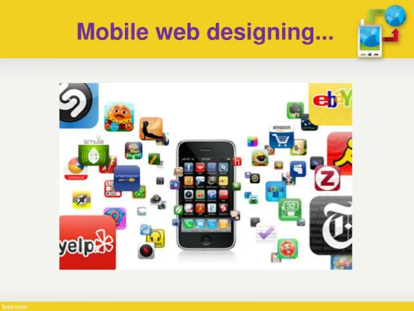
Understanding The Mobile Context The Mobile Web isDifferent From the Desktop Full Keyboard Accurate Pointing Device Large Screen, multiple monitors Powerful CPU / GPU, Big Disk Limited / Virtual Keyboard Finger Pointing Device Small Screen, which can rotate Less Capable CPU / GPU, Small Storage Physical Typically used from fixed, predictable locations Good for open-ended browsing Easy to switch among many tasks User is focused and comfortable Typically used on-the-go in an unpredictable environment Good for quick, glanceable information Focused on discrete individual tasks User is often distracted or busy Usability
Understanding The Mobile Context Mobile Web Users Have Different Expectations Mobile Web users expect immediate access to important information Mobile Web users expect information to be augmented by the real world – time, place, etc. Environmental conditions can vary widely – lighting, background noise, network speed, etc. A user’s surroundings influence how they use a Web application – relative privacy, for example
Guidelines for building rich mobile web sites Creating the Rich Mobile Web
Design for One Web • Provide the same information to users of your site regardless of their device • NOTE: This does not mean that you should provide the same presentation • Don’t exclude users based solely on the class of device they are using • If you’ve separated your content from presentation and behavior, this is easy
Design for the Finger, not the Stylus • Fingers are naturally more dexterous than a device like a stylus • It is relatively easy to perform multiple actions with a finger, like flicking, panning, scrolling, tapping, pinching, etc. • The typical size of a fingertip is 40 to 80 pixels. Navigation elements must be sized appropriately to ensure they respond well to the user. • Good finger-friendly design is also stylus-friendly, as long as you make sure that fingers aren’t the only way to access features
Focus, Grasshopper. Focus. • Good mobile Web apps focus on a few important tasks • Resist the temptation to make all of the features of your desktop site available on the phone • Distill the features of your main site into the ones that are most critical for mobile • Display the most common features prominently without having to scroll • What to do should be obvious – a “blink decision” by the user
Be Crisp, Clean, & Succinct • Design pages that use fewer fonts & colors • Avoid gratuitous graphics and unnecessary interactivity • Background images can make the page hard to read • Optimize content for the small screen space • Scale down images, use short titles • Use whitespace to separate elements, but be careful
Minimize Required Input • Entering data on a phone can be tiresome and error-prone • Only require the minimum amount of information to get the job done • Provide sensible default values where possible • Use cookies to remember previous user input
Example: Alaska Airlines Design for One Web. Design for the Finger.Focus. Be Crisp and Clean. Minimize.
Use Well-Defined Standards • Use minimum standard Web technologies: • XHTML 1.0 / HTML 4.01 / XHTML-MP • CSS 2.1, DOM 1, ECMAScript 3 • Always specify a DOCTYPE for your pages • Use standard media types • Static: JPEG, GIF, PNG • Dynamic: 3GP, AVI, WMV, MP4 • Avoid things that cause known issues: • Framesets, Tables Used for Layout, Nested Tables, Image Maps, Reliance on Plug-Ins or DHTML Behaviors
Adapting Content to Mobile No special content adaptation, result is the desktop site being delivered to the device Same page is sent to mobile and desktop, styled differently for each Managed app that uses WebBrowser control to host Web content Content laid out so it will at least be consumable on a device, special META tags indicate that page is ready for mobile Parts of site are designed for mobile specifically, kept in separate domain or subfolder, redirected to when necessary
Mobile <META> Tags • Pages that have been laid out specifically for mobile can be flagged as such • Prevents the browser from optimizing layout • Three <META> tags: <META name=”HandheldFriendly” content=”true” /> <META name=”MobileOptimized” content=”320” /> <META name=”Viewport” content=”width=device-width” />
The ViewportThe Viewport controls how content is laid out Device Screen Document Viewport
Multi-Serving Content • Same page, different devices, styled right • Usually involves some kind of detection • Client: use script to detect capabilities • Server: use code to detect User Agent string • Caveats: • DO NOT use script on client to check UA • DO NOT use UA detection to do things like fix bugs in specific user agents
Mobile-Specific Design • Web pages designed and coded specifically for mobile devices • Pages are usually kept separate – in their own domain (m.site.com) or folder (site.com/m/) • Usually involves some kind of UA detection • Suggestion: don’t roll your own. Use a good 3rd party detector, like MDBF (ASP.NET) or WURFL (PHP)
Additional Script Functions getElementsByClassName(name) querySelector(selector) querySelectorAll(selector) Viewport Settings IE Mobile supports the following values: IE Windows Phone 7 vs. IE Desktop • Frameset Handling • For usability reasons, IE Mobile expands frames to fit their content. • Navigating to .xhtml files • Pages that end with “.xhtml” are properly handled now – no download prompt
IE Windows Phone 7 vs. IE Desktop • CSS For Adjusting Text Size • IE Mobile recognizes “-ms-text-size-adjust” and “-webkit-text-size-adjust” • No Support for 3rd Party Plug-Ins • IE Mobile does not allow the installation of third party plug-ins • Behavior of Fixed Positioning • Elements that have fixed positions are attached to the document, not the browser window.
What To Do Next • Visit http://developer.windowsphone.com • Download our whitepaper on the Rich Mobile Web • Get the tools and sample code and start building • Follow @joemarini on Twitter • Dude! We’re getting the blog back together! http://blogs.msdn.com/iemobile • Fill out the session evaluation form!
?! & Questions and Answers
© 2010 Microsoft Corporation. All rights reserved. Microsoft, Windows, Windows Vista and other product names are or may be registered trademarks and/or trademarks in the U.S. and/or other countries. The information herein is for informational purposes only and represents the current view of Microsoft Corporation as of the date of this presentation. Because Microsoft must respond to changing market conditions, it should not be interpreted to be a commitment on the part of Microsoft, and Microsoft cannot guarantee the accuracy of any information provided after the date of this presentation. MICROSOFT MAKES NO WARRANTIES, EXPRESS, IMPLIED OR STATUTORY, AS TO THE INFORMATION IN THIS PRESENTATION.