Download
1 / 52
520 likes | 684 Views
Transportation and Land Use Coalition Ninth Annual Summit April 1, 2006. How to Choose: Comparing Transportation Modes Thomas A. Rubin, CPA, CMA, CMC, CIA, CGFM, CFM. Subjects To Be Covered. Transportation Capacity Metrics Modal Capacity Comparisons Cost Metrics and Methodologies

E N D
Transportation and Land Use CoalitionNinth Annual SummitApril 1, 2006 How to Choose: Comparing Transportation Modes Thomas A. Rubin, CPA, CMA, CMC, CIA, CGFM, CFM
Subjects To Be Covered • Transportation Capacity Metrics • Modal Capacity Comparisons • Cost Metrics and Methodologies • Modal Cost Comparisons • Other Considerations
Transportation Capacity Metrics • People vs. Freight • Persons/Tons Past A Point • “Transportation Work” • Passenger-Miles • Ton-Miles • Per Unit of Time (commonly, an hour)
Freeway “Level of Service” (LOS) Criteria Level of ServiceMax SpeedMax Service Flow A 75.0 750 B 75.0 1,200 C 71.0 1,704 D 65.0 2,080 E 53.0 2,400 F <53.0 >2,400 (Above is for Free-Flow Speed, which has nothing to do with the speed limit, of 75 mph.)
Case Study – Crossing the Bay Which has more capacity? The Bay Bridge? Or BART? (Peak Hour, Peak Direction)
Measurement Metrics Number of Lanes or Tracks x Vehicles or Trains per Hour per Lane/Track x Vehicles per Train x Passengers per Vehicle = PASSENGERS PASS A POINT x Speed = TRANSPORTATION WORK (Passenger Miles Index)
BAY BRIDGE vs. BART BridgeBART Lanes-Lines 5 1 Vehicles-Trains/Lane-Line 2,000 23 Vehicles/Train 1 9.13 Average Occupancy 1.5 80.3 Passengers Past a Point/Hr 15,00016,869 (Approximately Equal)
BAY BRIDGE vs. BART BridgeBART Passengers Past a Point/Hr 15,000 16,869 Speed (mph) 20 58.7 Transportation Work (Passenger-Miles) Index 300,000990,210 (BART’s index over three times Bridge’s)
How to “Tilt” a Modal Comparison • There are many different methodologies, and variations, for comparisons • Almost all are valid, and useful – when properly utilized by people who know what they are doing • It is very easy to misuse metrics to make them appear to show that your desired result, your modal selection, is the “right” one • WATCH OUT FOR PEOPLE WHO PLAY GAMES WITH DATA AND METHODS
How to “Tilt” a Modal Comparison II To make your favored mode look better, show: ..............Road………..….…………….…Rail………..…..… Location Entire Metro Area Length Peak Load Point Time Frame All Day Peak Hour Metric Transportation Work Passengers Past a Point Methodology Actual Theoretical f/Rail, Actual f/Road Freight Include Exclude
Examples of What to Watch Out For Cynthia Sullivan, Chair, (Seattle) Central Link (light rail system) Oversight Committee, “When this system is up and running, Northgate to SeaTac, in 2020, it will carry as many people every day as I-5 does today.” Center for Transportation Excellence: “It would take a twelve lane freeway going in one direction to equate the same amount of capacity of one light rail line.”
Passenger Carrying Capacity Modal Comparisons ..L.A. Blue Line.. ……..CFTE....…. Peak Peak El Monte/ NY Port Light …Real World…. Load Trip Busway Authority LOS “E”..Rail..LOS “E”LOS “F”.Point...Ave..HOV LaneBus Term. Trains/Hour 20 12 12 Cars/Train 6 2.5 2.5 Cars/Hour 2,000 120 1,800 2,100 30 30 1,218 515-779 Occupancy 1.25 125 1.15 1.15 150 80 4.36 32-48 Passengers 23,187- Past a Point 2,50015,000 2,070 2,415 4,500 2,400 5,310 34,685 Speed 55 25 15 24 56.9 Transportation Work Index 113,85060,37537,50056,700302,166 “E” Index 1.00 .53 .33 .50 2.65 “F” Index 1.189 1.00 .62 .94 5.00
Cost and Related Considerations Will it Work? Is it the Best Option? Can we Afford to Build it? Can we Afford to Operate it? Will it Negatively Impact Other Transportation System Components? Schedule – How Long to Get It Going? Risk – Financial, Political, Technical, Management?
Cost Metrics Federal Transit Administration Financial Capacity Analysis: 1. Is there funding to operate existing transit system? 2. Is there funding for capital renewal and replacement of existing transit system? 3. If answers to 1. and 2. are yes, then, and only then, is there funding to construct and operate the proposed system expansion?
FTA 49 USC 5309 “New Start” Tests The “new” metric is “Incremental Cost Divided by Transportation System User Benefit.” “Incremental Cost” is calculated in accordance with detailed procedures. “Transportation System User Benefit” is expressed in “time equivalent units,” which is basically travel hours saved. The “old” metric, which is still reported, is “Incremental Cost per Incremental Passenger,” aka “Cost per New Passenger.”
Annualized Project Cost Simplified, the “Cost” for old and new metrics is: Annualized Capital Cost + Annual Operating Cost + Other Cost Changes (such as savings in operating costs for pre-existing transit lines) = Annual Cost (usually, 20 years out) “Annualized Capital Cost” spreads original capital costs of assets over their specified useful lives.
Annualized Capital Cost Asset Type Useful LivesFactor 40-foot Bus 12 years .126 Pavement 20 years .094 Rail Cars 25 years .086 Track, Electric, Structures 30 years .081 Land 100 years .070 “Factors” math is the same as for a 7% mortgage.
Benefits “User Benefits” and “New Passengers” are outputs of transportation planning models, which must be approved by FTA. “Cost per New Passenger” was implemented because Feds believed the same riders were being shifted to more expensive transit modes, for no real transportation benefit. Change was made to “new” metric because opponents of many “new starts” projects were use “cost per new passenger” values to show it would be cheaper to least each new rider a car – often a luxury car.
The Role of Transportation Modeling Transportation Modeling, as performed for purposes including “new starts” projects refinement and analysis, is a highly complex process that can be almost impossible for lay persons, or even decision-makers, to understand. The “cost per user benefit” metric, and even the older “cost per new passenger” metric, are also often very difficult for even some people who should know better to comprehend.
Example of Cost/New Passenger Confusion “Frankly, light rail is very expensive. With respect to virtually all new systems, it would have been less expensive to lease each new commuter a car in perpetuity – in some cases, a luxury car, such as a Jaguar XJ8 or a BMW 740i.” – Wendell Cox, 2000 “This one is a real howler. To put it into perspective, a new BMW 740i goes for $62,900. APTA estimates that approximately 13,000,000 people use transit on a typical weekday. 13,000,000 times $62,900 would be $817.7 billion – almost half of the annual federal budget.” Paul M. Wyerich and William S. Lind
This response is extremely disquieting – while the difference between “cost per passenger” and “cost per new passenger” may not be readily apparent to lay persons, for people who are set forward by the primary public transit industry association in the U.S. to not understand the distinction is somewhat akin to listening to a sermon by a priest who has never heard of the Ten Commandments.And then for that industry association to actually publish this comment under its own name, …
The State of the Art in Transportation Modeling Not good. Following are from a presentation the 2004 Transportation Research Board Annual Meeting, by James Ryan, FTA Deputy Associate Administrator for Planning, who is, in essence, the FTA “chief modeling techie.”
Other Problems with Plans Case Study – Los Angeles County Metropolitan Transportation Authority Bus Rapid Transit “Orange Line” The entire “transportation” reason for a $325+ Million, 13-mile Guideway Bus Rapid Transit, instead of Rapid Bus – which does not have any exclusive/ semi exclusive guideway and would have cost <$500,000 per mile– was to save run time. Or was it?
Problems with Construction Cost Projections There have been many cases of very significant cost overruns on transit guideway projects. While, in recent years, the cost increases following the execution of a “Full Funding Grant Agreement” between the Federal government and the grantee, have been moderated greatly (but not completely), there have still been major problems with increases between the first and most important decision point – which is usually when the voters are asked to approve a tax for transit facility construction – and the ultimate construction cost. The following page shows one of the most massive such cost increases for a transit guideway.
What are the Costs – and Impacts – of Attempting to Increase Transit Ridership by Alternative Means? Over the past 25 years, Los Angeles has been a huge case study re the impact of radically different transit investment programs. From FY82-FY85, a program of rolling back the then 85¢ cash fare to 50¢ produced a 40+% ridership increase in three years, by far the most successful such demonstration in modern American transit history. Over the next 11 years, to FY96, the fare were increased back to 85¢, then to $1.10, and finally to $1.35, as over 60% of the MTA transit subsidies went for rail construction and operations – and ridership fell.
What are the Costs – and Impacts – of Attempting to Increase Transit Ridership by Alternative Means (concluded)? At the end of December, 1996, MTA entered into a Consent Decree to settle a Federal Title VI (discrimination in the utilization of Federal Funds) lawsuit, requiring it to drop the price of monthly passes back to $42, add bus service to relieve the most overcrowded buses of any major U.S. city, and add new routes. Ridership rose quickly and substantially, despite MTA efforts to fight the implementation of what it had agreed to do all the way to the U.S. Supreme Court – and losing in every one of the seven decisions along the way.
The “Efficient Frontier” Before beginning a search for new solutions, first see how your are doing now. The following graph shows subsidy per passenger and subsidy per passenger-mile for the 24 largest bus operators in the U.S. The next one shows the cost per new boarding (not rider) for the main MTA guideway transit lines and for bus.
How Much Should Light Rail Cost? “In most cases, Light Rail should not cost more than $20 million per mile.” Weyrich/Lind, page 42
How About Operating Costs? “The Critics also claim that buses cost less than rail. This is true of capital costs, but not of operating costs” Weyrich/Lind, page 18 If one examines national statistics, or those for bus and rail for most transit operators, one will generally find that the average bus cost and subsidy per passenger and per passenger-mile are slightly higher than those for rail. However, the main reason for this is that the capital costs for rail are so large that no one but a fool would ever build a new rail transit line anywhere but on a heavily utilized transit corridor.
How About Operating Costs (continued)? If one compares comparable types of transit service in comparable transit corridors – for example, if light rail is presented as a grade-separated guideway with one station per mile, consider the same type of bus service – one generally finds that bus is, at worst, extremely competitive and, very often, will have a huge operating cost/subsidy advantage. And this is only on the operating side – it is almost impossible to come up with any type of bus transit guideway that costs even half the cost of a rail line with comparable service characteristics. And there is the “mean is the median” factoid.
How About Operating Costs (concluded)? The following slide shows the cost per passenger for every bus line the Los Angeles MTA operated. As might be expected, it costs more to carry passengers on some lines than others. Note that the mean, the overall average, is $1.76 per passenger – but this is the 69th percentile cost, which means that over two-thirds of the rides cost less. The median – the ride in the middle – cost $1.62, far less. Move important, the 30th percentile ride cost $1.41, the 20th percentile ride cost $1.22, and the 10th percentile ride cost $1.10 – and this is not as low as bus can go. When you properly compare rail to highly productive bus lines, rail is rarely less expensive to operate.
How Bad Are Commutes – Really? We all hear about how overcrowded our roads are getting and how trips are taking longer. The following slide shows the home-to-work trip lengths for greater LA, the poster child for traffic congestion, from 1967 to 2003 – over this 36 year period, the average increased 5.1 minutes – 21%, from 24.0 to 29.1 minutes. Human beings are outstanding at adjusting to changes. As their travel situation changes, they change – new routes, move closer to work, new job closer to home, employer moves to where there are more workers, etc. There is, most certainly, a road capacity problem in this nation – but home-to-work commute times are not increasing significantly.
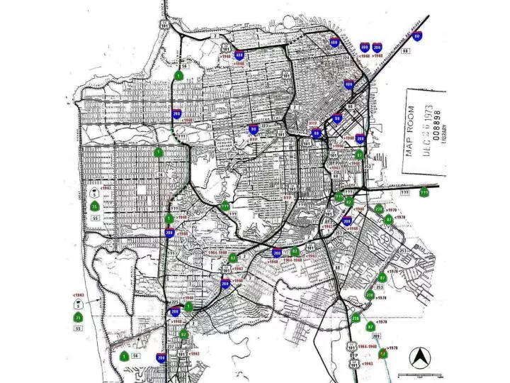
References – I (To receive this Microsoft™ PowerPoint™ document electronically, or for any other purpose, contact the author at tarubin@earthlink.net.) Opening Slide: 1955 City and County of San Francisco Freeway Plan (not entirely implemented). Freeway Level of Service Criteria from Transportation Research Board, Highway Capacity Manual 1997, Table 3-1, “LOS Criteria for Basic Freeway Sections,” page 3-11. Note that the “Maximum Service Flow Rate” is expressed in terms of “passenger cars per hour per lane,” where “passenger cars” means passenger car equivalents, which are adjusted for factors such as type of vehicle and roadway conditions. For example, a truck or bus on a straight and level section of freeway has a “pc” factor of 1.5, meaning it is counted as 1.5 cars for purposes of service flow rate, but for a 6% grade (the maximum allowed on Interstate Highways) over one mile long, the factor is 15. All other flow rates in this paper are given in terms of “real” vehicle counts, where one car = one truck = one bus. Measurement Metrics: For more detail, see Vukan R. Vuchic, Urban Public Transportation Systems and Technology, Prentice-Hall, 1981, Chapter 7, “Transit System Performance: Capacity, Productivity, Efficiency, and Utilization.” Bay Bridge operation statistics are an approximation from data formerly on Bay Bridge web site. Speed is author’s approximation – on a good day. BART operating data are from a recent e-mail exchange with Paul Forbes, Bay Area Rapid Transit District, Fleet and Capacity Planning. Cynthia Sullivan: Ms. Sullivan was the then the Chair of the Oversight Committee for the Central Link light rail system being constructed by the Central Puget Sound Regional Transit Authority (dba “Sound Transit”) in the greater Seattle Area. Central Link is proposed to operate more-or-less North-South along the Eastern side of Puget Sound, including through the Seattle Central Business District. I-5 is the primary North-South freeway through this corridor. The quotation is from a radio talk show interview, KIRO-AM, the Dave Ross Show, on March 12, 2003. (Northgate, the proposed North terminus of Central Link, is located North of the Seattle CBD. “SeaTac” is the Seattle-Tacoma area regional airport and is located South of the Seattle CBD and is near the proposed Southern terminus of Central Link.)
References – II Center for Transportation Excellence: The full citation can be found at: http://www.cfte.org/critics/what.asp#3: “This argument inaccurately compares the capacity of highways and rail transit to move passengers. A look at any transportation engineering manual will tell otherwise. According to the Highway Capacity Manual, highway operations are described as Level of Service (LOS), ranging from LOS A to LOS F. Peak highway capacity is typically regarded as LOS E (2,000 passenger cars per hour per lane). If you multiply that number by the Average Vehicle Occupancy (AVO) which averages 1.25 persons, you get 2,500 persons per lane per hour on a highway. For transit, a typical 6 car train can carry 750 passengers. Running at 20 trains per hour, per direction, that equates to 30,000 passengers. It would take a twelve lane freeway going in one direction to equate the same amount of capacity of one light railline.” The above comparison utilizes “passengers past a point” only, not transportation work, thus ignoring speed. The HCM statistics, which in the reasonable range, are, by my taste, a bit on the high side. The light rail service that they discuss is far in excess of that operated by any single light rail line in the U.S. in all particulars, although there are heavy rail lines that do have this capacity. It is also rare for transit loadings to be equal in both directions during peak periods. Finally, the last sentence is comparing a light rail line operating in two directions with a freeway operating in one direction. I-5 vs. Light Rail: James MacIsaac, a local P.E., complied this comparison of I-5 utilization in 2000 by taking the roadway utilization and on-off’s by ramp from WA-DOT data and the projected on-offs from the Environmental Impact Statement for the Central Link project for 2020. (I will take credit for suggesting the display format.) “Real World” Freeway Lanes Levels of Service “E” and “F” – representative values taken from the Highway Capacity Manual (1997), Transportation Research Board, as selected by author. Los Angeles Blue Line data: Schedule, train consists, speed, and occupancy from MTA web site and on-board surveys and author’s observations. El Monte Busway data: Average of a series of point checks over a period of years performed by Caltrans District 7 (Los Angeles/Ventura Counties). Port Authority Bus Terminal access data: Leroy M. Demery, Jr., Peak-Period Vehicle Occupancy Statistics for U.S. and Canadian Rapid Bus and Rapid Rail Services, Monograph 02-01, Final Report, updated April 18,2005, available at www.publictransit.us. Federal Transit Administration (FTA) Financial Capacity Analysis: FTA Circular C 7800.1A, 01-30-02, “Financial Capacity Policy, http://www.fta.dot.gov/legal/guidance/circulars/7000/424_1081_ENG_HTML.htm.
References – III For full FTA “New Starts” guidance, see, “New Starts Program Planning and Development: http://www.fta.dot.gov/16277_ENG_HTML.htm. The “older” guidance is more useful in some ways: Reporting Instructions for the Section 5309 New Starts Criteria: http://www.fta.dot.gov/grant_programs/transportation_planning/major_investment/reporting_instructions/2002/9956_ENG_HTML.htm. For the specifics on the financial tests, see Chapter 3.4, “Cost Effectiveness:” http://www.fta.dot.gov/grant_programs/transportation_planning/major_investment/reporting_instructions/2002/9957_10743_ENG_HTML.htm. For a introduction to transportation modeling for these purposes, see Edward A. Beimborn, Center for Urban Transportation Studies, University of Wisconsin-Milwaukee, A Transportation Modeling Primer, May 1995: http://www.uwm.edu/Dept/CUTS/primer.htm. The Wendell Cox “BMW” citation is from “Coping with Traffic Congestion,” in A Guide to Smart Growth: Shattering Myths, Providing Solutions, The Heritage Foundation, 2000, page 46, and is quoted in the Weyrich/Lind citation following. The Weyrich/Lind response is from Twelve Anti-Transit Myths: A Conservative Critique, by the Free Congress Foundation for the American Public Transit Association, July 2001, page 36. Although the Cox quote very clearly is discussing “new” passengers, Weyrich/Lind completely missed the vital distinction between passengers and new passengers – and the American Public Transportation Association, the primary transit industry professional and lobbying association, which commissioned this piece, somehow also failed to notice this incredible error. The history of the end-to-end travel time projections for the Bus Rapid Transit line now known as the Orange Line, which serves the San Fernando Valley in Southern California is most interesting. Supposedly, there were two options, plus the “no-build,” reviewed as part of the environmental clearance process, one being “Bus Rapid Transit” (BRT), which would operate with a semi-exclusive right-of-way on a former freight railroad alignment that the Los Angeles County Metropolitan Transportation Authority had originally purchased in the early 1990’s to build a subway under. The proposed BRT line would, however, have over 30 at-grade crossings. The other option was “Rapid Bus,” which would operate on city streets, but with only approximately one stop per mile, limited traffic signal preference, and other low-cost speed enhancements. The terminuses for the BRT line were the North Hollywood Red Line Station in the East Center of the Valley and Warner Center, a major commercial/retail development in the Southwest of the Valley. MTA Red Line ridership projections from Draft EIS/EIR, 1983 and Final EIS/EIR, 1989. The 1983 document was utilized to actually “sell” the line and obtain the funding, the 1989 document is for the line as was actually built. Actual ridership from MTA web site monthly reports for the periods indicated.