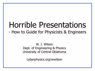
Horrible Presentations - How to Guide for Physicists & Engineers
530 likes | 737 Views
Horrible Presentations - How to Guide for Physicists & Engineers. W. J. Wilson Dept. of Engineering & Physics University of Central Oklahoma cyberphysics.org/ wwilson. Why Should I Care?. You want people to: Understand your work Be INTERESTED in your work Think you’re great !

Horrible Presentations - How to Guide for Physicists & Engineers
E N D
Presentation Transcript
Horrible Presentations- How to Guide for Physicists & Engineers W. J. Wilson Dept. of Engineering & Physics University of Central Oklahoma cyberphysics.org/wwilson
Why Should I Care? • You want people to: • Understand your work • Be INTERESTED in your work • Think you’re great! • What happens if you give a bad presentation? • Few pay attention • They may fall asleep • Might think your work is not important
Types of Presentations • Informative • focus on pertinent points • introduce small amount • repeat often • Persuasive • motivate and convince • demonstrate a need • provide proof/evidence • show benefits
Basic Tips For Presenting • How to give GOOD presentations: • Part I: Presence • Attitude • Voice • Mannerisms • Part II: Slide style • Understandable • Interesting • Will show examples of what NOT to do
Part I - Presence • Keep your audience interested • Keep them with you • Things that can affect this • Topic, topic depth • Attitude/Presence • Mannerisms
Know Your Topic • Be prepared to get questions! • “What if I don’t know the answer?” • Know WHEN to say “I don’t know” • Know HOW to say “I don’t know” • Don’t just stand there uncomfortably! • Be able to recover from interruptions • Know what to skip if you’re running late • Don’t just talk faster!
Know Your Audience • Do they have a background like yours? • How much hand-holding? • Can you jump right in to specifics? • How much motivation for your work? • How detailed should you get?
Know Your Location • Need to bring a laptop? • Need to bring a CD, or emaila PPT in advance? • Need to print and hand out slides? (Better - give audience website to download them from themselves.) • How far is audience from screen? • Can you point with a pointer,or do you need a laser pointer?
Attitude. (Yours) • Are you INTERESTED in your topic? • If no, get a different one! • If yes, ACT LIKE IT • If YOU aren’t excited… • Can’t expect OTHER people to be! • Don’t talk down to audience • You know more than them about THIS… • They know more than you about other stuff
Dead Man Talking • Are you hiding behind the podium? • Are your hands/face motionless? • Are you staring… • at your advisor/boss? • at your laptop? • at the screen? • at the ceiling? • Is your back to the audience? • IF SO… you’re probably BORING!
I Had A Case Of Monster Energy Drink Before this Talk! • Sometimes nerves make for fast talking • Calm down. E-nun-see-ate. • It’s not a race • People need time to absorb information • Take a bottle of water if necessary • Bottles if you can work a cap (spillage) • Glass if you’re using a laser pointer
Is This Thing On …tap tap? • Feedback kills people! • Most PA systems are tuned so that the microphone can be middle of your chest • Not 2mm from your mouth • Modulate your voice evenly • Careful – turning head affects volume! • If not using a mic – project your voice!
Where are your hands? • You have a set of “moves”that repeat during your talk • Make sure they aren’t silly looking • Don’t point with your middle finger • Can videotape yourself speaking • Do a practice for friends • Make sure they’re not too nice • You want real feedback!
Look Ma, I have a L-A-S-E-R! • If necessary, get a laser pointer • Will depend on your talk • Get it a few weeks before your talk • Play with it. Circle things. Make shapes. • Be comfortable • Get Borg impersonations out of the way • Get a second one for backup, or make sure session chair/host has one
Common Laser Pointer Moves • The circle • The underline • The back-handed flick • The epileptic-seizure inducer • DO NOT POINT AT EVERYTHING • Not everything is equally important • Your voice can provide emphasis too
Right Here. See? • Don’t point at your laptop screen • They can’t see it
Ummmm… The… Uh… Yeah. • Practice makes perfect • Don’t do the Office Space Lumberg Impersonation • Caveat: OVER practicing can be bad… • Do not read your slides like a script • Most people lose 20 IQ points in front of an audience
Part II: Slide Design • Goals: • Convey the necessary information • Be readable/understandable • Be interesting (enough) • Avoid: • Over stimulation • Booooring
Logos • We know you had support • Don’t need to list all of them every slide • If on first slide, don’t obscure title/authors • Maybe save it for last slide
Outline • Title Slide • Introduction • Outline • My Work • Results • Conclusions • References and/or Acknowledgments
Outline Slides • Previous slide didn’t “help” audience • If use outline slide, make it USEFUL • Everyone (hopefully) introduces their topic • Everyone explains their work, gives results • What is specific to YOUR talk? • Talk length correlates to outline need • Talk is 45 minutes, maybe! • Talk is 5 minutes… probably not.
README.TXT • Do not attempt to put all the text, code, or explanation of what you are talking about directly onto the slide, especially if it consists of full, long sentences. Or paragraphs. There’s no place for paragraphs on slides. If you have complete sentences, you can probably take something out. • If you do that, you will have too much stuff to read on the slide, which isn’t always a good thing. • Like the previous slide, people do not really read all the stuff on the slides. • That’s why it’s called a “presentation” and not “a reading” of your work • Practice makes perfect, which is what gets you away from having to have all of you “notes” in textual form on the screen in front of you. • Utilize the Notes function of PowerPoint, have them printed out for your reference. • The audience doesn’t need to hear the exact same thing that you are reading to them. • The bullet points are simply talking points and should attempt to summarize the big ideas that you are trying to convey • If you’ve reached anything less than 18 point font, for God’s sake, please: • Remove some of the text • Split up the text and put it on separate slides • Perhaps you are trying to do much in this one slide? • Reading a slide is annoying. • You should not simply be a text-to-speech converter.
Font Size • You are close to your monitor • Your audience is far from the screen Tahoma 32 pt 28 pt 24 pt 20 pt 18 pt 16 pt 14 pt 12 pt 10 pt Comic 32 pt 28 pt 24 pt 20 pt 18 pt 16 pt 14 pt 12 pt 10 pt Lucida Sans 32 pt 28 pt 24 pt 20 pt 18 pt 16 pt 14 pt 12 pt 10 pt TNR 32 pt 28 pt 24 pt 20 pt 18 pt 16 pt 14 pt 12 pt 10 pt Courier 32 pt 28 pt 24 pt 20 pt 18 pt 16 pt 14 pt 12 pt 10 pt
Squint City • If you find yourself saying “you probably can’t read/see this, but…” • Then you probably have a BAD SLIDE! • There are exceptions, but very few • Test on real screen in conference room • Not just your computer screen 15” away.
This is a really long title for this single slide, I should have just summarized • Hard to read • Many people don’t read the title anyway • Should have been “Long Slide Titles”
Know Your Limits • People can’t read text that runs off the side of the slide
Bullets Aren’t Everything • How many • Levels of • Hierarchy do • You think • You need * To express - Your point?
Speelchick • How samrt will poeple thikn yuo are? • Watch for: • there/their/they’re • too/to/two • its/it’s
System Architecture System Architecture • There’s a CPU, a RAM and an FPGA and they’re all connected - The FPGA connects to the CPU’s data cache - The bus is 32 bits wide - Blah blah blah blah • You have to visualize it yourself CPU data cache main memory 32 32 FPGA 1 Picture = 1000 Words • There are exceptions, but in general • Don’t have only text on most of your slides • Try to draw diagrams wherever applicable • (Well-drawn) pictures easier to understand
Example Diagrams • Compute-intensive sections on hardware • Hardware reconfigured for each wwwwwwwwwww wwwwwwwwwww wwwwwwwww wwwwwwwwwwwwwww wwwwwwwwww wwwwwwwwwwwwww w wwwwwwwwwwwwwww wwwwwwwwww wwwwwwwwwwwww wwwwwwwwwwwwww wwwwwwwwww wwwwww wwwwwwwwwwwww w w FPGA Source code
Example Diagrams • Compute-intensive sections on hardware • Hardware reconfigured for each wwwwwwwwwww wwwwwwwwwww wwwwwwwww wwwwwwwwwwwwwww wwwwwwwwww wwwwwwwwwwwwww w wwwwwwwwwwwwwww wwwwwwwwww wwwwwwwwwwwww wwwwwwwwwwwwww wwwwwwwwww wwwwww wwwwwwwwwwwww w w FPGA Source code
You are not Pixar Studios • Previous slide(s) used “animation”… • Use only where it is USEFUL • Know if presentation system will handle • Different versions of PowerPoint, Macs, etc. • Or use multiple slides to safely animate • Flip-book style Animation Use it sparingly Can (it can be annoying) Be Very Distracting
Caveman Art Bad • This is a bad drawing • Put in some effort FPGA CPU
The Art of Suspense • Don’t
The Art of Suspense • Don’t • Be
The Art of Suspense • Don’t • Be • A
The Art of Suspense • Don’t • Be • A • Tease
Anticipatory Lecturing • Don’t Be A Tease • Let the audience think at their own pace • It only provides benefit if there’s a “surprise” result
Mommy, my eyes are burning! • Can you look at this for 45 minutes? • Colors look different on every LCD projector • Colors look different between transparencies and projector • Side note: if printing slides, may want to choose white background to save ink!
I See Dead People (Ghosts) • More contrast on monitor than projector • Different projectors == different results • Colors to avoid with white are: • Light Green • Light Blue • Pale Yellow • Your slides should have good contrast Usually can’t read this…
Contrast Guidelines • White background, black text is clearest • Can use other (dark) text colors… • But be careful -- don’t be distracting! • Make sure to not use light-on-white or white-on-light • Don’t using glaring colors • If not an art major, don’t have to get fancy
Equations • So you see we get half the previous result • Ummm… okay…
KISS-Keep It Simple Stupid • Do you really need all those equations? • This is very instance-dependent! • Depends on what you’re discussing • Depends on your audience • Sometimes you may need them • Explain the variables and what they mean • Give a “plain-text” description of it • If you don’t need them, don’t use them!
g BB D N l h B A a FF HH EE q c V o F H n GG E DD VV YY R p II m h KK NN K JJ k Y OO L I CC t J O TT QQ C X f PP ZZ LL Q M MM P Z RR XX x r T y u SS d WW z G w UU S v W s b AA U e j Use Simple Examples • This isn’t one. It doesn’t help.
Results • You havelots of coolresults • No one canread this • No one canunderstand this • Graphs areyour friend…
Summary/Conclusion • If your talk is more than 5 minutes, nice to summarize work & results • Bring people back if they zoned out • Remind them why you’re great • Give “selling” points here • 30x performance increase with only 10% area penalty • Described novel method to create clean fuel from used cat litter