Download

1 / 45
450 likes | 648 Views
Tips for Designing and Giving an Effective Presentation. Barron J. Orr, PhD University of Arizona March 23, 2014. For: Dissertation Writing and Research Series National Graduate Institute for Policy Studies (GRIPS ) Tokyo, Japan.

E N D
Tips for Designing and Giving an Effective Presentation Barron J. Orr, PhD University of Arizona March 23, 2014 For: Dissertation Writing and Research Series National Graduate Institute for Policy Studies (GRIPS)Tokyo, Japan
Barron J. OrrProfessor and Geospatial Extension SpecialistOffice of Arid Lands Studies School of Natural Resources and the Environment University of Arizona
Tips for Writing Abstracts • Be concise. Focus only on the major elements • An science abstract is like a formula – it almost always contains the same elements in the same order. • Begin by capturing the problem / question(s) you have been trying to address as well as your objective(s) • After you can link the problem to the purpose of your project/research, etc.
Abstract Tips • Next, summarize the methods / activities pursued to address the problem • Next, summarize your results / accomplishments • Finally, conclude with interpretations of those results and their significance • In the case of R&D work, science education, or science writing, conclude with your interpretations of the potential utility and impact the product / activities / articles will have.
Presentation Tips: Know Your Audience • You • The other speakers • Audience • Scientists? • Technical experts? • Managers? • Moderator
Session etiquette • The moderator • Opens presentations • Introduces speakers • Keeps time • Fields questions • You • Attend the plenary first thing in the morning • Go to your session early & introduce yourself • Sit in front • Participate in the entire session* *Possible exception: to see an important talk in another parallel session. BUT -- be polite and tell you moderator when that will occur, and when you are not speaking next, sit near exit
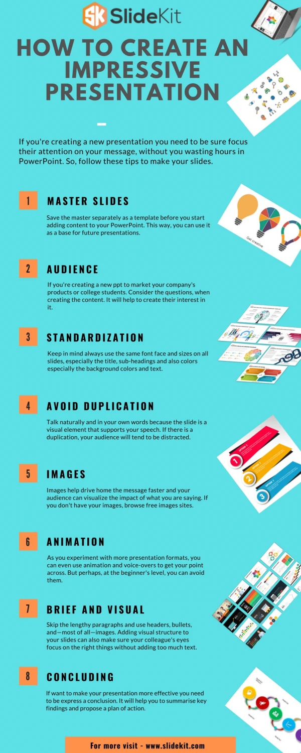
Presentation Tips • Format matters • Frequently presentations must be in Microsoft PowerPoint (for Windows and Mac). • However, there are alternatives: • Kingsoft Presentation Free (Windows) • Prezi (http://prezi.com/) • Sliderocket (http://www.sliderocket.com/) • SoftMaker Presentations Mobile (Android) • Haiku Deck (iPad) • Pixxa Perspective (iPad)
Presentation Tips • Submit on time!!!It is EXTREMELY difficult to change a presentation on site, or worse, during a conference session. It is also unprofessional. • File size matters a lot – so it pays to learn how to make images small (file size is the key, not screen size), and then compress images in PowerPoint.
Presentation: Core Content • Much like the abstract, the core of your presentation will flow through • statement of the problem, • objectives, • methods/activities/analysis techniques, • results and • interpretations of the results and their significance/use/impact.
How long and how many slides? • Imagine a Conference with a limitof 15 minutes to present with 5-10 minutes for questions afterwards. • How many slides depends on your pace, etc., but a general rule of thumb is one minute per slide, so start by targeting no more than 15 slides. • Exception: Images which illustrate something well, but do not require much air time.
Tricks for better timing • Avoid prolonged discussion on any one slide. • Timed practice runs will help you fine tune your presentation length and number of slides. • “Backup” slides of 1 or 2 things hard to explain, placed after your “Thank you” slide, just in case you get a question about, say, a complicated method.
Word choice • Though scientifically aware, some of your audience may not necessarily be versed in the technical terms of your specific topic or discipline. • define technical terms • spell out acronyms • avoid jargon Source: Blogging Innovation
Logos & Attribution • Somewhere on the edges of this slide it is a good idea to put logos of organizations key to the research (the department, NASA, etc.). • Since Space Grant is the primary sponsor, it is common to place the Space Grant logo in the bottom corner of all subsequent slides as well. • http://spacegrant.arizona.edu/about/logos
Opening? • Most presentations use the title slide to begin: • title • your name • key acknowledgements (your mentor's name and affiliation and folks who worked with you directly), • the name/place of the symposium • date
Outline of Presentation? • It is a good idea to brieflysummarize what you are going to present at the beginning. • It helps focus the audience and organize your own thoughts. • This can be done verbally on the opening slide, or as a bullet list on the second slide. • Which depends on your style, comfort and pace.
Closing? • Conclusions!! Generally presenters close the science part of the talk on the second to last slide where they discuss their interpretations, giving some insight of future directions. • After completing that slide, the close with advance to a "Thank you" slide that offers the opportunity for questions. • This may have a more detailed list of acknowledgements than your opening slide • It is possible you may want to put in a “Future Directions” slide before the “Thank you” slide…but only if you feel you will have time. You can always discuss these as you say thank you.
How do I field questions? • The moderator usually a) asks the audience for questions and b) fields the questions…and then you answer them. • Therefore, do not end your presentation with “Questions?” – It is much more polite to end with “Thank You” • Do NOT close your PowerPoint because you may need it to help you answer a question!
Positive vs. Negative? • Research, R&D, science education and science writing all have moments of success surrounded by periods of trial and error -- and frustration! • While your presentation may include mention of the challenges overcome and not overcome, the focus should be on those elements that you did do and which moved things forward rather than those things which had to be discarded for whatever reason. • Be positive! Focus on what you did do and what worked, not the opposite.
Images • Images are excellent, particularly if they aid comprehension. • They often are better than strings of detailed text. • They can be core to a slide or used to add clarification and break up text. • NOTE: It is very important that you credit the source of the image on your slide. (usually in smaller font below the image). Source: openscience.org
A Picture is Worth 1000 Words Jive Software CMO Sam Lawrence http://gobigalways.com/10-roi-charts-you-cant-live-without/
Background Colors • Background colors have the potential to add energy to a presentation, but should never be permitted to impede comprehension. • Be careful about standardized, fancy backgrounds – some are distracting to the audience and others take up far too much real estate without adding to your message. • Be very careful about the relationship of your background with the color of your text. • Many presenters use a simple background (basic white with black text or dark blue with white or yellow text), using images and the actual words chosen to provide energy to the slides.
Text Colors • Red text is almost always very difficult to read regardless of the background. Do not use red. • Light text on light background or dark text on dark background should be avoided. • If you place text on an image, make sure it is easy to read. If it is not, put a color background beneath the text on top of that part of the image. • Ask someone good with colors to comment on your choices. A simple test? Flash a slide to someone who has never seen your presentation and ask them what they saw first – if it is anything other than your main message, change your slide!
Animations? …are oftendistract ing! Animations…
Animations? • Avoid animations! PowerPoint animations (e.g. flashing text, appearing and disappearing bullet points, fancy slide transitions, etc.) should be used very carefully if at all. • Avoid anything that can distract the audience from your message and impede comprehension, or that forces your audience to look at specific text. • What you really want is for the audience to concentrate on what you are saying, while taking in / reading the slide at their leisure.
Capturing Images • Capturing images in websites is fairly easy in most browsers: right click the image, and either “copy” or “save” the image. • Capturing windows, screens, and parts of screens can be a bit more tricky. There are a number of simple methods (e.g. Print Screen key on many keyboards provides these functions). • There are also a number of freeware or shareware applications that make this very easy and fast, such as ScreenRip (http://www.snapfiles.com/get/screenrip.html) (Remember to credit the source in your PowerPoint either on or next to the image, including who took the photo and the web page you borrowed it from.)
Very simple software:ScreenRip by Progency http://www.snapfiles.com/get/screenrip.html
Very simple online photo editing tool:PicMonkey http://www.picmonkey.com/
Making Images Smaller • NEVER grab the sides of the photos to resize…only grab the corners. • Resizing in PowerPoint does NOT reduce file size!!! • To reduce file size, try these options: • Use a photo software and resize • “Grab” the image with ScreenRip • Use the PowerPoint compression tool
In PowerPoint 2003… Right-click the image Choose “Format Picture” Click “Compress…” Choose “All pictures” Choose Web/Screen Resolution 96 dpi Check both boxes PowerPoint Compression Tool
PowerPoint 2007 Compression • Go to file menu (the MS Windows icon on top left) • Choose Presentation Save As AND Click PowerPoint • In the Save As dialog box, go to the bottom right and find the Tools drop button • Select “Compress Pictures” (and Options) • Select “All Pictures in Document” • Target Output: Web/Screen (150ppi) • OR – even smaller: E-mail (96ppi) • Check • Automatically perform basic compression on save • Delete cropped areas of pictures
PowerPoint 2010 Compression • Click any image in the presentation • Notice “Picture Tools” above the “Format” menu tab, and click the words “Picture Tools”. • When the “Compress Pictures”dialog box pops up, be sure • Apply only to this picture NOT CHECKED • Delete cropped areas of picture IS CHECKED • E-mail (96 ppi) IS CHECKED
Which Font? • Sans serif fonts lend themselves well to computer projection. • Serif fonts don’t.
Which Font? • Discouraged: serif fonts (typefaces that use serifs, light lines or curves called serifs projecting from the top or bottom of a mainstroke of a letter). These include, among many others, Times Roman, Courier, New Century Schoolbook, and Palatino. Why not? Light lines do not project well, making them harder to read.
Which Font? • Encouraged: sans serif fonts (a category of typefaces that do not use serifs, small lines in or at the ends of characters). These include, among many others, Arial, Helvetica, Avant Garde, and Geneva. Why? Easier to read when projected on a screen.
Which Font? • Strongly Discouraged: playful fonts such as Comic Sans, which was developed as a as a casual, non-connecting script, and was designed to imitate comic book lettering, for casual use in informal documents and the packaging of children’s software. Source: BBC News Magazine “What’s wrong with Comic Sans?
Font Size • Too many words in tiny font sizes should be avoided! • Specific font sizes will vary, but generally slide titles should be larger (e.g. 40pt), while bullets can be smaller 32 or 28pt. • Avoid using smaller than 24pt, other than information less critical to topical comprehension (e.g. providing credit for a photo). • The only exception is where text is used as a visualization to illustrate a concept or an activity and the details therein are not essential for comprehension. • For example, a snapshot of a table with numbers used to illustrate a concept like "Database Development" or "Statistical Analysis" if and only if you do not expect the audience to read the table.
How Best to Present? • The answer to this comes from practice. • When you practicealone– something recommended as you form the presentation – make sure to speak out loud (full voice) and, in at least one run through, watch yourself in a mirror. • Next, do a practice run with people who you know well(comfort is important at this stage, as is an audience which is not versed in the specific topic you are presenting as they will catch jargon and technical terms that need to be defined).
How Best to Present? • Finally, do a practicerun with your colleagues where you work. In all practice runs, it is very important to pretend that each run is a live presentation. • Before starting, ask your audience to pretend it is the live presentation, and ask them to note any suggestions which you can discuss afterwards. • Remember to time each practice run so that you eventually are able to consistently complete in 7 minutes
Strong Beginning, Strong Finish? • Memorization rarely if ever helps a presentation. • However, having a strong beginning and strong finish can make a world of difference. • These get you rolling, reduce nerves because you are rolling, and help you gracefully off the stage!
Transition? • Memorize ONLY your introduction and conclusion…and identify the transitions you want between slides. • Two complimentary methods work well: • a) plan for the last thing you say on a slide to be the opening for the next slide, and/or • b) place something on the slide (a word in the last bullet or an image) that cues you as to what is coming next. • Good transitions lead to good presentations and are much more effective than rote memorization.
Delivery? • Face your audience, not the screen. • Do not read your slides…they should speak for themselves. • Eye contact is very helpful for communication. • Some movement (walking, gestures, etc.) is ok, but be kept at a minimum. (Too much can be distracting). • Directing audience attention to a particular aspect of a slide (e.g. with a laser pointer) can add energy and focus to a presentation. • Point– but do not distract with the pointer!
The End? • Some end with “Future Directions” – but do not make this overly long. Do not waste precious time you could use to talk about what you did discussing the future. • It is good idea to end with a more detailed Acknowledgements slide. • Remember your mentor, any graduate students, the funding agency, the Department, the name of the grant, etc. • A final slide for questions can be a simple “Thank You” • At the end there is generally 1 to 2 minutes for some questions. Most of these you will be able to answer directly, however you always have the option to move back through your presentation to support your response with a particular slide when needed.
Filename • Remember, you may be sharing the presentation and/or uploading your file (the PowerPoint presentation) to a formal conference. • So…give what you upload a filename which is clear and identifies you: • Lastname_Firstname_keyword_abstract.docx • Lastname_Firstname_keyword_presentation.pptx
Other Ideas If you are really getting into this, try this website. It will challenge some of the ideas I have put forward and introduce some new ones. What I have presented is a simple approach. This website offers more insights as you get more comfortable with presenting. http://www.presentationzen.com/
Thank you! With special thanks to Susan Brew (University of Arizona/ NASA Space Grant), my mentor, and the many, many students who helped me prepare and improve this talk over the years.