Download

1 / 9
0 likes | 25 Views
ud83dudca1 Ready to elevate your design game? ud83dudcbb Learn how to avoid common UI/UX design mistakes with Attitude Academy! ud83cudfa8<br><br>Learn ui/ux Designing -: <br>https://www.attitudetallyacademy.com/class/figma-for-ui/ux-designing<br>Visit Attitude Academy <br><br>Yamuna Vihar :- https://maps.app.goo.gl/gw9oKCnXDXjcz4hF7<br>Uttam Nagar :- https://maps.app.goo.gl/iZoQT5zE3MYEyRmQ7 <br>.<br><br>Welcome to Attitude Academy! Follow https://www.instagram.com/attitudeacademy4u/ for your valuable Training Course insights and content.<br><br><br>

E N D
Introduction: Avoiding Common UI/UX Design Mistakes Welcome to Attitude Academy! We're here to guide you through the world of UI/UX design, helping you create user-friendly and visually appealing interfaces. Let's explore some common pitfalls to avoid, ensuring your designs stand out and resonate with your audience.
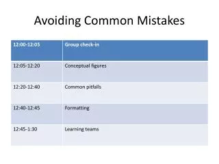
Table of Content Neglecting User Needs Inconsistent Design Elements 1 2 Understanding user needs is crucial. Conduct thorough research to discover user preferences, pain points, and goals. Maintain consistency in typography, color schemes, and spacing for a cohesive and professional look. Cluttered Interface Lack of Responsive Design 3 4 Prioritize information and reduce visual noise. Focus on clear hierarchy and easy navigation. Ensure your designs adapt seamlessly to different screen sizes, providing an optimal user experience across devices. Unclear Navigation Insufficient Feedback and Interactivity 5 6 Guide users through your interface with intuitive menus, clear labels, and consistent navigation patterns. Provide clear and timely feedback to users, keeping them informed and engaged with the design.
Mistake #1: Neglecting User Needs Empathy and Research User Personas Testing and Iteration Conduct thorough user research to understand their needs, pain points, and goals. Empathy is essential for creating user-centered designs. Create user personas representing your target audience. This helps visualize your users and tailor your designs to their specific needs. Continuously test your designs with real users to gather feedback and iterate on your designs, ensuring they meet user expectations.
Mistake #2: Inconsistent Design Elements Typography Choose a font family and set consistent font sizes and weights for headlines, body text, and other elements. Color Palette Limit your color palette to 2-3 primary colors and use them consistently throughout your design for a cohesive look. Spacing Ensure consistent spacing between elements for visual clarity and a balanced aesthetic. Use padding and margins effectively.
Mistake #3: Cluttered Interface Information Hierarchy Organize information effectively, prioritizing important content and minimizing visual clutter. White Space Use white space strategically to create visual breathing room, enhancing readability and improving the overall design. Visual Cues Use visual cues, such as color, size, and contrast, to guide users' attention to key information.
Mistake #4: Lack of Responsive Design Responsive Design Non-Responsive Design Adapts to different screen sizes, providing an optimal user experience on all devices. Does not adjust to different screen sizes, resulting in poor usability and user frustration. Uses flexible layouts and responsive images to ensure content is displayed correctly across all devices. May require users to scroll horizontally or zoom in to view content, creating a poor user experience.
Mistake #5: Unclear Navigation Intuitive Menus Search Functionality Use clear and concise menu labels that accurately represent the content behind each link. Provide a search bar to allow users to quickly find specific information on your website. 1 2 3 Breadcrumbs Implement breadcrumbs to help users track their location within the website, allowing them to navigate back easily.
Mistake #6: Insufficient Feedback and Interactivity Loading Animations Provide visual feedback during loading processes, indicating to users that their actions are being processed. Success Messages Display clear success messages upon successful completion of actions, confirming the user's interaction. Error Messages Provide informative error messages when errors occur, guiding users to resolve the issue. Notifications Use notifications to keep users informed of important updates, actions, or events.
Conclusion: Elevate Your Design with Attitude Academy By avoiding these common UI/UX design mistakes, you can create user-friendly, visually appealing, and effective interfaces. Enroll in Attitude Academy today to learn from experienced designers and elevate your design skills to the next level. Together, let's create exceptional user experiences!