Aa Hh Xx Yy
110 likes | 297 Views
Aa Hh Xx Yy. serif (Times New Roman). Aa Hh Xx Yy. Sans serif (Arial). Traditional (like Goudy Old Style). Conservative variation among letters Project an image of solidity and “class” Highly readable Fairly economical Great for body text. Modern (like Bodoni).

Aa Hh Xx Yy
E N D
Presentation Transcript
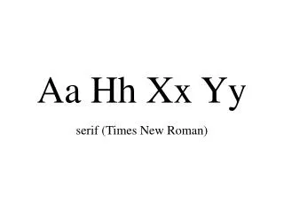
Aa Hh Xx Yy serif (Times New Roman)
Aa Hh Xx Yy Sans serif (Arial)
Traditional (like Goudy Old Style) • Conservative variation among letters • Project an image of solidity and “class” • Highly readable • Fairly economical • Great for body text
Modern (like Bodoni) • sharply defined serifs • significant stress • good for a design statement • require large type and lots of white space • better for headings than body text
Slab Serif (like Rockwell) • heavy, thick horizontal serifs • uniform stroke widths • architectural or engineering image • project feeling of accuracy and preciseness • no-nonsense, not frivolous • good with low-res output
Rounded (like Souvenir) • not pretentious or rigid • subtle amount of stress • friendly, hometown, personalized image • non-threatening
Geometric sans serif (like Avant Garde) • no stress • “constructed” precision • strong design statements • harder to read than sans serif • contemporary image • headlines only
Open Typefaces (like Colonna) • outline look (inside not filled in) • reduce visual weight • avoid dominating page • use sparingly! • terrible for body text
Novelty (like Matisse) • break all the rules of typography • fun • great for “comic relief” or design accents • Terrible for body text • not so good for all headings in a doc, either
Headline (like Eras Bold) • very, well, black • large, dramatic • make a strong impression on the reader • suited for headlines only