Download
1 / 4
40 likes | 50 Views
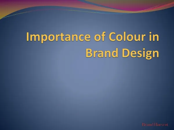
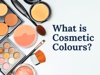
The colour of a cosmetic product packaging is one of the most powerful design elements. Different colours communicate differently to the target audience, often helping segregate different products. For more details: https://www.artworkflowhq.com/resources/importance-of-colors-in-cosmetics-brand-packaging Or https://www.artworkflowhq.com/

E N D
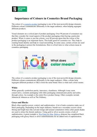
Importance of Colours in Cosmetics Brand Packaging The colour of a cosmetic product packaging is one of the most powerful design elements. Different colours communicate differently to the target audience, often helping segregate different products. Visual elements are a critical part of product packaging. Over 90 percent of consumers say that they consider the visual aspects of the product packaging when buying a particular product. When it comes to just the colours, over 80 percent agree that the colour of the product packaging is an important factor. This holds good for cosmetics too. They help in creating brand identity and help in visual storytelling. In some cases, certain colours are used in the packaging to protect the formulations. Here is a brief intro to what colours mean in cosmetics packaging. The colour of a cosmetic product packaging is one of the most powerful design elements. Different colours communicate differently to the target audience. Often, colours help segregate different products or SKUs from the same brand. Here is what each colour means: White White generally symbolises purity, innocence, cleanliness. Although it may seem conservative, cosmetic packaging with white packaging communicates purity and safety through colour. An example is the entire Dove product lineup. Other examples include Johnson & Johnson as well as The Ordinary. Greys and Blacks Black often signifies power, control, and sophistication. A lot of male cosmetics make use of black packaging. Depending on the target audience, brands use a secondary accent colour. Strong and bright hues like red and orange add sensual connotation while softer pastel shades are used to attract the female audience. Using gold or silver accents creates a look of sophistication. A great example is War Paint for Men. Bettr.co skincare has completed black packaging with glossy black or silver embellishments for an added look of sophistication. https://www.artworkflowhq.com/
Blues Blue is the safest colour that a brand can use. It can create boring and predictable packaging, but it also signals reliability and dependability. The darker blue is aimed towards older audiences while brighter hues attract younger people. A great example is the packaging of Nivea’s cream that has remained unchanged for decades. Reds Reds can stimulate the senses. They signify liveliness, passion, strength, and enthusiasm. Darker shades have a luxurious outlook while brighter hues give out more energetic and exciting vibes. An example includes Certain products from Olay, such as their Regenrerist line-up comes in red packaging. Green Brands mostly use green packaging for organic or eco-friendly products. Green is a great option for nutraceuticals as they suggest natural and organic items. People associate greens with security, growth, and health. Almost all products from Himalaya uses green accents in their packaging to show their plant-based origin. Mario Badescu, a brand of personalised skincare products also uses green in its branding and packaging to show vitality and growth. Orange Using orange can be risky. While the colour signifies optimism and confidence, a lot still depends on the design. Therefore, most brands usually stay away from Orange for their product packaging. A good example is Lotus Herbals Safe Sun Sunscreen that comes in orange packaging. Many other brands such as Re'equil use such a colour scheme. Yellow Yellow is fun, uplifting, and mentally stimulating. It is a great option for already saturated markets. Yellow packaging attracts the young crowd. Brands also use yellow for sunscreen and to show if their product has lemon extracts. For example, Garnier has numerous products which dominantly uses yellow in their packaging as it comes with lemon extracts. Neutrogena Beach Defence is another sunscreen product that comes in yellow packaging. Teal and Turquoise These shades usually communicate a sense of serenity and calm. They provide a sense of familiarity. They are great for products that consumers will use every day and they will provide a soothing effect. An example includes Loreal Hydration (Aqua) products. Purple and pinks Shades of purple generally signify sophistication while pinks are softer feminine tones. Brighter shades of pinks are usually aimed at a younger audience, such as pre-teens. Kylie Cosmetics uses various shades of pink in its packaging. https://www.artworkflowhq.com/
Choosing the right packaging colours Developing the right colour for your cosmetic packaging can be a challenging task. There are multiple perspectives that you need to consider before you select one. Demographics and target audience You need a good understanding of your current consumer base before you select the packaging colour. This includes their age, their likes and dislikes, any cultural bias, and so on. For example, colours can be used to communicate current events too, such as the Make It Black campaign that was backed by beauty brands like Maybelline and Morphe. Brand identity Colour is a big part of the brand identity. You should ensure that your core brand colours are a part of the selected colour palette. The product’s purpose and its USP Is the product a luxury cosmetic item to be used occasionally, or is it something that people can use daily? You can use colour to share that information. Sunscreens come in yellow and orange packaging; charcoal masks come in black packaging, products meant for daily use often use white or blue for their packaging. The colour also encodes the product functionality as well as its contents. Product segregation Colours help products stand out. Brands use colours to separate their product from the competition as well as their other products. For example, Minimalist uses dark pastel accents in their predominantly white packaging to colour-code its products. https://www.artworkflowhq.com/
Managing colours in cosmetic packaging While developing packaging artwork for cosmetics, managing colours can be a confusing task. It is difficult to describe colours with just words. You can’t expect a person to understand the exact shade of red when you say crimson red, or maroon. Furthermore, the appearance of colours changes based on the medium. Different digital displays have different colour calibrations. Colours in print and colours on a monitor have a different appearance. Hence, brands need to adhere to standards to ensure consistency. Using standard colour naming schemes Brands need to talk to designers and printers and hence they need a standard to communicate the exact shade of a colour. Both Pantone and CMYK codes are extensively used by designers and printers to talk colors. They are also compatible with all designer and printer software, as well as artwork management tools that allow you to verify colour consistency. Using artwork management tools Artwork management tools come with a colour extractor tool that lists all the colours in the design file. It helps reviews to easily verify if the right colour is present or not. It lists out all the colours in CMYK as well as Pantone codes. Furthermore, you can compare old and new artworks using the compare tool to spot even minor colour changes. Source: Artwork Flow - Google Workspace Marketplace Read More https://www.artworkflowhq.com/