Comparative Study of Travel Times Between Year 9 and Year 13 Students
Analyzing and comparing travel times from home to school for year 9 and year 13 students using dot plots and statistical measures. Results suggest a need for a larger sample size for more accurate conclusions.


Comparative Study of Travel Times Between Year 9 and Year 13 Students
E N D
Presentation Transcript
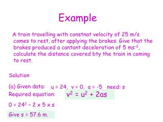
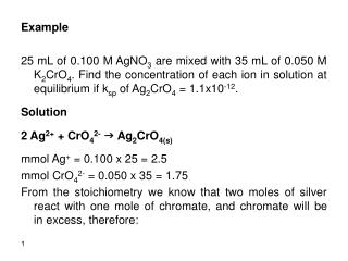
Problem I wonder if year 9 students from the censusatschool 2011 database have longer travel times from home to school than year 13 students from the censusatschool 2011 database.
Analysis Shape Year 13 Dot Plot The year 13 graph has a large peak at approximately 15 minutes. There is a large cluster from approximately 3 minute to 7 minutes. There are several small gaps but there is a large gap from 30-40. The year 13 graph is not symmetrical it is skewed towards lower travel times.
Year 9 Dot Plot The year 9 graph has a large peak at 30 minutes. There are also smaller peaks at approximately 1 minute, 15 minutes and at 20 minutes. There is a cluster from approximately 1 minute to 3 minutes. There are several small gaps but the largest ones are from large gap from 35-45 and from 23-30. The year 9 graph is not symmetrical it is skewed towards lower travel times.
Spread The range of the year 9 graph (51) is much larger than the range of the year 13 graph (37) The Inter Quartile Range (IQR) of the year 9 graph (23.8) is also much larger than the IQR of the year 13 graph (12.6). Both of these show that the year 9 graphs have a much higher range. This may be because year 13 students have more freedom in how they get to school, such as being able to drive.
Unusual Points The year 9 graph has three points that show travel times greater than 40 minutes. These probably represent students who make a long trip to school, possibly with delays such as having to change bus. Both year levels had clusters with very low travel times. These students may live very close to school and walk to school.
Middle 50% The middle 50% of the year 9 students (6.2-52) is shifted more towards longer travel times than the middle 50% of the year 13 students (6.2-18.8) However they do share the same lower quartile. The year 9 student middle 50% was shifted to longer travel times because it had a higher IQR.
Overlap DBM = 19 – 12 = 7 OVS = 30 – 6.2 = 23.8 1/3 of OVS = 23.8 ÷ 3 = 7.9 Because the DBM (9) is not greater than 1/3 of the OVS (7.9) we cannot say that it is likely that Year 9 students from the census at schools 2011 database have longer travel times than year 13 students from the census at schools 2011 database.
Conclusion We cannot say that it is likely that Year 9 students from the census at schools 2011 database have longer travel times than year 13 students from the census at schools 2011 database. However the DBM (9) was very close to 1/3 of the OVS (7.9). It would be a good idea to take another, larger sample. A larger sample will more accurately show the results for all of the population.