Creating Charts with Microsoft Excel
180 likes | 200 Views
Learn how to create charts in Microsoft Excel using rows, cells, and columns. Turn data into visual representations like pie charts. Step-by-step guide with interactive quizzes. Try it now!

Creating Charts with Microsoft Excel
E N D
Presentation Transcript
Microsoft Excel TERMS Cells Rows A 1 Columns
All three elements come together to make…. Three spreadsheets automatically are available when you open Microsoft Excel. Let’s get those gears moving! SURPRISE QUIZ!!!! Rows, columns and all those cells are called???? Together, they are called a SPREADSHEET. Together the spreadsheets are called a workbook.
Data is the key Click on a cell to begin entering information. When preparing to create a chart, it is important to have category headings across the top row. For example:
Then enter categories on the left side. Now add the data under the appropriate headings and rows.
Now it is time for a Quiz! What elements create a spreadsheet? A. rows and cells A B. cells and columns B C. rows, cells and columns C
CLOSE, BUT NOT THE RIGHT ANSWER! Try Again!
Way to Go! Hurray! GREAT! Now You are ready to turn your data into a chart!
Once all the data has been entered… Highlight all the cells like in the example.
After highlighting the data, now you will be making the information appear in a chart or graph format.
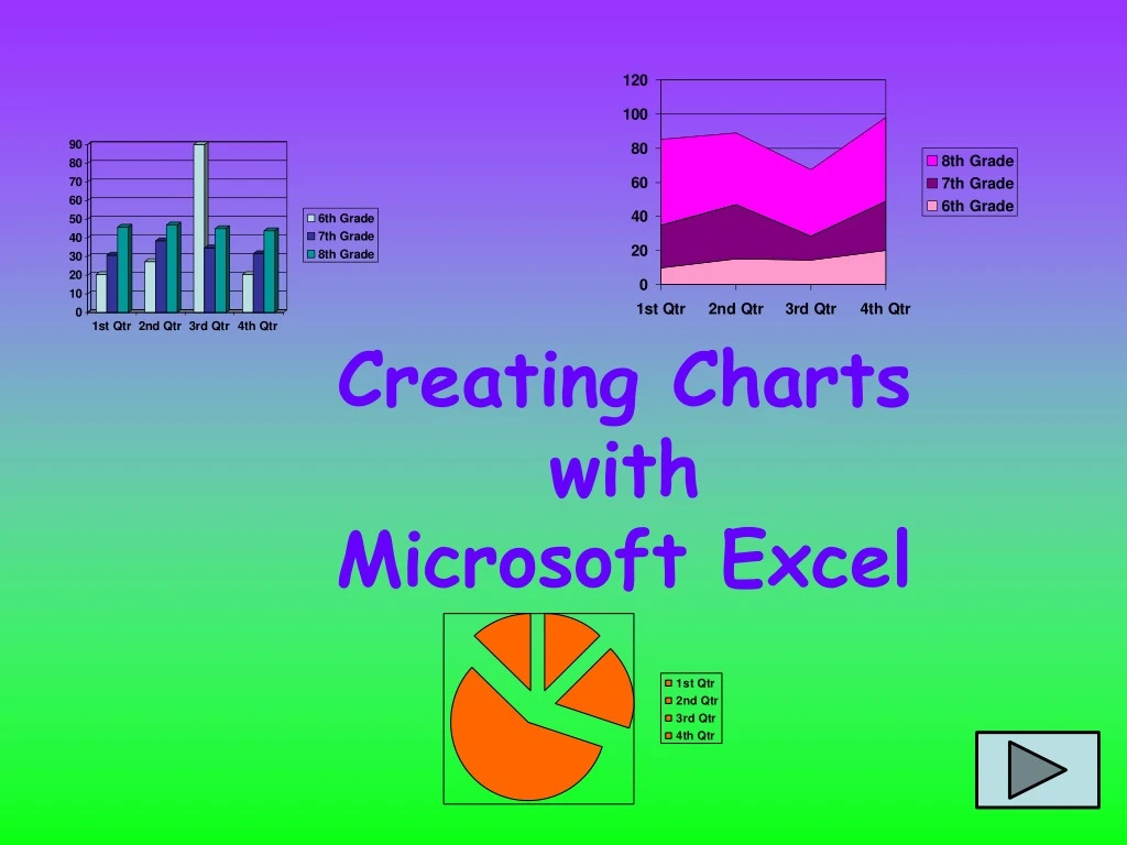
Can be turned into this Pie Chart The information on the left
Survey information is best displayed in a chart format INFORMATION TURNS INTO THIS
Let’s take a look at the Button Bar Please follow along to see how this is done! There are many options to choose so it is good to have an idea of what you are wanting to create. This is the CHART button
Once you have selected the chart, you can click this button to see what it will look like Clicking the Chart Button opens a dialog box that looks like this… Click on the Chart that best suits the information you want to display Then click the NEXT button
The last part of formatting your chart has to do with where you want the chart to appear The options that are offered after this are self-explanatory. On the same note, if you would like the chart to be on its own sheet, select, “As new sheet”. If you want the chart on the same spreadsheet, select “As object in:” Try out the options offered and you can always change things back. The best advice is to move slowly so that you can undo choices you do not want.
True or False QUICK QUIZ When displaying parts of a whole, the pie chart works best.
Sorry! This statement is true. See how all the parts make one object.
Congratulations! Now, you try! Collect information, either take a survey about opinions or show your own grades for a class. Type all of the information in a Microsoft Excel spreadsheet. Highlight the information and click the chart button. Click here to open a Microsoft Excel spreadsheet!