Download
1 / 4
0 likes | 17 Views
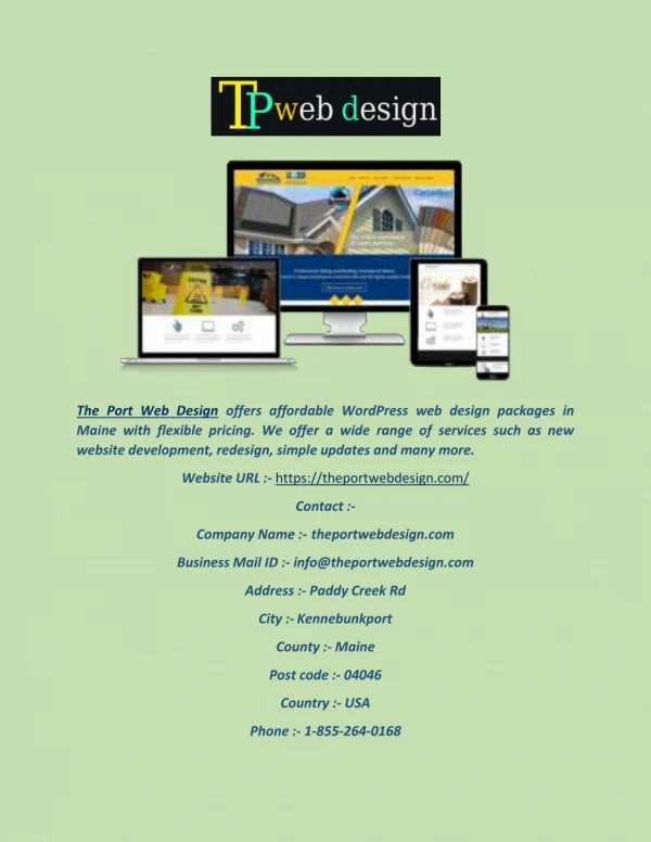
We at Anand Techverce the best web development & digital marketing company in Chennai, India. We help you to reach the right audience to build your brand. Call us.

E N D
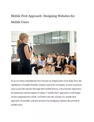
Mobile First Approach: Designing Websites for Mobile Users In an era where smartphones have become an integral part of our daily lives, the significance of mobile-friendly websites cannot be overstated. As more and more users access the internet through their mobile devices, it has become imperative for businesses and developers to adopt a "mobile-first" approach to web design. In this comprehensive article, we'll delve into the concept of a mobile-first approach, its benefits, and best practices for designing websites that prioritize mobile users.
Understanding the Mobile First Approach 1. What is a Mobile First Approach? The mobile-first approach is a design strategy that prioritizes the development of website layouts and features for mobile devices before scaling up to larger screens, such as tablets and desktops. It involves starting the design process with the smallest screen size in mind and then progressively enhancing the layout and functionality for larger screens. 2. Why Mobile First? The rise of mobile usage has fundamentally changed the way people access and interact with the internet. With mobile devices accounting for a significant portion of web traffic, designing with a mobile-first approach ensures that websites are optimized for the devices that users are most likely to use. It also promotes a focus on essential content and functionality, leading to better user experiences across all devices. Benefits of a Mobile First Approach 1. Improved User Experience Designing with a mobile-first approach encourages simplicity and clarity in website design, resulting in better user experiences on all devices. By prioritizing mobile users, developers can streamline navigation, optimize load times, and ensure that content is easily accessible and readable on smaller screens. 2. Enhanced Performance
Mobile-first design often leads to more efficient code and optimized performance. By starting with a mobile-centric mindset, developers are forced to prioritize performance optimization techniques such as image compression, lazy loading, and minification, resulting in faster loading times and improved site performance across all devices. 3. Higher Search Engine Rankings Search engines like Google prioritize mobile-friendly websites in their search results, especially for users searching on mobile devices. Adopting a mobile-first approach can improve your website's mobile usability and SEO performance, leading to higher rankings and increased organic traffic. Best Practices for Mobile First Design 1. Start with Content Prioritization Identify the most critical content and functionality for your website and prioritize them for mobile users. Focus on delivering essential information and core features in a clear and concise manner, avoiding unnecessary clutter or distractions. 2. Embrace Responsive Design Principles Utilize responsive design techniques to create fluid and flexible layouts that adapt seamlessly to different screen sizes and orientations. Use CSS media queries to apply specific styles and layouts based on the user's device characteristics, ensuring a consistent and optimized experience across all devices. 3. Optimize for Touch Interaction
Design with touch-friendly elements and gestures in mind to accommodate mobile users' interaction patterns. Use larger tap targets, spacing between links, and intuitive swipe gestures to enhance usability and prevent accidental clicks or misclicks. 4. Performance Optimization Prioritize performance optimization to ensure fast loading times and smooth user experiences on mobile devices. Optimize images and assets, minimize HTTP requests, leverage browser caching, and implement lazy loading techniques to reduce page load times and improve site performance. 5. Test Across Multiple Devices and Browsers Thoroughly test your website across various devices, screen sizes, and browsers to ensure compatibility and consistency. Use device emulators, browser developer tools, and real device testing to identify and address any issues or discrepancies in layout and functionality. Conclusion The mobile-first approach represents a fundamental shift in web design philosophy, emphasizing the importance of prioritizing mobile users in the development process. By designing with mobile users in mind from the outset, businesses and developers can create websites that deliver superior user experiences, improved performance, and higher search engine rankings. Embrace the principles and best practices of mobile-first design to stay ahead of the curve and meet the evolving needs of today's mobile-centric users.